Monthly Archives: June 2014

April Greiman: A New Realm of Dynamic Space

At the time of this writing, April Greiman is sixty-five years old and has been designing for over thirty-seven years. She has been recognized as one of the first designers to embrace computer technology as a design tool and with popularizing the New Wave approach to typography in the United States originally fathered by Wolfgang Weingart.

April GreimanGreiman was born in New York City in 1948 and raised in a domestic atmosphere that encouraged her originality, challenged her to question everything and stimulated her aspiration for exploration. She was raised to have a questioning and curious attitude and find adventure in life. Neighbors called her family, “The Flying Greimans” because they were always looking up, searching for interesting phenomena and traveling by air. It is no doubt that young April took a lot from her parents as a young child into adulthood and applied this learned attitude into her work and life (Lutz).

Greiman began her college studies at the Rhode Island School of Design but quickly moved to Missouri in 1966 where she studied graphic design at the Kansas City Art Institute and earned her undergraduate degree in 1970. April continued her studies at the Allgemeine Künstgewerberschule Basel, now known as the Basel School of Design, in Basel, Switzerland between 1970 and 1971 (McCoy).

Visual CommunicationsIn 1976, Greiman moved to Los Angeles and established her approach of rejecting the belief that computers and digitalization would compromise the International Style by exploiting pixilation and other digital errors as integral parts of digital art. By 1982, she became head of the design department at the California Institute of the Arts and in 1984 Greiman lobbied successfully to change the department name to Visual Communications, as she felt the term “graphic design” would prove too limiting to future designers (AIGA).

Graphic Design Talk said it best when they summarized some of Greiman’s work by saying:

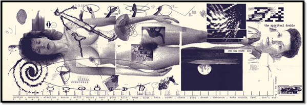
Together with her studio “Made in Space”, she founded ”Gremanski Labs”, which is considered in her own words,” a laboratory dedicated to experiment and exploration.”   Starting with her 1987 Design Quarterly #133 magazine to today public art commissions for the city of Los Angeles, Greiman hasn’t stop searching new ways to present her art. Her work expanded beyond works on paper to a combination of graphic design, video, computer graphics, architecture and environment.

Made in SpaceIn the early 1970s, Wolfgang Weingart commented, “April Greiman took the ideas developed at Basel in a new direction, particularly in her use of color and photography. All things are possible in America!” (Meggs). Inspired by the New Wave typography which started in the early 1960s, Greiman advanced the application of new and intriguing layout principles while simultaneously creating a bridge to the retro and vernacular designs of the 1980s.

While Greiman made groundbreaking advances to the periodical format by introducing a fold-out layout for posters with her issue #133 of the influential Design Quarterly magazine, her outstanding poster for the California Institute of the Arts truly epitomizes her concept of merging graphic design with photography.

In collaboration with photographer Jayme Odgers in 1979, Greiman revolutionized design by introducing graphic elements within a photographic space; thus, creating a dynamic image with extreme depth and width, allowing objects to occupy peripheral space by the use of wide-angle photography. Typography plays a minimal part in this particular piece, although the readable text is important: the name of the institution and an abbreviation of the same – each placed on the far edges of the design, essentially containing the talent depicted between.

Color is scattered across the image in several primary forms. Flesh tones represent warm reds and yellows while several instances of cool blue appear in sky images. Orange is the only real secondary color that appears on a regular basis. Most of the composition is black, white and shades of gray. The lightest areas almost washout in the white while stark, dark blacks and deep grays make smaller objects stand out and move forward, even from the background of the design. Objects overlap in unrealistic ways, allowing the eye to continuously move from within the image to the border and outside of the composition.


Graphic elements within a photographic space

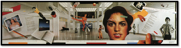
Repeated patterns also establish movement as do the repeated colors. Some individual objects are vertical while others float or are diagonally situated within the image. Square elements balance with round objects and curved lines while jagged edges are tempered by organic features.

Design Quarterly

Greiman furthered the New Wave movement and continues to influence the perception of typography, graphic design and photography while feeding from past movements and inspiring new styles. Psychedelia was symbolic of the 1960s in America and particularly in California. The form mirrored the anti-establishment attitudes of the age of “sex, drugs and rock and roll.” Psychedelic design found its true format in the Day-Glo poster as it rejected any formal structure. Psychedelia inspired the spirit of many of the New Wave design basics and could be considered a loose predecessor of the movement. Pop Art challenged tradition by asserting that an artist’s use of the mass-produced visual commodities of popular culture is parallel with fine art. Pop removes the material from its original context and isolates the object, or combines it with other objects. Pop art often took as its imagery whatever was currently in use in advertising. Product logos and labels were prominent in the imagery chosen by pop artists such as Andy Warhol. Pop Art and Minimalism are considered to be the precursors to Postmodernism which began as New Wave and is contradictory to the structure of Modernism but, interestingly enough, began with the designers of the Swiss International Style. Post-modernism and New Wave challenged and departed from what was perceived as too much of an emphasis on pure formalism and functionalism. In a postmodern design, typography was pushed beyond its traditional norms of legibility. In the 1980s, Punk was an American graphic style that represented a youthful attempt at rebellion. New Wave AprilIt was a manifestation of Postmodernism in which imagery often emulated comic book art (RIT).

April Greiman continuously asks herself some basic questions, such as: “Am I taking enough risk?”, “Do I explore the unknown?” and “Can people learn and grow from what I make?” While the answer to all three seems to be a resounding “yes”, the answer could be different if she wasn’t always wondering those exact queries. April said it best herself by stating, “I’ll always be designing. It’s not what I do, it’s who I am!”

Works Cited

Lutz, Rebecca. Designer Spotlight: April Greiman, The Queen of Chance. N.p., n.d. Web. 28 June 2014. <http://rebeccalutz.com/april-greiman/>.

McCoy, Katherine, High Ground Design. American Graphic Design Expression: The Evolution of American Typography, Design Quarterly 149, The MIT Press, Cambridge, Massachusetts, 1990, pp. 3-22. Print.

AIGA (American Institute of Graphic Arts). Medalists: April Greiman. 2 January 2011. Web. 28 June 2014. <http://www.aiga.org/medalist-aprilgreiman/>.

Graphic Design Talk. April Greiman. Does it Make Sense? N.p., n.d. Web. 28 June 2014. <http://alechagraphicdesigntalk.wordpress.com/history_of_graphic_desigh/april-greiman-does-it-make-sense/>.

Meggs, Philip B., and Alston W. Purvis. “Graphic Design and the Industrial Revolution”. Meggs’ History of Graphic Design. 5th ed. Hoboken, N.J.: J. Wiley & Sons, 2012. . Print.

RIT Graphic Design Archive. Movements. N.p, n.d. Web. 28 June 2014. <http://library.rit.edu/gda/movements>.

View/Download PDF

DaDa

The Last Tree

Visual TitleI designed a poster in the Futurist typography style around the lyrics of an original poem: The Last Tree. First, I drew the focus point of the poster, the title, in the form of a typical tree silhouette in Adobe Flash with a VisTablet. I then transferred the image to a black background in Photoshop where I began adding the stanzas of the prose. The first stanza I arched with a left alignment and a fifty percent bend and placed it in the upper, left-hand corner of the poster. The second stanza was placed below and to the right of the first and was also configured with a left alignment but consisted of a negative fifty percent bend. Both stanzas were rotated to the left so that they would complement each other and add movement to the composition. It could be interpreted as whipping wind or the physical manifestation of a toxic storm generated by a nuclear war. Some may even infer a symbolic rain of destruction and desolation based on the social commentary of the poem. The third and final stanza was placed below the illustrated title, given a negative fifty percent bend and center aligned.

Black Background First Stanza Second Stanza

Third Stanza Background Image Negative Text

Additional elements were added in the spirit of DaDa beginning with a larger, colorized tree image at twenty-five percent opacity. This effect enhances interest and creates further movement to the design, allowing the eye to wonder, before or after reading the text. Another component included to occupy large negative space involved the recurrence of all three stanzas in black font with an outer glow and reduced to twenty-five percent opacity. Each was adjusted by bend and/or alignment to fit its new space and placed within the composition in such a way that some of the script ran off the edges of the poster. This writing is not meant to be read but to increase repetition and balance the overall image. Lastly, a light glow of a border was included to delicately frame the piece.

The Last Tree: A Dada Project

View/Download PDF

The Last Tree

Art Nouveau

WireframeTree of Life

I started my Art Nouveau Tree of Life by drawing the trunk in an organic, flowing style. Next, I added branches, progressively thinning the width of each as they extend beyond the tree trunk. By inserting the ground in the same flowing manner, I effectively produced a limited depth perspective without drifting from my original style. To complete my initial design, I decorated my tree branches with curving, round leaves and fruits nearly indistinguishable from each other but identifiable by their placement within the composition.


Organic, flowing trunk Progressively thinning branches Limited depth perspective ground Curving, round leaves & fruits

Elements with unique colors

By giving each element a unique color, I visually separated the components of my design and could concentrate on the background. My first choice was a natural gradient of sky-blue and a pastel green (which, when seen with the maroon ground lines create an illusion of an earthy brown). My second and third versions modified my organic elements to create partially solid portions within the composition. The third style took advantage of a split background pattern divided between the imaginary horizon to further define the sky and ground.

Sky-blue and pastel-green background         Partially solid organic elements

Split background pattern

View/Download PDF

Futurism: the Birth of Modern Art

Filippo Tommaso MarinettiIn the early 20th century, a social movement began that changed the perception of the world, art, technology and modern life. It emphasized and glorified speed, the automobile, the airplane and the industrialized metropolis. Youth, violence and revolution were major themes and its founder, Filippo Tommaso Marinetti, promised destruction, war and injustice.

Marinetti (22 December 1876 – 2 December 1944), born in Alexandria, Egypt, was the bastard son of a lawyer, Enrico, and his lover, Amalia Grolli (Berghaus). His affection for literature was developed young and influenced greatly by his mother who was an enthusiastic poetry admirer. He studied in Egypt, Paris and Italy to become a lawyer, like his father, but decided instead to pursue a career in literature. He based his literary work out of France but traveled frequently to Italy and wrote in both languages for an Italian–French magazine in Milan.

Futurist ManifestoIn 1909 Marinetti wrote his Futurist Manifesto which established Futurism as a revolutionary movement which voiced enthusiasm for war, the machine age, speed and modern life. In addition, it shocked the public by proclaiming that they would “destroy museums, libraries, and fight against moralism, feminism, and all utilitarian cowardice.” (Meggs). What Marinetti described as the “first will and testament to all the living men on earth” was bulleted as the following:

  1. We want to sing the love of danger, the habit of energy and rashness.
  2. The essential elements of our poetry will be courage, audacity and revolt.
  3. Literature has up to now magnified pensive immobility, ecstasy and slumber. We want to exalt movements of aggression, feverish sleeplessness, the double march, the perilous leap, the slap and the blow with the fist.
  4. We declare that the splendor of the world has been enriched by a new beauty: the beauty of speed. A racing automobile with its bonnet adorned with great tubes like serpents with explosive breath … a roaring motor car which seems to run on machine-gun fire, is more beautiful than the Victory of Samothrace.
  5. We want to sing the man at the wheel, the ideal axis of which crosses the earth, itself hurled along its orbit.
  6. The poet must spend himself with warmth, glamour and prodigality to increase the enthusiastic fervor of the primordial elements.
  7. Beauty exists only in struggle. There is no masterpiece that has not an aggressive character. Poetry must be a violent assault on the forces of the unknown, to force them to bow before man.
  8. We are on the extreme promontory of the centuries! What is the use of looking behind at the moment when we must open the mysterious shutters of the impossible? Time and Space died yesterday. We are already living in the absolute, since we have already created eternal, omnipresent speed.
  9. We want to glorify war — the only cure for the world — militarism, patriotism, the destructive gesture of the anarchists, the beautiful ideas which kill, and contempt for woman.
  10. We want to demolish museums and libraries, fight morality, feminism and all opportunist and utilitarian cowardice.
  11. We will sing of the great crowds agitated by work, pleasure and revolt; the multi-colored and polyphonic surf of revolutions in modern capitals: the nocturnal vibration of the arsenals and the workshops beneath their violent electric moons: the gluttonous railway stations devouring smoking serpents; factories suspended from the clouds by the thread of their smoke; bridges with the leap of gymnasts flung across the diabolic cutlery of sunny rivers: adventurous steamers sniffing the horizon; great-breasted locomotives, puffing on the rails like enormous steel horses with long tubes for bridle, and the gliding flight of aeroplanes whose propeller sounds like the flapping of a flag and the applause of enthusiastic crowds. (Joll).

Fortunato DeperoWhile occupied on creating a collection of poems praising the wartime accomplishments of the Decima Flottiglia MAS (10th Assault Vehicle Flotilla) in Bellagio on December 2nd,1944, Marinetti died of cardiac arrest.

An influential contributor to the Futurism movement was Fortunato Depero (March 30, 1892 – November 29, 1960), an Italian painter, sculptor and writer. He is also well known for his work as a graphic designer and produced a dynamic body of work in poster, typographic and advertising design (Meggs).

Depero FuturistaDepero was born in the Italian Trentino region near Fondo and Malosco but grew up in Rovereto, to the south-west. It was in Rovereto that he first began displaying his work as a sculptor while working as an apprentice to a marble worker. Eventually, he made his way to New York and between September of 1928 and October 1930, Depero designed magazine covers for Vanity Fair, Movie Makers and Sparks, among others (Meggs).

Text formed into various shapesDepero attended Scuola Reale Elisabettina, a school that targeted the development of technical specialization and applied arts, along with other notable artists such as Luciano Baldessari, Fausto Melotti, Umberto Maganzini, Lionello Fiumi, Tullio Garbari and Carlo Belli. It was here that Depero created some of his finest artistic works (Stylepark).

In 1927, Depero published his Depero Futurista, a compilation of typographical experiments, advertisements and tapestry designs. This publication became the precursor of the modern artist’s book. Bound together with two bolts, this tome is considered a manifesto of the Machine Age. Within its pages, even more innovation was waiting to be discovered, such as the use of different typefaces, the text formed into various shapes, the use of different papers and colors, and several other typographic inventions (Colophon).

Use of different typefacesBoth Filippo Tommaso Marinetti and Fortunato Depero changed the world of art and social perceptions of their time. Marinetti’s contribution being quite obvious: founding the movement of Futurism and, through his enthusiasm, leading its followers into the future. Despero invented the artist’s book, a creative expression publ shed by the artist independent of the publishing establishment (Meggs). These visionaries, along with many others, are responsible for such further movements including Art Deco, Surrealism, Dada and Constructivism. It is safe to say that Futurism was an influence on the modern art world and all of its decedents!

Works Cited

Berghaus, Günther. “F.T. Marinetti (1876-1944): A Life Between Art and Politics”. New York: Farrar, Straus, and Giroux, 2006. Print.

Meggs, Philip B., and Alston W. Purvis. “Graphic Design and the Industrial Revolution”. Meggs’ History of Graphic Design. 5th ed. Hoboken, N.J.: J. Wiley & Sons, 2012. . Print.

Joll, James. Three Intellectuals in Politics. New York: Pantheon Books, 1961 / 1960. Print.

Stylepark, “Fortunato Depero (1892-1960).” Fortunato Depero. N.p., n.d. Web. 15 June 2014. <http://www.stylepark.com/en/designer/fortunato-depero>.

Colophon, “Italian Futurist Books.” Italian Futurist Books. N.p., n.d. Web. 15 June 2014. <http://www.colophon.com/gallery/futurism/1.html>.

View/Download PDF

George Eastman

George Eastman“Eastman is known as the man who brought the joy of photography to millions around the world” (GEH). By introducing the general public to his Kodak camera in 1888, George Eastman gave ordinary citizens the ability to document their lives and experiences with fixed images of themselves and their loved ones. The personal, handheld Kodak camera was an invention without precedent and effectively etched his name in the history books as the father of modern photography. (Meggs)

Eastman was born in Waterville, New York on July 12th, 1854. His father worked two jobs to make ends meet: primarily teaching bookkeeping and penmanship, he also sold fruit trees and roses. By working so many hours and running between Waterville and Rochester, young George was raised mostly by his mother, Maria Kilbourn Eastman. His father died in 1862 and his mother raised him and his sisters alone until 1870 when his older sister, Katie, died of polio. (Lindsay)

The Eastman Dry-Plate CompanyAs a young man, Eastman procured a camera for a trip he never took but the event started him on a lifelong love affair with photography. Initially, he found the cost, awkwardness and weight of the photographic outfit needed serious improvements. Eastman started experimented with simple ways to develop negatives involving gelatin emulsions and by 1880 he had invented and patented a dry-plate coating machine.

The Eastman Dry Plate Company was formed in 1881 with the financial backing of Henry Strong, Eastman and Strong. In 1884, they reincorporated as the Eastman Dry Plate and Film Company as they produced and patented rollable film as an alternative to the long-standing, but clumsy, glass negative.

The Eastman Kodak CompanyEastman conceived the word “Kodak” as a distinguishing name that would be considered strong, short and unique. The word would also need to meet foreign trademark laws. In Elizabeth Brayer’s biography of George Eastman, she noted some quotes by Eastman himself describing why he chose the name Kodak for his portable camera:

He liked the letter “K” because it was “strong and incisive… firm and unyielding”. It was pronounced the same in every language, and it was the first letter of his mother’s family name. Registered as a trademark on 4 September 1888, Eastman later explained the word’s merits to the British Patent Office: “First: It is short. Second: It is not capable of mispronunciation. Third: It does not resemble anything in the art and cannot be associated with anything in the art except the Kodak.” (Brayer)

Philanthropist, Businessman, AdventurerThe Eastman Kodak Company was founded in 1892 by Eastman and was one of the first companies to mass-produce standardized cinematography equipment. The Brownie camera was introduced in 1900 and was a modest cardboard box that took small, 2 ¼-inch square pictures. By being so simple and inexpensive, the Brownie was a camera for the masses that anyone could use. Kodak adopted the slogan “You push the button, we do the rest.”, which essentially summed up the uncomplicatedness of its design in a catchy phrase that, in turn, described the process of returning the first cameras back to the company for their film development.

Eastman was a great philanthropist, a successful businessman and an adventurer, at heart. His obvious achievements in the photographic arena and his influence on modern filmmaking and great strides at perfecting photo development would be enough to ensure his place in history; however, Eastman was also generous to a fault. He donated almost $20 million to the Massachusetts Institute of Technology, $625 thousand to the Mechanics Institute (the Rochester Institute of Technology) and roughly $2 million each to the Tuskegee Institute and the Hampton Institute. Near the end of his life, Eastman traveled extensively. Two notable trips were to Kenya in 1926, between March and October, and to Uganda in 1928.

By 1930, Eastman was in considerable pain from a condition diagnosed as a form of degenerative disease affecting his spine and he had trouble standing. Over the next two years, he grew progressively more depressed due to this intense discomfort and reduced capacity to function and on March 14, 1932, Eastman committed suicide with a single gunshot through the heart, leaving a note which read: “My work is done. Why wait?” Eastman was buried at Kodak Park in Rochester, New York on the grounds of the company he founded forty years earlier.

Father of modern photographyWhile Eastman considered his work done, his company lives on and has revolutionized the photograph, the negative development, modern filmmaking. From early 1880 when a young George leased the third floor of a building on State Street in Rochester, New York where he began manufacturing dry plates to his invention of roll film, the basis for the creation of motion picture film, five years later, Eastman was destined to change the world of photography. A mere three years later, the first model of the Kodak camera was introduced to the public and it only took Eastman a year to form the Eastman Company A driven visionary, George Eastman pushed the Eastman Kodak Company of New York into the 1990’s by producing the Brownie, color film, instant cameras and digital cameras. (Ackerman)

If it hadn’t been for George Eastman, our world could very well be a much less colorful and documented place to live. Today we enjoy truly instant image reproductions by way of the internet, digital cameras and applications that share our images around the globe in nanoseconds and all of this technology can be traced back to the “father of modern photography” who “brought the joy of photography to millions”.

Works Cited

Meggs, Philip B., and Alston W. Purvis. “Graphic Design and the Industrial Revolution”. Meggs’ History of Graphic Design. 5th ed. Hoboken, N.J.: J. Wiley & Sons, 2012. . Print.

Lindsay, David. The Wizard of Photography: The Story of George Eastman and How He Transformed Photography. People & Events. n.d. Web. 2 June, 2014. < http://www.pbs.org/wgbh/amex/eastman/peopleevents/pande02.html >.

Brayer, Elizabeth. “You Press the Button…” George Eastman: a Biography. Baltimore: Johns Hopkins University Press, 1996. . Print.

GEH. About George Eastman. George Eastman House Online. n.d. Web. 2 June, 2014. < http://www.eastmanhouse.org/collections/eastman/biography.php >.

Ackerman, Carl W.. George Eastman: founder of Kodak and the photography business. Washington, D.C.: BeardBooks, 20001930. Print.

View/Download PDF

Butterfly Wallpaper

Barndt Butterflies

Raw ButterfliesMy butterfly pattern is in the style of the Arts and Crafts movement because it is an organic, simple design. I began with the butterfly, much like the repeated birds that frequent many of William Morris’ wallpaper textures. The added branches with their curving and flowing stems also depict a very natural and organic feeling, unlike the industrial numbness of alternative designs. By manipulating the edges of this base composition and mirroring the horizontal and vertical edges, a tiled pattern emerged. I experimented with several color combinations, beginning with a forest red and green and a brighter yellow, orange, pink on black then moving to a pure black and white version and ending with a lighter sky blue design on a pastel green background.

Forest red & green Yellow, orange, pink on black

Pure black & white Sky blue design on pastel green

View/Download PDF

Illuminated Manuscript

An Illuminated Manuscript…

…is a document in which the text is supplemented by the addition of decoration, such as ornamented initials, margins and miniature graphics. In the strictest definition of the term, an illuminated manuscript refers only to manuscripts decorated with gold or silver but, in both common usage and modern scholarship, the term is now used to refer to any decorated or illustrated manuscript.

Procedure

I chose to illuminate a poem circa late 1980’s early 1990’s titled ‘Cross the Sky.

I began, as many of these documents do, with an elaborate, over-sized first letter and descending – yet still larger than the majority of the prose – text for the lines adjacent to said letter. I completed the first stanza with decreasing text dimensions until I reached the standard font size I would utilize for the remainder of the poem.

An elaborate, oversized first letter Descending text for the lines adjacent First stanza with decreasing text dimensions

Next, I added the second stanza but right-aligned it to produce a sense of movement within the piece. The third, and last, stanza was aligned back on the left, which balanced the text and centered the movement. Borders are a staple of the illuminated manuscript; so, I added stars around my poem.

Right-aligned second stanza Last stanza aligned back on the left Star border


To complete the decorative elements, I added a sun icon and fancy moon symbol to the white spaces next to the first two stanzas. I reserved the third white space for a field of tiny stars.

Sun Icon Moon SymbolField of tiny stars

This could be a finished product, however, color was a large part of the illumination process since all books, documents and manuscripts were already written in black ink. To include this effect, I started by simply adding color to the initial letter, some of the surrounding stars, the sun and even the last line of the poem.

Still, some decoration needed to be added to truly encompass the spirit of illumination; so, I replicated the moon, sun and stars and overlaid miniature versions on the initial letter to produce the ornamented embellishment well-known within classical illumination.

Adding color Replicated the moon, sun and stars Monogram

Finally, I added my initials to the star-field at the bottom of the work. This monogram is a principal element to fine art and the illuminated manuscript is no exception. In this case, the signature reveals not only the illuminator but also the author of the prose.

Illuminated Manuscript

View/Download PDF