Monthly Archives: October 2013

Texture Rubbing

Assignment

The Texture Rubbing project is designed to learn and understand more about different textures and how they might make a viewer describe them by how they visually “feel”.

The final composition will fill a 12”x12” grid, divided by 3” squares in four rows and four columns centered within a 3” border on sketch/drawing paper. Other tools needed include a ruler, a soft pencil, various erasers and a graphite pencil.

Rubbings are produced by placing the paper on top of a textured surface and gently rubbing the graphite pencil across the paper, thus allowing the texture below to transfer its pattern to the paper. Each rubbing must fill as much of the appropriate square as possible and only one texture should be used in each square. Each square should also be filled from a unique texture source.

To complete the project, assign an adjective to each texture square and include it as a compositional element.

Preparation

I began preparing my sketch paper by measuring an 18”x18” surface area and dividing the square into sixteen 3” squares using my ruler and a soft pencil. Next, I went on a texture scavenger hunt.

ConcreteAsphaltTree BarkRoot
MulchLandscape TimberManhole CoverFence Panel
Wicker ChairTire TreadWrought Iron SeatSewer Pipe
Brick WallBolderWooden GrateTile

Rough Draft

Rough DraftAs I found each texture I was interested in, I took an initial rubbing with a 6B graphite pencil. I did this for two reasons: first, I wanted to make sure the surface I thought would produce a nice transfer actually produced a unique effect. In some cases I found the surface didn’t stand out or even transfer so I moved on. My second reason for the rough draft was to visual organize the patterns in my mind before deciding where within my grid I’d like the final rubbing to exist.

Texture Design

Once I decided which textures I wanted to use in my final design, I had to take the sheet with my prepared grid to each texture source and get a new rubbing. For this I used a harder HB graphite pencil than previously utilized. I found that the soft 6B pencil left too much graphite on the page to distinguish between the texture underneath and the normal graphite rubbed on the paper.

Texture Collection

Collection Process

As I took each rubbing, it was necessary to erase some overlap from square to square to ensure the adjacent textures were properly displayed. Since most of my textures were outside, I took my grid sheet, a kneaded rubber eraser and my graphite pencil with me on my second texture journey. When I returned to the house, I used a mars plastic eraser to clean the edges and some harder to remove marks from my design and its frame.

Clean Up

Descriptions

The next step in the texture project was to describe each texture with an appropriate adjective. To accomplish this, I blew up a picture of the final texture rubbings and considered many types of adjectives such as tastes and tactile adjectives, appearance adjectives, positive and negative sensation adjectives and shape, size and sound adjectives. I chose the most appropriate for each texture pattern I had collected but did not stick to the predictable tactile descriptions. I purposefully ignored the source of each rubbing and focused purely on the design created by the transfer.

Descriptive Adjectives

Labeling

After deciding on descriptions and a font that would complement my design, I needed to transfer the text to the composition. To accomplish this I used the simple tracing paper method. By printing my labels the appropriate size to fit my work, I simply traced the positive image of each, reversed my trace on the negative image and then transferred the descriptive text to my graphite rubbing. I later darkened each adjective with a permanent marker.

Positive Labels Negative Labels Label Transfers

Finalization

One of the last steps was to trim the excess paper from the final composition and clean the edges and frame of the design with my kneaded and plastic erasers.

TrimmingLabel Contrast
While I thought this version was pretty close to complete, as I reviewed the overall design I wanted more contrast between the descriptions and the rubbings. I first thought about purchasing a white marker to accent the dark, black text but decided instead to lighten the area directly behind each label with a kneaded eraser, thus allowing the descriptive adjective to stand out from each pattern.

Feeling Feelings
FEELING FEELINGS

Case In Point

Chapter Six of Art Fundamentals: Theory and Practice by Ocvirk, Stinson, Wigg, Bone and Cayton focused on Texture. The nature of texture was broached in this chapter along with types of texture, patterns, composition and space as related to texture. Its expressive content and some three-dimensional applications of texture rounded out the chapter.

Case: Texture and its Types

Experiencing texture can be subconscious or obvious, inviting or repellent, visual or physical. When texture is more than an illusion it is considered tactile. There are several types of textures: actual, simulated, abstract and invented. Actual texture is a tangible, concrete, physical texture. Some examples of actual textures include thick uses of paint, enhanced by the quality of the paint utilized, and papier collé, the origin of the modern collage, which makes use of actual objects within a planer design. Simulated texture looks real but is an illusion. Many genre paintings of the Dutch and Flemish produced amazing effects often associated with trompe l’oeil paintings so convincing in their detail they could be mistaken for the real thing. Modified textures that display a hint of an original texture are known as abstract textures whereas invented textures are without precedent; in other words, these textures do not simulate nor abstract from reality, they are created from the artist’s imagination. Patterns are often derived from textures and decorative in purpose. Textures can provide movement within a composition and manipulate space by appearing blurred or sharp depending on the artists’ intent. The lines between two-dimensional and three-dimensional art blurs even more as texture building becomes assemblage where the artist constructs large, protruding objects – either free-standing or hanging – and mixes surface textures with the assembled objects’ textures.

In Point

Focusing on the four texture types as my bullet points allowed me to utilize Dr. Giampa’s personification method to explore the unique characteristics of each type and how they could be perceived by a viewer.

Actual Texture

As an actual texture you can consider me the “real thing”! I can be inherently found in natural materials, although I may be manipulated from my natural form. I change the surface of planer designs when an artist builds their materials upon that surface, subtly or obviously.  Papier collé is one way to accomplish such a collage effect of objects within a design, thus offering my viewer’s many different tactile experiences.

Simulated Texture

When I merely create an illusion of a texture I’m described as a simulated texture. A talented and skilled artist can make such an illusion so real the viewer feels compelled to reach out and touch me. Trompe l’oeil paintings are perfect examples of my ability to fool the eye with photographic detail. Although I may look like I contain tangible textures, you can trust me when I tell you I’m lying.

Abstract Texture

Sometimes I simply hint at another texture and in these cases I’m considered an abstract texture.  Normally, I become a simplified version of the original texture and I often emphasize patterns and designs. I am usually used decoratively to accent or diminish areas of the composition as well as control eye movement. I’m just here to compliment other areas of a design, or even tame dominant features, to improve the balance or focus of a composition.

Invented Texture

I can also be an interesting invented texture that is without precedent! At these times I’m neither simulated nor do I abstract from reality. As an invented texture my main purpose is sometimes to surprise or shock my viewers and I share similar decorative and compositional tasks just like when I’m an abstract texture. Be careful when using me in this manner because I should not distract the viewer from the true purpose of the design. The subject and meaning of a work can be lost in the swirl and excitement of imaginative and unique textures like me!

Trivia

For curiosities sake, I’ve included a graph describing which source textures produced which patterns.

Trivia

View/Download PDF

Case In Point Mapping based on research by
Dr. Joan Giampa http://www.joanmariegiampa.com/teaching/my_research.html

Value & Intensity

Value Scale

The first step to the Value and Intensity project was to create an 11 step value scale, from pure white to pure black, with even incremental shades of gray in-between. Each value would occupy a 2”x2” square with a 1” border around the entire scale resulting in a 24”x4” composition on Bristol board. Acrylic paint, brushes, painters tape and an X-acto knife would be needed to complete the assignment.

Preparation

To visualize my process, I charted the percentages of black and white paint I would need to produce each value square. Obviously, Value 1 would be 100% white and Value 11 would be 100% black, so no mixing would be required for these two squares. Value 6 would be exactly 50% black and 50% white, resulting in a perfect mid-tone gray (in relation to the acrylic paint utilized).

Value Percentages

Just for trivia’s sake, I included the RGB and hexadecimal color values. CMYK would only vary in its K, or black key plate. For example: White = 0, Gray = 50 and Black = 100. They are also referenced by percentage.

I started my surface preparation by cutting my Bristol board to size.  I taped off the vertical sides first, to ensure the sides of each value square would line up evenly when all the squares were completed. Next, I taped off the top square for Value 1, the bottom square for Value 11 and the middle square for Value 6.

Cutting Bristol Board Blank Slate Taped Off Squares

I wanted to come up with a reproducible method of mixing my paint that could be easily recreated, quickly and efficiently. To this end, I experimented with a couple different approaches: first, I tried adding drops of paint based on the percentage of gray I wanted to create. Unsure if this would generate a consistent value each time, I tried a second technique by measuring an exact amount of paint using measuring utensils. This attempt took much longer, was unreliable to be precise and resulted in an almost identical shade that my first method produced. After trying different attempts of more accurate measuring, I returned to my original approach. I knew that a common method was to mix black into white until a visually acceptable shade could be reached but I was unhappy with the inconsistency such a system would form.

Painting Value Squares

To mix my first shade of grey, Value 6 – 50% white, 50% black –  I added 5 similar drops of white paint and 5 drops of black paint to my palette. I continued this pattern for Values 4 and 8 and Values 2 and 10.

50% Paint MixValue 6Values 4 and 8

   Values 2 and 10 Value 3 and 9 Values 5 and 7

By allowing these squares to dry, I could move the tape and continue my process with Value 3 and 9, leaving only Values 5 and 7 to complete the value scale.

I had to use a hairdryer to speed up the drying process to allow me to tape off the last two squares. After finishing Value 4 and 8, I double checked each square by removing the horizontal tape one strip at a time, ensuring each square was touching and even. Any discrepancies required remixing the value needed – which was easy due to my drop-method – and fixing the errors found. A kneaded eraser and gum eraser were both used to remove guide lines and measurement marks. An X-acto knife was also utilized to scratch off a few random paint spots that mistakenly crossed their taped-off areas.

Value Scale

Case In Point

Chapter Five of Art Fundamentals: Theory and Practice by Ocvirk, Stinson, Wigg, Bone and Cayton was dedicated to Value. Some relationships of value were covered in this chapter along with art media, techniques of plastic value, decorative value and patterns within compositions. Three-dimensional applications of value were also addressed.

Case: Value – dark to light (and back again)

An area’s relative lightness and darkness is referred to as its value and achromatic values consist of black, white and the limitless degrees of gray between. Alternatively, the same scale applied to color is known as chromatic values. The darker end of these scales is referred to as low-key values and the lighter end contains high-key values.

Highlights include the portion of an object that, from the viewer’s point of view, receives the greatest amount of light while shadows are the darker values on the surface of an object that suggest that a portion of it is turned away from or obscured by the source of light. Without additional lighting, an object’s surface has a natural local value. Plastic values create the appearance of depth and Cast Shadows are dark areas that occur when another shape is placed between a light source and an object or surface.

Chiaroscuro is the technique of gradually blending contrasting lights and darks to develop an illusion of mass. By extremely exaggerating this technique, tenebrism is created. This great contrast is utilized for emphasis and indicating importance.

The illusion of limited depth known as Shallow Space and decorative values, which stress the essential flatness of a surface, both ignore conventional light. Conversely, organized areas of light and dark create value patterns which can be readily recognized in closed-value compositions where values are contained within the contours of defined shapes. On the other hand, open-value compositions allow values to cross over shape boundaries. The area between the contours of an object as defined by a contrast of value is a shape’s silhouette.

In Point

Becoming value to cover three bullets of interest provided insight into the effect that value has upon shapes, elements and the patterns created within compositions.

Relationships

I have many moods, and at my most placid I might even be considered boring; but fret not, I wear many accessories that will keep your attention. My highlights can draw your eye toward important elements by illumination, both direct and indirect, while my shadows beckon you to explore unknown depths within my darkest corners. While my local value is often accented, if I lighten my humor, I’m considered “high-key”. This could suggest that I’m excited but normally it merely means I’m a bit happier: bright and optimistic; however, if you see me in my “low-key” state, you might want to look more closely. I might be hard to see but it’s easy to tell my temperament may have turned dark and mysterious and even depressed. Don’t get comfortable! I can shift these relationships quickly with alterations to my composition.

Composition

If I feel structured and defined, I’m known as a closed-value, which basically means my values are contained within the contours of my shapes, each distinct and separate; conversely, when I’m labeled as an open-value, my values (and often colors) cross shapes and areas to abstractly combine normally isolated elements. Additional means of elemental distinction is needed in these situations. In either case, I produce patterns by organizing my areas of light and dark and many times my silhouette is easily recognizable.

Techniques

Some techniques worth mentioning have been developed to deal with my boundless degrees of subtlety – some less subtle than others. Chiaroscuro makes use of the ability to gradually blend my contrasting darks and lights to develop an illusion of solidity. This is very helpful when I occupy the two-dimensional world. Before this technique was common, most of my values would have been considered decorative, stressing the essential flatness of my surfaces, or merely utilizing shallow space, which only took advantage of producing an illusion of limited depth – moving only slightly away from the picture plane. Tenebrism, in extreme contrast, exaggerates my contrasting highlights and shadows to emphasis elements within a composition. Of course, there are many, many more techniques to consider if you want to tame my unlimited values!

Value Painting

The second step to the Value and Intensity project was to transfer this newly discovered knowledge of values to a design and represent highlights and shadows within a chosen range, or key. The composition would be produced on a 14”x16” Bristol board with a 3” undefined border. Acrylic paint, brushes, tracing paper, a soft pencil and an X-acto knife would be needed to complete the assignment.

Preparation

For this painting a still life was selected by Dr. Giampa, so the first task was to transfer the image to the final medium. By utilizing tracing paper, I traced the positive image with a number 8B pencil.

Still LifePositive Trace

I started my surface preparation by cutting my Bristol board to size.  I also measured the border and marked it, lightly, with a soft pencil to ensure my design would ultimately be centered within the composition.

Cutting Board to Size Measure Border

Next, I needed to trace the negative image so that it would be transferable as a positive design. By flipping the tracing paper over and tracing the negative lines, the image was ready to be transferred to the prepared Bristol board.

Negative TraceTransfer Image
 Checking Transfer Completed Transfer

Value VisualizationTo visualize my value patterns and determine how many values I would need to represent the image appropriately while still economizing my palette, I decided to color code the design with pastel pencils. I started by identifying highlights with yellow and cast shadows as purple. This method isolated my lightest and darkest areas within the composition. By utilizing the same technique, I was able to ascertain my reflective light (orange) and crest shadows (blue). This left me with a dilemma, because I originally wanted to keep my natural value at one additional shade; however, there were too many adjacent shapes needing a natural value, so I chose a light (green) and dark (red) base value.

Painting Value Still-life

An important aspect of the value painting, regardless of the number of values involved, is the decision to create a low-key or a high-key composition. I chose a low-key value scale for several reasons: I wanted my design to stand out from its naturally occurring border of white; I thought a darker image would contrast with the subject matter, which reminded me of a cheerful, bright kitchen scene; and I wanted to experiment with creating highlights and reflective light within a darker value range.

To complete the preparation phase of my value painting, I assigned percentages to my low-key gray-scale categories. By primarily utilizing the lower end of the value spectrum, I began by allocating my two natural values 50 to 60 percent black. I wanted my shadows to hover near the very end of the scale at 80 and 90 percent black. At the opposite end of my range, I gave the highlights a mere 30 percent black while the reflective light received a 40 percent black value.

One last decision was made, good or bad, to freehand the painting portion of the project instead of blocking off each area or creating stencils. The reason behind this choice was to hopefully produce a more fluid and natural movement within the design.

Natural Values

The first value mixed and applied was the lighter main value meant for areas without significant light or shadow: namely, the 50 percent areas (green). Second, the darker main value was mixed at 60 percent black and applied to the remaining natural areas (red).

50 Percent 60 Percent

Shadows

The next value added to the composition was primarily mixed as a crest shadow value at 80 percent black and added to the appropriate shapes (blue). Some areas assigned to this shade resided within areas already painted, so I took advantage of the opaque qualities of acrylic paint and painted directly over the spaces necessary. First, the correct shapes needed to be transferred on top to the design in progress. A 90 percent cast shadow value was mixed to be included in the darkest areas (purple) as my last shade to complete the composition.

80 Percent Shadow Transfers

90 Percent Sifter Details Rolling Pin Details

Highlights

By utilizing the same method, I transferred reflective light outlines to the design and mixed a 40 percent black value for the appropriate areas (orange). The highlights were mixed next at a 30 percent black value and augmented as accents to the lightest areas (yellow) of the design.

Highlight Transfers 40 Percent

30 Percent All Values

Finalization

The finishing touch was to add the lettering to the butter and sugar packages. I choose to use pure white to compliment the background while simultaneously adding contrast against the global darkness of the composition.

Dark Kitchen
DARK KITCHEN

View/Download PDF

Case In Point Mapping based on research by
Dr. Joan Giampa http://www.joanmariegiampa.com/teaching/my_research.html

Parts of the Puzzle

Assignment

The Parts of the Puzzle exercise is a shape based project that requires imaginative problem solving within strict limitations.

Four 6”x8” compositions must be created while utilizing only three types of shapes: a circle, a line and a simple rectilinear shape.

Black construction paper, white Bristol board and painted gray paper should be used to employ an achromatic design. (Black paper may be made by painting Bristol board, similar to the gray paper.) Construction of the project will utilize rubber cement, acrylic paint (white and black), an X-acto knife, a ruler and a rubber cement eraser.

  1. No study may have more than six positive shapes.
  2. The same components must appear in each study.
  3. Any component may be repeated, as necessary.
  4. Any component may be enlarged or reduced in any study.
  5. If a shape extends beyond the boundary of a study, it should be cropped.

Trim Bristol Board

Preparation

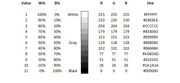
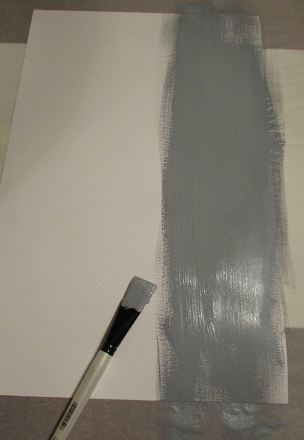
Knowing that I needed to create gray paper by painting white Bristol board, I started this process first. I cut approximately half of a large sheet of Bristol board for gray paper and left the remainder for my white shapes I would cut out later. Next, I took a large sample of white acrylic paint and a much smaller amount to black – approximately a 90/10 split – and started mixing the colors a little at a time with an old brush until I was happy with the shade of gray produced.

White & Black AcrylicMixing PaintGray Acrylic

Cross-painting
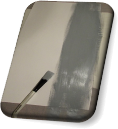
By utilizing a technique introduced by Dr. Giampa of painting vertically and then horizontally and cross-painting several layers in this manner a fairly solid gray was created. By brushing water into the mix and alternating the directional strokes, layer by layer, the actual brush marks were eliminated, little by little. I actually repeated this process a dozen times to smooth the surface of my gray paper as much as possible.

Halfway through my process, I noticed some inconsistencies in the paint. I wanted to eradicate these imperfections and rough areas before using the paper in my project so I smoothed the flaws with fine sandpaper before continuing with my layers of gray. One last attempt at removing brush lines was attempted by completing my last few repetitions with a sponge brush.


 Layers 1 - 3Layers 4 - 6Sanding Imperfections

Layers 7 - 9Wet-washingLayers 10 - 12

Case In Point

Chapter Four of Art Fundamentals: Theory and Practice by Ocvirk, Stinson, Wigg, Bone and Cayton was assigned to set the groundwork for this project as a study in shape. This chapter covered types, dimensions and expressive content of shapes as well as several compositional principles that apply to shape, such as harmony and variety, dominance, movement, balance, proportion and economy. Three-dimensional applications of shape were also mentioned.

Case

Depending on placement, shapes can create illusions of depth and dimensionality. Shapes are very expressive.

During the creative process, certain shapes can be planned and expected or develop themselves as the design evolves. Abstract shapes may morph into defined and recognizable shapes. Even negative space may become obvious shapes. All shapes have an outer edge – either implied or explicit.

Objective shapes are representational and more concrete than subjective shapes which appear much more abstract. Geometric shapes are very structured and defined – mainly consisting of a curvilinear and rectilinear contour. Biomorphic shapes, in contrast, are living, breathing forms; often they are thought of as natural and organic. The idea of implied, or amorphous, shapes is strongly connected to the principle of closure and indicates a shape that is not yet a shape – although, the human mind would argue otherwise.

Two dimensional shapes exist in any pictorial composition, although, through the use of the principles of organization, the illusion of three-dimensional mass may be created. Volume is the measurable space, or void, that will offset this mass and can also be implied in two-dimensional art. Planar shapes, however, are perceived as flat and have height and width but not depth. Equivocal space refers to the optical illusion of a shape seeming to change as the viewer’s perspective changes.

Shapes within a form will either work with the compositional layout or stand out from the design. Harmony may be achieved by producing shapes with similar characteristics while variety can be created with accents and changes to elements within a shape. Contrasting qualities of shapes suggest dominance and determine a viewer’s duration of attention. Subconscious association can also influence dominance. The angle or positioning of shapes (and other elements) can suggest movement. This movement can be toward the viewer, away from the viewer or simply within the image, from one area to another. The rhythm of movement can be smooth or jarring, quick or slow. Balance of one sort or another is almost always desired and may be achieved by the inclusion or absence of any elements and the development of many of the principles. By breaking down a subject of art into simple planer shapes, proportion and economy can become more manageable during the developmental stages of a composition. Objects in relationship to each other and their surroundings are more easily managed when containing less detail.

Artists may intentionally use certain shapes to invoke inevitable emotions from viewers. A spectator’s perception, imagination and sensitivity to form will all influence their appreciation of a piece of art.

Within three-dimensional artwork, mass is physical and measurable, as is volume, or areas within the piece that recede and hold space. Contours describe the shapes edges and the silhouette is a major example of a shapes boundaries. Secondary contours move the viewer’s eye around the work and join major contours together. The negative space of a three-dimensional sculpture is sometimes as important, if not more important, than the positive space as it moves the eye to opposite sides of an object and implores the viewer to experience the entire work.

In Point

By developing the bullets point of view, I’ve found deeper understand of each subject and happen to enjoy the process of personification. To that end, I employed that empathy to shape and three aspects of Chapter Four I found most important.

Type

As a shape, I can be defined or implied, abstract or representational, geometric or biomorphic. The beauty of being me lies in my ability to not only be all these things; I can also be several at one time! I may allow you to see my true nature or I may hide my contours and make you wonder if I am what I say I am. I can be rigid and mathematical or I can move and breathe just like you. I can even be both simultaneously or change right before your eyes!

Composition

However, you may want to be careful how you use me, who you put me next to and how often you duplicate me. My relationships are delicate and I can be quite temperamental. For example, if you want me to get along with all your elemental cliques, I suggest you keep some of us together. We like to mingle with family and friends; but if you start to clone us we can easily become bored and refuse to play nice. Some of us are dominant by being different but there is a balance to be found within this variety. My friends and I all have rhythm but it may not please everyone all the time. Like I said, be careful!

Emotion

If you upset me, I may not be predictable; then again, often times I am and you can use this knowledge to your advantage. Know your enemy! Scratch that. Know your observer (if you think you can). Their imagination, perception and emotions are influenceable, but only to a certain extent. To thine own self, be true!

Development

After reviewing the requirements, limitations and examples of this assignment, I had a vague idea of some personal elements I wanted to include and thought they would be instrumental in making my final design unique while staying within the guidelines. I was certain I would include circles of various sizes in each study, squares in alternating positions and sizes and straight lines, both horizontal and vertical, all the same width but of varying lengths.

I decided I would include exactly six shapes in each study but I used a random method of assigning how many repetitions of each would occur in which study by laying out a grid with the shapes on the left and the study number on top.

Random Assignment Method

By assigning one circle, two lines and three squares to Study One, I started a pattern that indicated Study Two would include four circles; however, since no study could have more than four shapes while still including a minimum of one of the two remaining shapes, Study Two could only include one line and one square.

Beginning Grid

This began a simple game of Sudoku, because Study Three and Study Four could only have two circles each. With three being the next logical number, Study Two was assigned three lines and left with one square. To round out the study varieties, Study Four was allocated two lines and two squares.

Final Grid

The resulting grid contained a happy coincidence of seven squares, eight lines and nine circles; thus satisfying an obsessive compulsive need for numeric order.

Thumbnail Sketch

One of my initial desires for this project was to complete the four studies in such a manner that I could create one complete composition out of the four individual designs. To this end, I started reverse engineering by sketching the completed, combined image and breaking the design into four separate panels during the process. However, I didn’t simply sketch a composition and divide it into four pieces.

First I reduced the entire sketch to exactly half of the required project size. By designing in this manner, I made my sketch a manageable unit that fit within one piece of notebook paper and could be edited and experimented with to scale.

I started with a square that would share space with all four studies and, just to add a unique twist (literally), I rotated this square 45 degrees. Continuing with shared shapes in mind, I added lines that would cross panels. This allowed me to connect Study One with Study Two and Study Three with one horizontal line and one vertical line; likewise, Study Three connected with Study Four with two horizontal lines. This finalized the self-imposed line requirements. The last shared element needed to be a circle, thus ensuring at least one example of each shape would cross panels within the final design. This was accomplished between Study Three and Study Four.

Design SketchTo balance the lack of lines on the left side of my overall image, I added a square to Study Four precisely where the vertical line existed in Study Three. The last shape needed in Study Four was a circle and an empty area in the lower right-hand corner lent itself perfectly for a medium-sized shape to extend outside the bounds of the panel. Similarly, I added a smaller circle to Study Three in a position that not only balanced the individual panel but offset the small square in Study Four, thus completing a second study.

Next, I added an extremely large circle to Study One in the upper left-hand corner, which was intended to contrast with the many smaller shapes already included within the composition, harmonize with the overlapping circle in Study Three and Study Four and balance the opposing circle in Study Four. Two squares were needed to complete Study One and the first was included in the upper left-hand corner to extend off the panel and break up the large, flat area created by the gigantic circle. The remaining square was purposely reduced to arguably the smallest shape of all the studies and ironically shared space with the largest shape of all the studies. Set between the horizontal and vertical lines and diagonally between the conventional and rotated squares, this last element of Study One resided comfortably on top to the large circle and close to the center of the panel.

Study Two was left with a need to elegantly include four circles, the most shapes of one kind in any panel, while simultaneously maintaining a balance within the overall composition and executing an impartial image, strong enough to stand alone. Luckily, I had an idea for these four circles as soon as I noticed the numbers in my planning grid. While almost every shape in the other three studies were intertwined by means of overlapping shapes – the offsetting square and circle in Study Three and Study Four, respectively – Study Two would allow it’s four circles to float off the top of the panel from a free-standing position near the center of the design. The circles themselves overlap but are not connected to the other shapes nor are they allied with any other elements in the combined image. However, by wrapping around the line on the left side of the study and seeming to originate from the implied square in the lower left-hand corner, an economy and domination are produced concurrently.

Normally, I would never begin finalizing a project without attempting several variations, sketches and ideas. However, I was so inspired by the effortlessness with which this design presented itself and the simple complexity of which it was comprised, that I had no choice but to proceed.

Prototype

Sample ShapesOnce all the shapes were included in each study and arranged in their appropriate locations, it was time to visualize the values and their contrasting and harmonizing properties. To determine which shapes should be black, white or gray I needed a sample of each shape in each color. I basically measured my sketch, cut out one black shape from construction paper and two white shapes from scrap paper. To simulate gray, I colored in one of the duplicate shapes for each individual component. Then it was a simple matter of moving the samples around over simulated backgrounds. It’s important at this point to mention that I planned on utilizing two black, one white and one gray background. This decision was based on a practical need to economize my limited gray Bristol board.

If the shape arrangements within each panel while simultaneously appeasing a combined composition was a balancing act, then the value distribution of each study was the tight-rope in the center ring! To begin, I placed my gray background and one black background in the lower corners of my overall design because together they would weigh more than the black and white backgrounds in the upper corners.

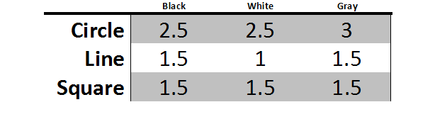
Starting with Study One which was assigned a black background, the large circle was decidedly white for contrast. The line from Study One to Study two would become black to connect the panels and the background in Study One, since it overlapped the large white circle. The rotated square was made white to balance the study and the square in the upper left-hand corner was allocated gray, both to contrast with the white circle while tying the vertical line into the composition, as it was assigned gray as well. The tiny square was made black to stand out from the large white circle and harmonize with the black horizontal line.

Following the gray line into Study Three allowed me to change the value to black since it would overlap the gray background. The horizontal line in the lower portion of the study was white and stayed white as it crossed into Study Four. The white square from Study One was continued into Study Three and remained white while overlapping a black circle. Also overlapping this circle would be a gray line which crossed into Study Four above the white line. Lastly, the circle on the left of the panel was assigned a white value to stand out against the gray background.Prototype

Two things happened when Study Three combined with Study Four: first, the black circle became a white circle to contrast against the suddenly black background; second, the square on top of the white circle become black, for the same reason. The white square on the right-hand side of the study was made white to stand out against the black background and to compliment the other lone shape in Study Three: the white circle. Lastly, the circle in the lower right-hand corner was given a gray value to add variety to this panel while at the same time tying into the adjacent panels and to contrast with the overlapping white line.

In Study Two, the square was continued from Study Four as black that contrasts perfectly with the white background. Alternating gray and black circles gradually grow and float off the study starting with gray and ending with black. This allows the largest black circle to offset the black square and be divided by the black horizontal line. The gray circles provide unity and variety at the same time while the white background provides the illusion of space and atmosphere.

Color Grid

Construction

I measured a quarter inch border to cut shapes from the gray painted paper and used the same procedure to extract my gray background panel. For each straight-edged shape, namely the squares and lines, I used an X-acto knife and a ruler. Gray PaperFor each circle I cut the shape out with a pair of scissors, leaving a quarter-inch margin and then carefully cutting closer until an exact circle was removed. A 6”x8” section of Bristol board was cut as the background of each study, even the white panel.

Because I started my sketch and sample to a 1:2 scale, all I had to do to create perfectly sized shapes was multiple my sample shapes by two. For each circle, the diameter of the sample was measured and then divided by two to find the radius. Creating CirclesThe radius was multiplied by two and a compass was used on a scratch piece of paper to test the visual impact of the new shape. After confirming the new size was appropriate, the compass was used on the white, gray or black paper to create the final shape. (It may not seem important to go through the process of finding the radius as the new radius is simply the diameter of the sample shape; however, if I were to need to triple or quadruple the sample size, this procedure would be vital.) All the rectilinear shapes, squares and lines (which are essentially rectangles), were simply doubled in width and length. This method allowed my final composition to be a scale representation of its sketch.

Study 4 LayoutStudy 3 LayoutStudy 2 LayoutStudy 1 Layout

Documented GuidlinesOnce I had all of the appropriate shapes cut out of the black construction paper, white Bristol board and gray painted board, I arranged them together to visualize the final designs. To ensure each component was aligned correctly, I measured and documented guidelines to appropriately place each shape within its study.

Employing the technique of applying rubber cement in a scoring method demonstrated by Dr. Giampa, horizontally on one element and vertical on the component to which it would adhere, each background, circle, square and line was affixed to each study until all four panels were complete. Smoothing the shapes to each other by covering the area with tracing paper and utilizing a drafting triangle to press from the center to the edges allowed each shape to be perfectly flat. Cropping shapes that extended beyond the limits of its panel occurred as necessary.


Applying Rubber CementScoring Rubber CementSmoothing Adhesive

Completed Project

Puzzle Pieces

The final individual studies are each compositionally stable, interesting and independently successful.

Study 4 Study 3

Study 2 Study 1

Single Study

Additionally, the four studies can be combined to indicate a new, single design.

Single Study

Complete Separation

My personal preference is to view the combined panels with some white space between each study.

Complete Separation

View/Download PDF

Case In Point Mapping based on research by
Dr. Joan Giampa http://www.joanmariegiampa.com/teaching/my_research.html

200 Lines

Assignment

200 Lines is an exercise in utilizing straight lines, and straight lines only, to create an abstract design that shows space. Materials needed to complete the project included pencils, erasers, a ruler, permanent markers and an 18”x24” Bristol board. The composition could be horizontal or vertical but no border would be employed. The end result was expected to show a development of each student’s line variety.

Development

Series of LinesI started this project by creating a series of lines based on the physical characteristics of line: measure, type, direction, location and character. Where measure refers to the length and width of a line, it implies much, much more. For instance, thick lines can communicate a sense of stability and thin lines may suggest movement.

Some examples of different types include straight lines, curved lines and angular lines – each having distinct characteristics. Straight lines may seem rigid or stiff while curved lines are often stimulating and exciting. Angular lines might be confusing or interesting, depending on their implementation.

The direction and location of a line can change its emotion and psychological response from the viewer. Slanting a line upward may inspire a sense of strength while slanting it down could diminish its vitality. Lines high in a design could appear to soar while those same lines lower within an image may seem to plunge. Horizontal lines may indicate serenity while vertical lines can be interpreted as ambitious.

The character of a line can be implied by both the medium and surface utilized during the creation of a design. In this project both were chosen beforehand but care was taken to understand the difference between the sketches and preliminary designs on notebook and sketch paper verses the final composition on Bristol board.

Sketchbook Sketchbook inked

After my initial sketches on notebook paper, I transferred some of my line experimentation’s to a sketchbook in pencil and then tested the change in look and feel when outlined in permanent marker. I took the same approach in sketching preliminary design ideas, starting on notebook paper, transferring to my sketchbook and finally adding marker to emulate the final project materials.

Notebook DesignSketchbook Design Design Inked

Straight-line SketchTo ensure the final design was in compliance with the basic instruction regarding using only straight lines, a few revisions of the composition were created and a completely straight-lined version was sketched. Ultimately, this sketch would be the basis of the final project.

Sneak Preview
Sneak Preview

Case In Point

Chapter Three of Art Fundamentals: Theory and Practice by Ocvirk, Stinson, Wigg, Bone and Cayton was assigned in preparation of this assignment as a study in line. In addition to the physical characteristics of line previously mentioned, the relationship between line and shape, value, texture and color were discussed as well as the spatial characteristics of line, line as representation and expression and three-dimensional applications of line.

Case

Line is the most basic, yet arguably the most utilized, element of design. Whether physical or implied, two-dimensional or three, the line provides movement, structure, description and definition to an image or sculpture. The measure of a line refers to the physical dimensions of a line – the width and length: measurable proportions. When describing types of line, one can be referring to the direction, or multiple directions, of a line. A line can be straight, curved, graceful or abrupt. Each of these directions, combined with differing measures, has the potential to produce many different emotions and feelings within a viewer. To expand upon direction, there are different implications regarding the course of a line: horizontal lines may indicate stability while vertical lines might suggest poise. Diagonal lines are more likely to imply movement or anxiety and a line may contradict its basic nature by the overall direction of its course. Another element of line is its location within a composition. While heavy lines high in an image may suggest to the viewer a sense of imbalance and a contradictory representation may cause the viewer to reject the objects location within the design, serene lines in appropriate and expected locations within a work of art may exude a peacefulness and calmness in the viewer. There are also many illusions that may be created by an artist depending on the location of specific lines. A line, every line, has character. Many times this character is defined by the medium used regarding the artist’s instruments and surface as well as the method by which the artist utilizes their implementation. Shapes are created by their outer edges and defined by the lines which produce those edges, or contours; in addition, cross-contours indicate the rise and fall of a shapes surface. The value of a line refers to the lightness and darkness of a line in contrast to its background. Close, thin lines may represent a darker area even better than thick lines or completely darkened ranges of a surface. Hatching and cross-hatching are popular methods of indicating shading by varying the quantity, direction and intimacy of lines. Texture may also be inferred via line by producing a rough or smooth look by the artist’s use of surface and instrument regarding medium choice. The color of lines within a composition can create the illusion of receding or advancing images based on the choice of warm or cool colors just as thick and thin lines may indicate advancing or retreating shapes. Calligraphic lines may be considered specific to fancy writing techniques; however, more often than not, these lines are fluid, implied – even abstract – lines that visually represent the artist’s intent and produce the desired effect within a design. Gestural drawing, on the other hand, is very free and quick sketch-like lines which can characterize movement and flexibility within an arrangement.

In Point

I chose to further develop my Case In Point map on Line by utilizing the empathy strategy pointed out by Dr. Giampa in which I discussed three bullets from the Case above by exploiting the line’s point of view.

Direction

As a line, my direction decides the feeling a viewer senses by looking at the shapes I produce. If I stand tall and straight, I imply a sense of composure, ambition or hope while when I move level and horizontally I exude tranquility and constancy. By changing my mind and moving diagonally, the viewer may feel nervous, a sense of motion or impulsive tendencies. If I slant upward, I radiate strength, suspense and positivity; in contrast, if I slant downward, I issue a sense of decreasing energy.

Location

My location is important to a viewer because my visual weight changes in the eye of the beholder. Expectation makes up a large part of this visual suspense and I can generate serenity out of commotion just by altering my location within a composition. High in a design, my diagonal lines can appear to climb while lower in the design they may appear to dive.

Value

By changing my value, I transform from dark to light and based on my background I can increase and decrease the contrast of the shapes and lines I define. Utilizing wide lines, I appear to have a dark value while thin lines make my value lighter; similarly, many lines close together make my value darker and generously spaced lines will appear light.

Design

Once I decided on a starting point, it was time to draw my initial design on Bristol board with a ruler and an 8H pencil (the softer, the better). I painstakingly spaced certain lines at specific intervals to ensure proper repetition, thus allowing certain patterns to develop. Adding permanent marker to the image permitted me to see where my value choices needed development and how my use of straight lines could produce an illusion of curved images. Some connected lines indicated shapes that other individual lines reproduced, thus proving similar effects could be made with diverse techniques. Implied lines were used to indicate the interpenetration of inferred shapes.

Pencil LayoutMarker Layout

By varying the thickness of the lines in my design, I balanced the overall composition and created harmony within distinct areas as well as contrast with surrounding elements. While some thin lines were meant to seem farther away from the viewer, others were intended to create a sense of weight and value. Specific lines and their implied counterparts were added to disrupt the assumed location of imaginary shapes depending on the focus of the viewer. Instead of threading adjacent elements, these lines purposely throw the same area of the composition forward in one perspective and backwards in another. Movement is created, not only by the direction of these lines but by the demand upon the viewer’s eye to constantly move in an attempt to disentangle the illusion. Continuous, angular lines were utilized to subtly draw the more curious and scrutinizing viewer into neighboring regions of the image. In one case, a single uninterrupted line angles 45 times (technically becoming 45 separate lines) to cross three distinct parts of the design. Other lines are a meager centimeter long but are vital to the overall impression of a distinct shape.

Variety and DepthEnhanced Movement

Overlapping lines were incorporated into the design to provide variety and depth while also adding scale and proportion and interest levels to the interpenetrated shapes. By balancing the contrast between light and dark, several lines were deepened and thickened and additional components were included to enhance movement.

Within this project, all of the basic elements have been utilized, specifically shape – mostly implied – contrast – dark versus light, curved verse angular lines, connected verses suspended shapes – and, of course, line in all its glory. Color is used in its purest sense of black and white and texture, although subtle, is included in several areas. By combining all of the Elements of Art and using the Principles of Organization, an innovative, cohesive piece of artwork has been fashioned out of one plain sheet of Bristol board and various permanent markers.

Bigger On The Inside

View/Download PDF

Case In Point Mapping based on research by
Dr. Joan Giampa http://www.joanmariegiampa.com/teaching/my_research.html