

Value Scale
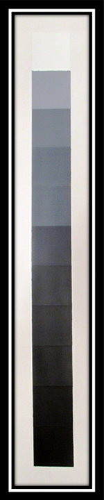
The first step to the Value and Intensity project was to create an 11 step value scale, from pure white to pure black, with even incremental shades of gray in-between. Each value would occupy a 2”x2” square with a 1” border around the entire scale resulting in a 24”x4” composition on Bristol board. Acrylic paint, brushes, painters tape and an X-acto knife would be needed to complete the assignment.
Preparation
To visualize my process, I charted the percentages of black and white paint I would need to produce each value square. Obviously, Value 1 would be 100% white and Value 11 would be 100% black, so no mixing would be required for these two squares. Value 6 would be exactly 50% black and 50% white, resulting in a perfect mid-tone gray (in relation to the acrylic paint utilized).
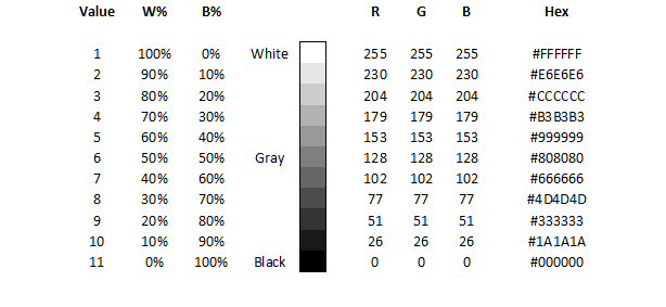
Just for trivia’s sake, I included the RGB and hexadecimal color values. CMYK would only vary in its K, or black key plate. For example: White = 0, Gray = 50 and Black = 100. They are also referenced by percentage.
I started my surface preparation by cutting my Bristol board to size. I taped off the vertical sides first, to ensure the sides of each value square would line up evenly when all the squares were completed. Next, I taped off the top square for Value 1, the bottom square for Value 11 and the middle square for Value 6.


I wanted to come up with a reproducible method of mixing my paint that could be easily recreated, quickly and efficiently. To this end, I experimented with a couple different approaches: first, I tried adding drops of paint based on the percentage of gray I wanted to create. Unsure if this would generate a consistent value each time, I tried a second technique by measuring an exact amount of paint using measuring utensils. This attempt took much longer, was unreliable to be precise and resulted in an almost identical shade that my first method produced. After trying different attempts of more accurate measuring, I returned to my original approach. I knew that a common method was to mix black into white until a visually acceptable shade could be reached but I was unhappy with the inconsistency such a system would form.
Painting Value Squares
To mix my first shade of grey, Value 6 – 50% white, 50% black – I added 5 similar drops of white paint and 5 drops of black paint to my palette. I continued this pattern for Values 4 and 8 and Values 2 and 10.


By allowing these squares to dry, I could move the tape and continue my process with Value 3 and 9, leaving only Values 5 and 7 to complete the value scale.
I had to use a hairdryer to speed up the drying process to allow me to tape off the last two squares. After finishing Value 4 and 8, I double checked each square by removing the horizontal tape one strip at a time, ensuring each square was touching and even. Any discrepancies required remixing the value needed – which was easy due to my drop-method – and fixing the errors found. A kneaded eraser and gum eraser were both used to remove guide lines and measurement marks. An X-acto knife was also utilized to scratch off a few random paint spots that mistakenly crossed their taped-off areas.
Case In Point
Chapter Five of Art Fundamentals: Theory and Practice by Ocvirk, Stinson, Wigg, Bone and Cayton was dedicated to Value. Some relationships of value were covered in this chapter along with art media, techniques of plastic value, decorative value and patterns within compositions. Three-dimensional applications of value were also addressed.
Case: Value – dark to light (and back again)
An area’s relative lightness and darkness is referred to as its value and achromatic values consist of black, white and the limitless degrees of gray between. Alternatively, the same scale applied to color is known as chromatic values. The darker end of these scales is referred to as low-key values and the lighter end contains high-key values.
Highlights include the portion of an object that, from the viewer’s point of view, receives the greatest amount of light while shadows are the darker values on the surface of an object that suggest that a portion of it is turned away from or obscured by the source of light. Without additional lighting, an object’s surface has a natural local value. Plastic values create the appearance of depth and Cast Shadows are dark areas that occur when another shape is placed between a light source and an object or surface.
Chiaroscuro is the technique of gradually blending contrasting lights and darks to develop an illusion of mass. By extremely exaggerating this technique, tenebrism is created. This great contrast is utilized for emphasis and indicating importance.
The illusion of limited depth known as Shallow Space and decorative values, which stress the essential flatness of a surface, both ignore conventional light. Conversely, organized areas of light and dark create value patterns which can be readily recognized in closed-value compositions where values are contained within the contours of defined shapes. On the other hand, open-value compositions allow values to cross over shape boundaries. The area between the contours of an object as defined by a contrast of value is a shape’s silhouette.
In Point
Becoming value to cover three bullets of interest provided insight into the effect that value has upon shapes, elements and the patterns created within compositions.
Relationships
I have many moods, and at my most placid I might even be considered boring; but fret not, I wear many accessories that will keep your attention. My highlights can draw your eye toward important elements by illumination, both direct and indirect, while my shadows beckon you to explore unknown depths within my darkest corners. While my local value is often accented, if I lighten my humor, I’m considered “high-key”. This could suggest that I’m excited but normally it merely means I’m a bit happier: bright and optimistic; however, if you see me in my “low-key” state, you might want to look more closely. I might be hard to see but it’s easy to tell my temperament may have turned dark and mysterious and even depressed. Don’t get comfortable! I can shift these relationships quickly with alterations to my composition.
Composition
If I feel structured and defined, I’m known as a closed-value, which basically means my values are contained within the contours of my shapes, each distinct and separate; conversely, when I’m labeled as an open-value, my values (and often colors) cross shapes and areas to abstractly combine normally isolated elements. Additional means of elemental distinction is needed in these situations. In either case, I produce patterns by organizing my areas of light and dark and many times my silhouette is easily recognizable.
Techniques
Some techniques worth mentioning have been developed to deal with my boundless degrees of subtlety – some less subtle than others. Chiaroscuro makes use of the ability to gradually blend my contrasting darks and lights to develop an illusion of solidity. This is very helpful when I occupy the two-dimensional world. Before this technique was common, most of my values would have been considered decorative, stressing the essential flatness of my surfaces, or merely utilizing shallow space, which only took advantage of producing an illusion of limited depth – moving only slightly away from the picture plane. Tenebrism, in extreme contrast, exaggerates my contrasting highlights and shadows to emphasis elements within a composition. Of course, there are many, many more techniques to consider if you want to tame my unlimited values!
Value Painting
The second step to the Value and Intensity project was to transfer this newly discovered knowledge of values to a design and represent highlights and shadows within a chosen range, or key. The composition would be produced on a 14”x16” Bristol board with a 3” undefined border. Acrylic paint, brushes, tracing paper, a soft pencil and an X-acto knife would be needed to complete the assignment.
Preparation
For this painting a still life was selected by Dr. Giampa, so the first task was to transfer the image to the final medium. By utilizing tracing paper, I traced the positive image with a number 8B pencil.


I started my surface preparation by cutting my Bristol board to size. I also measured the border and marked it, lightly, with a soft pencil to ensure my design would ultimately be centered within the composition.


Next, I needed to trace the negative image so that it would be transferable as a positive design. By flipping the tracing paper over and tracing the negative lines, the image was ready to be transferred to the prepared Bristol board.


 To visualize my value patterns and determine how many values I would need to represent the image appropriately while still economizing my palette, I decided to color code the design with pastel pencils. I started by identifying highlights with yellow and cast shadows as purple. This method isolated my lightest and darkest areas within the composition. By utilizing the same technique, I was able to ascertain my reflective light (orange) and crest shadows (blue). This left me with a dilemma, because I originally wanted to keep my natural value at one additional shade; however, there were too many adjacent shapes needing a natural value, so I chose a light (green) and dark (red) base value.
Painting Value Still-life
An important aspect of the value painting, regardless of the number of values involved, is the decision to create a low-key or a high-key composition. I chose a low-key value scale for several reasons: I wanted my design to stand out from its naturally occurring border of white; I thought a darker image would contrast with the subject matter, which reminded me of a cheerful, bright kitchen scene; and I wanted to experiment with creating highlights and reflective light within a darker value range.
To complete the preparation phase of my value painting, I assigned percentages to my low-key gray-scale categories. By primarily utilizing the lower end of the value spectrum, I began by allocating my two natural values 50 to 60 percent black. I wanted my shadows to hover near the very end of the scale at 80 and 90 percent black. At the opposite end of my range, I gave the highlights a mere 30 percent black while the reflective light received a 40 percent black value.
One last decision was made, good or bad, to freehand the painting portion of the project instead of blocking off each area or creating stencils. The reason behind this choice was to hopefully produce a more fluid and natural movement within the design.
Natural Values
The first value mixed and applied was the lighter main value meant for areas without significant light or shadow: namely, the 50 percent areas (green). Second, the darker main value was mixed at 60 percent black and applied to the remaining natural areas (red).


Shadows
The next value added to the composition was primarily mixed as a crest shadow value at 80 percent black and added to the appropriate shapes (blue). Some areas assigned to this shade resided within areas already painted, so I took advantage of the opaque qualities of acrylic paint and painted directly over the spaces necessary. First, the correct shapes needed to be transferred on top to the design in progress. A 90 percent cast shadow value was mixed to be included in the darkest areas (purple) as my last shade to complete the composition.


Highlights
By utilizing the same method, I transferred reflective light outlines to the design and mixed a 40 percent black value for the appropriate areas (orange). The highlights were mixed next at a 30 percent black value and augmented as accents to the lightest areas (yellow) of the design.


Finalization
The finishing touch was to add the lettering to the butter and sugar packages. I choose to use pure white to compliment the background while simultaneously adding contrast against the global darkness of the composition.

DARK KITCHEN

Case In Point Mapping based on research by
Dr. Joan Giampa http://www.joanmariegiampa.com/teaching/my_research.html