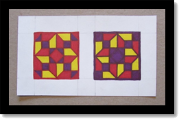
Monthly Archives: March 2014

Salvador Dalí

Salvador Dalí

Introduction to Dalí

Salvador Dalí was a Spanish surrealist known for his imaginative and eccentric views and lifestyle. He was born on May 11th, 1904 and died at the age of eighty-four on January 23rd, 1989. Dalí was best known for his painting but was also involved in film and theater, photography and writing, fashion and architecture. He was also a great sculptor and worked extensively in the graphic arts.

Diminutive Biography

When he was five, Dalí was taken to his brother’s grave and was told by his parents that he was his brother’s reincarnation, a concept which he came to believe. Of his brother, whom shared his first name, Dalí said, we “resembled each other like two drops of water, but we had different reflections.” He “was probably a first version of myself but conceived too much in the absolute.”

His mother died of breast cancer when Dalí was 16 years old; he later said his mother’s death “was the greatest blow I had experienced in my life. I worshiped her… I could not resign myself to the loss of a being on whom I counted to make invisible the unavoidable blemishes of my soul.”
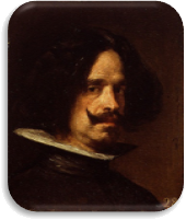
Diego VelázquezIn 1926 he made his first visit to Paris, where he met Pablo Picasso, who the young Dalí revered. Picasso had already heard favorable reports about Dalí from Joan Miró. As he developed his own style over the next few years, Dalí made a number of works heavily influenced by Picasso and Miró.
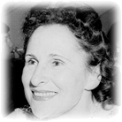
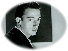
Gala DalíDalí grew a flamboyant mustache, influenced by 17th-century Spanish master painter Diego Velázquez. The mustache became an iconic trademark of his appearance for the rest of his life.

In August 1929, Dalí met his lifelong and primary muse, inspiration, and future wife Gala. In the early 1930s, Dalí started to sign his paintings with his and her name and stated, it “is mostly with your blood, Gala, that I paint my pictures”.

Chronology of Select Works & Contributions

Dalí’s painting was greatly inspired by Renaissance masters such as Leonardo da Vinci, Giulio Clovio and Giovanni Bellini but he was involved in many of the fine arts in addition to graphic art including etchings and lithographs.

Theatre

In 1927, Dalí designed scenery for Federico García Lorca’s romantic play Mariana Pineda; thus contributing to the theatrical arts. Later he would create set designs for Labyrinth in 1941 and The Three-Cornered Hat in 1949.
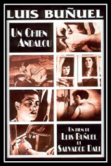
Un Chien Andalou (1929)Film

Dalí and Luis Buñuel produced a short film called Un Chien Andalou in 1929 that consisted of seventeen minutes of bizarre and surreal images that were designed to not mean anything at all. A straight razor is placed by a woman’s eye which is then slit open, a small cloud formation obscures the moon, a woman pokes at a severed hand in the street with a cane, a man drags two grand pianos containing dead and rotting donkeys and live priests and a man’s hand has a hole in the palm from which ants emerge. A shot of differently striped objects is repeatedly used to connect scenes.

Painting

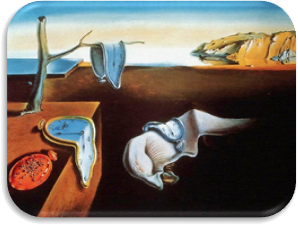
The Persistence of Memory was completed in August of 1931. Dalí indicated that the soft watches were not inspired by the theory of relativity, as many believed, but by the surrealist perception of a Camembert cheese melting in the sun.

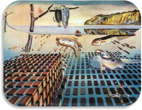
 The Persistence of Memory (1931) The Disintegration of the Persistence of Memory (1954)

He returned to the theme of this painting with the variation The Disintegration of the Persistence of Memory in 1954. Dalí had been greatly interested in nuclear physics since the first atomic bomb explosions of August 1945, and described the atom as his “favorite food for thought”. Recognizing that matter was made up of atoms which did not touch each other, he sought to replicate this in his art at the time, with items suspended and not interacting with each other.
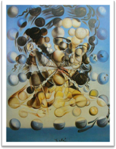
Galatea of the Spheres (1952)A great example of this style was his earlier work in 1952, Galatea of the Spheres. This painting depicts Gala Dalí, Salvador Dalí’s wife and muse, as pieced together through a series of spheres. The name Galatea refers to a sea-nymph of classical mythology renowned for her virtue, and may also refer to the statue beloved by its creator, Pygmalion.

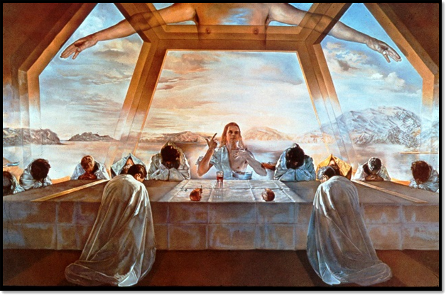
The Sacrament of the Last Supper is another well-known painting by Salvador Dalí. Completed in 1955, this work of art took nine months to finish.

“The first Holy Communion on Earth is conceived as a sacred rite of the greatest happiness for humanity. This rite is expressed with plastic means and not with literary ones. My ambition was to incorporate to Zurbarán’s mystical realism the experimental creativeness of modern painting in my desire to make it classic.”

~Salvador Dalí
 The Sacrament of the Last Supper (1955)

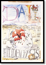
Hidden Faces (1944)Writing

In Hidden Faces (1944), Dalí describes the lives and loves of a group of aristocratic characters who, in their beauty, luxury, and extravagance, symbolize the decadent Europe of the 1930s. The story of the tangled lives of the protagonists, from the February riots of 1934 in Paris to the closing days of the war is Dalí’s only attempt at an approach to a literary career.

Photography

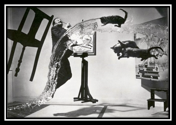
Dalí collaborated with many talented artists such as Man Ray, Brassaï, Cecil Beaton, and Philippe Halsman. While working with the later, the famous Dali Atomicus was taken in 1948. It took 28 takes to get the desired effect and the steps taken have been described as follows:

  • The photographer counts:
    • 1: His wife, Yvonne, holds the chair up
    • 2: The assistants get ready with the water and the cats
    • 3: The assistants throw the cats from the right and the bucket of water from the left
    • 4: Salvador Dalí jumps
  • …and milliseconds later, Philippe Halsman takes the photo. Click!
Dali Atomicus (1948)

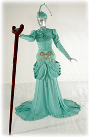
Costume for the Year 2045 (1950)Fashion

Elsa Schiaparelli commissioned Dalí for various designs including a white dress with a lobster print, a shoe-shaped hat and a pink belt with lips for a buckle; additionally, Christian Dior asked him to create the “costume for the year 2045”, in 1950.
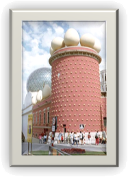
Teatro MuseoArchitecture

In 1960, Dalí and the mayor of Figueres decided to rebuild the town’s old theater which had been bombed during the Spanish Civil War. Teatro Museo is now a museum which opened on September 28th, 1974 and houses the single largest and most diverse collection of works by Salvador Dalí.

Sculpture

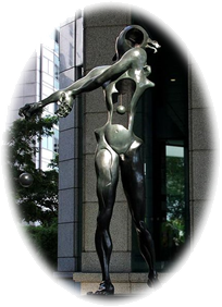
Homage to Newton (1985)

Homage to Newton (1985) is Dalí’s tribute to Isaac Newton. With an open torso and suspended heart, this sculpture indicates “open-heartedness” and its open head designates “open-mindedness”—the two qualities important for scientific discovery and successful human endeavors.

Symbolism

“I am painting pictures which make me die for joy, I am creating with an absolute naturalness, without the slightest aesthetic concern, I am making things that inspire me with a profound emotion and I am trying to paint them honestly.” ~ Salvador Dalí

Dalí employed extensive symbolism in his work. For instance, the hallmark “melting watches” that first appear in The Persistence of Memory suggest Einstein’s theory that time is relative and not fixed.

The elephant is also a recurring image in Dalí’s works and is portrayed “with long, multi-jointed, almost invisible legs of desire”.

The egg is another common Dalíesque image and Dalí connects it to the prenatal and intrauterine, thus using it to symbolize hope and love.

Use of Color

It could be considered obvious even after a cursory review of Dalí’s works, but gold and blue were prevalent in his palette and utilized frequently. He used the cool blues in many paintings to dominate the background and yellows, oranges and gold’s were often used for figures and foreground items. The colors he chose to use most reflected the distinct gold light and vivid blue skies of the Mediterranean which Dali insisted was “the most beautiful place on earth”.

Dali often produced a dark foreground to contrast with lighter objects he’d place in these areas and, conversely, he would utilize a light background to display a darker figure. While this practice is slightly unorthodox, he followed normal protocol most of the time regarding warm colors in the foreground and cool colors in the background.

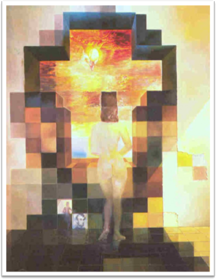
 Gala Contemplating the Mediterranean Sea Which at Twenty Meters Becomes the Portrait of Abraham Licoln (1974-76)

View/Download PDF

Contrast

Introduction

The seven color contrasts described by Johannes Itten are:

7 Contrasts of Johannes Itten

Contrast of HueContrast of Hue

Contrast of hue is illustrated by undiluted colors in their most intense luminosity and is formed by the juxtaposition of these hues. The greater the distance between hues on a color wheel, the greater the contrast. Orange, green and violet are weaker in character than yellow, red and blue, and the effect of tertiary colors is even less distinct.

Light and Dark ContrastLight and Dark Contrast

The contrast of light and dark is formed by the association of light and dark values. Darkened colors are considered shades and shadows while lightened colors are described as tints and highlights.

Cool and Warm ContrastCool and Warm Contrast

The contrast of cool and warm is formed by the apposition of warm and cool hues. Warm colors are often said to be hues from red through yellow, browns and tans included. Cool colors are often said to be the hues from blue-green through blue-violet, most grays included.

Complementary ContrastComplementary Contrast

When placed next to each other, complementary colors create the strongest contrast and reinforce each other. The contrast of complements is formed by the juxtaposition of opposites on the color wheel.

Simultaneous ContrastSimultaneous Contrast

Simultaneous contrast is the predisposition of a color to induce its opposite in hue, value and intensity upon an adjacent color and be mutually affected in return.

Contrast of SaturationContrast of Saturation

Contrast of saturation is formed by the collocation of light and dark values and their relative saturation. Saturation is controlled by adjusting tints, shades and tones or by mixing a color with its direct compliment.

Contrast of ExtensionContrast of Extension

The contrast of extension, or proportion, is created by controlling the percentage of one color relative to another. It is used to balance, or counter the balance, of an image that is heavily weighted with a single hue.

Explanations of Photographic Examples

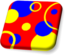
  1. My Contrast of Hue example displays reds, yellows and blues because, by definition, primary colors exhibit stronger contrast then secondary or tertiary hues. The result is an intriguing image of constant movement and perpetual divergence.
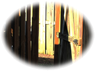
  2. Light and Dark Contrast balances shades and tints, shadows and highlights, to produce variety, movement and harmony. In my example, the eye flows naturally from left to right while it follows the fence line; however, with the bright background and the dual-tone gate, the eye is drawn into the image and back to the left.
  3. By emphasizing the warm reds, yellows and oranges in the foreground of my next example and allowing the cooler greens and blues to dominate the background, I successfully demonstrated Cool and Warm Contrast in a compelling image rich with interpenetration and repetition. The elaboration of the foreground in contrast with the background creates additional variety.
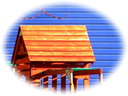
  4. My Complementary Contrast image is dominated by a blue ground with a bright orange figure. As compliments and secondary hues they are strong enough to create an interesting visual impact but not so overwhelming as to generate an objectionable appearance.
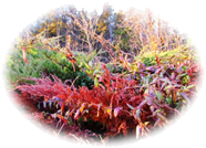
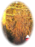
  5. Simultaneous Contrast allows complementary colors to enhance each other based on their positions within an image and their alliance with each other. In my example, the rich greens and reds within my forest scene intensify each other and even combine with the yellows that are naturally present. Many of the primarily green areas of the foliage mix with yellow tints as do the reds and browns of the branches and undergrowth.
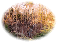
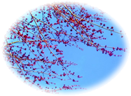
  6. By utilizing an unsaturated, plain blue background and highly saturated flower buds on sharply defined branches, a Contrast of Saturation is achieved. The buds are much more intense on such a flat, plain sky blue then they would appear had they been displayed against a bright yellow, red or orange or even a rich, dark royal blue, purple or green.
  7. Finally, I displayed my example of Contrast of Extension by exhibiting a common fire hydrant figure against a natural ground of browns, yellows and greens. While much of the image is dominated by warm hues, the red in the primary figure stands out, not because it’s a cool color or a larger shape but because it is a bold, concentrated hue surrounded by larger regions of distributed colors.

Simple Contrast Examples

Hue Example
Contrast of Hue


Light Dark Example

Light and Dark Contrast


Cool Warm Example
Cool and Warm Contrast

Complementary Example
Complementary Contrast

Simultaneous Example
Simultaneous Contrast

Saturation Example
Contrast of Saturation

Extension Example
Contrast of Extension

Composition Variations

Contrast of Hue Image
Contrast of Hue

Light and Dark Contrast Image
Light and Dark Contrast

Cool and Warm Contrast Image
Cool and Warm Contrast

Complementary Contrast Image
Complementary Contrast

Simultaneous Contrast Image
Simultaneous Contrast

Contrast of Saturation Image
Contrast of Saturation

Contrast of Extension Image
Contrast of Extension

View/Download PDF

Monochromatic Pattern

Assignment

Create an interesting original design composition using one motif, object or image in a monochromatic color scheme on any medium and of any size.

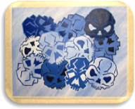
Skull Motif

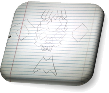
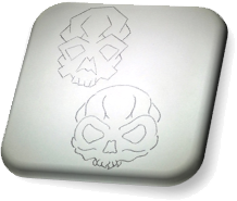
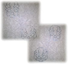
My first design began by sketching some skull concepts on notebook paper. After deciding against my initial notions of having skulls within other skulls, I settled on two abstract models: one angular and the other curvaceous; both of which I drafted on sketch paper.

Notebook SketchSketchbook Skulls

Negative TracesComposition

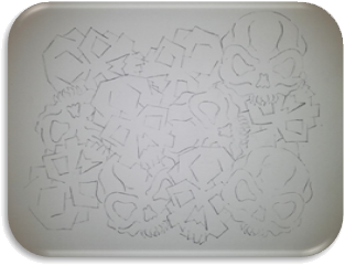
Once I decided on my two versions of skulls I used tracing paper to create a positive image which I transferred to Bristol board. Simultaneously, I utilized the negative image to transfer alternative designs into my pattern; thus, I truly had four different variations of my skulls to incorporate into the overall composition. I also rotated each transfer to add movement and variety into my design.

Skull Patterns

Painting

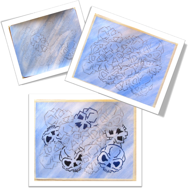
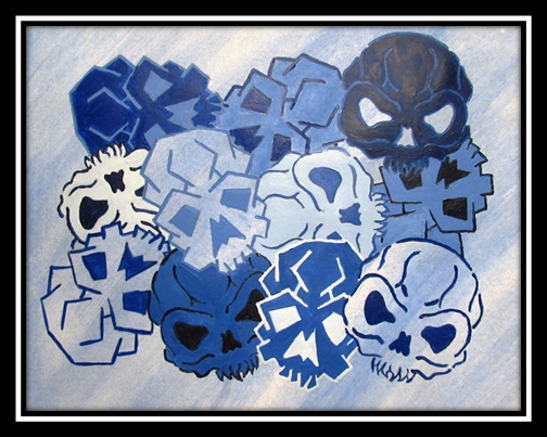
I started the colorization of my skulls by coating the background in a light blue acrylic wash. Of course, by transferring the design before painting the background meant that I needed to transfer my skulls again to ensure I could see where each was placed. I began painting with a pure blue and darkened several shades to vary the initial outlines. For some shades I mixed black into blue and for others I mixed blue and its compliment, orange.

 Skulls, Skulls, Skulls

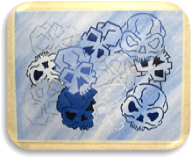
The next step was to outline some alternate skulls with several tints of blue. In addition, I filled a couple of the previously outlined skulls with these newly mixed tints. For each skull I outlined, I filled that skull’s eye sockets and nasal aperture with the same color, except in a couple specific instances: three skulls retained the backgrounds light blue wash – the central, top-most angular skull and the bottom-right and bottom-left skulls. The top-right dark skull was the only skull in the composition with the background wash left in the eye sockets and nasal aperture.

Tints & ShadesEye Sockets & Nasal Apertures

Blue Brain Buckets
Blue Brain Buckets

Book Motif

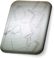
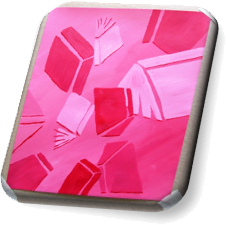
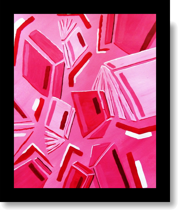
My second design was based on a simple pattern based on books scattered across a page of notebook paper. After adding a light pink background to my Bristol board, I began adding the base shapes that would represent each book.

Notebook Paper Books Flat Shapes

Abstract DetailsDetails

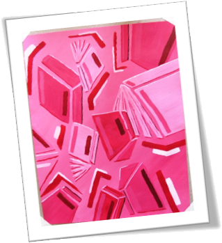
Adding a dark red edge to many of the shapes created definition and contrast to the pattern. Next, I complimented the opposite side of many of the forms with a very light, almost white, pink that simulated an abstract light source. Several additional shades and tints were added in various placements within the composition, mostly within the larger book covers but also on the bindings and spines scattered around the image. To complete the design, horizontal and vertical, seemingly random, shapes were positioned in strategic areas within the composition.

Passion of Literature

View/Download PDF

The Bezold Effect

Introduction

The Bezold effect is an optical illusion, named after a German professor of meteorology, Wilhelm von Bezold (1837–1907), who discovered that a color may appear different depending on its relation to adjacent colors.

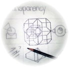
It happens when small areas of color are interspersed. An assimilation effect called the von Bezold spreading effect, similar to spatial color mixing, is achieved.Transparent Cubes

Assignment

Create your own pattern displaying the Bezold effect.

Pattern

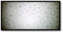
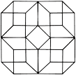
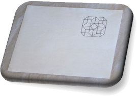
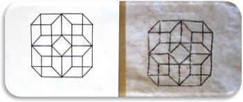
Four Cube PatternI began this project by producing a personal pattern based on my transparent cube design. First, I traced my cube four times, back to back, to connect each cube into a single repeatable form. I then copied the pattern across a piece of Bristol board until the design covered the entire background.
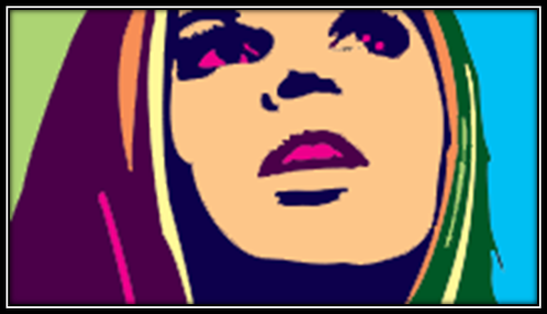
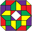
Sample HuesColorization

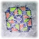
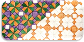
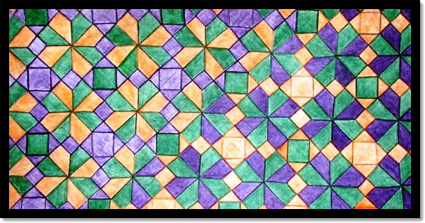
I chose to use a shade of violet and green along with a tint of orange. To visualize these colors as I intended to include them in my pattern, I filled in the template with the sample hues. I planned on utilizing green as my consistent figure, while the purple and orange shapes would exchange placement halfway across the composition.

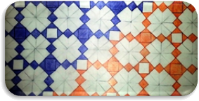
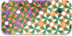
I started coloring the exchanged shapes, first with purple and second with orange. I then filled in the left half of the composition with the alternated orange and the consistent green. Next, I completed the consistent green forms and finished the right side of the composition by coloring the alternated purple shapes.

Exchange of ColorLeft Half
Consistent GreenRight Half

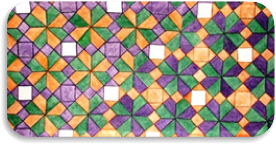
The last modification I made was to fill in the white square negative spaces with the “background green” to ensure the design was composed of only three colors.

4 Cubes
4
Cubes

Critique

I wasn’t entirely happy with the final result of this experiment; so, I wanted to explore some other possibilities for displaying the Bezold Effect.

Alternatives

My first alternative design was based on a bicycle composition I had created in 1989. This time I altered the design by simplifying the multi-toned gray-scale hatching into two new compositions: one dominated by a light yellow tint and the other by a darker violet hue.

Yellow Bike Bicycle Purple Bike

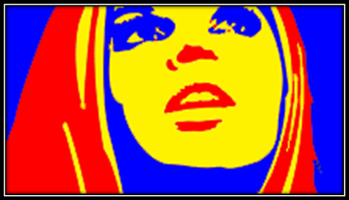
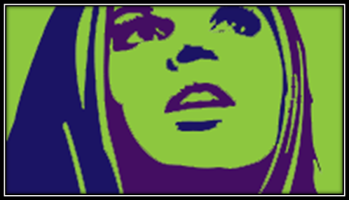
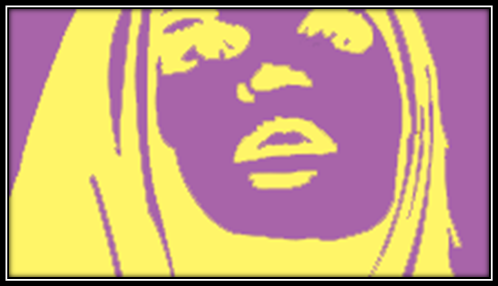
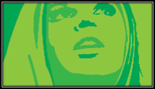
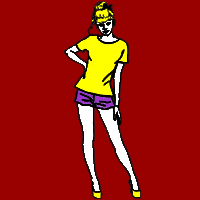
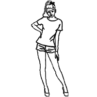
My second experiment started from a graphic sketch I utilized as an icon for tee-shirt designs on a popular website. The sketch was a simple, black and white outline of a woman with her hand on her hip. This time I only changed the background color and left the image hues identical in both graphics.

Red Woman Woman Green Woman

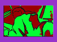
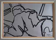
I wanted to experiment with another old design, circa 1989 – 1990, to demonstrate how differing adjacent colors can affect a pattern’s visual impact. Instead of altering the background, I only changed the frame of this image.

Purple FridayFriday  Yellow Friday

Bezold Cubes

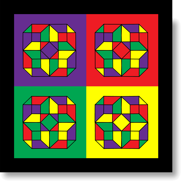
Quad-cubeOne last experiment was needed to complete my vision of the Bezold Effect. Returning to my quad-cube, I digitized my previous sketch of a transparent block, duplicated it and adjusted the pieces into position to complete the four-cube pattern.

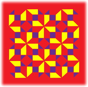
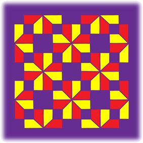
Utilizing this basic design, I carefully chose a tetrad color scheme that would accurately display the visual Colored Patternresults I intended. I began with Violet and added its compliment of yellow along with red and its compliment of green.
The last step was to add four different backgrounds, one of each complimentary color used in the duplicated design; thus, a different effect was produced from each of the four individual images and to the overall composition as a whole.

Bezold Cubes

New Pattern

Revamp

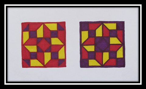
Since none of my previous experiments created the correct result the Bezold Effect describes, I chose to utilize only three colors and change the backgrounds of two images. I decided on removing green from my previous palate and kept red and purple as my primary (and background) hues with yellow as my third color.

Red CubesPurple Cubes

Construction

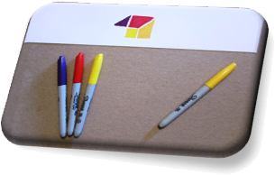
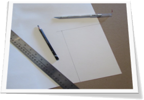
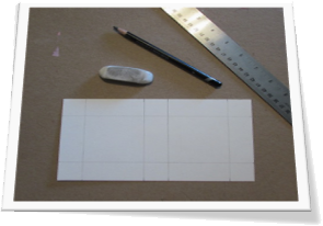
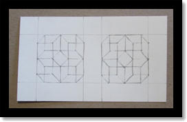
For this project I used Bristol board and permanent markers. I tested some shades and tints of the specific hues chosen. Next, I traced a small sample of my cube pattern to reproduce the effect desired. I also had to calculate the dimensions of my background media to include both images and a one inch border. Then I trimmed a piece of Bristol board to 4 ½”x9”, allowing for two 2” patterns, separated by an inch partition of white space.

Testing MarkersCube Pattern
Traced Cubes
Measurments
Guidelines

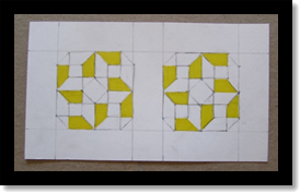
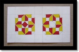
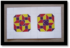
After transferring my cube design to both halves of the Bristol board, I began coloring in the parts of the images that would contain the yellow hue. I the proceeded to fill each designated red portion and eventually completed the pattern with the dark purple. By starting from light to dark, I was able to correct a small mistake while working on the red hue, where I lengthened a line beyond its shape due to a guideline that transferred too lightly.

Transfered CubesYellow Shapes
Red Shapes
  Purple Shapes

BackgroundsThe last step was to add the actual background colors. I started by outlining each image in its respective hue and then adding an extra layer of thickness to the outside border. Then I simply outlined each individual shape and filled in the corners to complete the effect. Finally, I erased the outside guidelines and cleaned the image for presentation.

Bezold Sample
Bezold Sample

View/Download PDF