Assignment
The color wheel project is designed to better understand the relationships between the twelve most common color divisions along with their tints and shades and to develop painting techniques and mixing skills via practical exercises.
Terminology
- A color wheel, or color circle, is an abstract illustrative organization of hues around a ring that shows the associations between primary colors, secondary colors and tertiary colors as well as display complementary color affiliations.
- Hue refers to a pure color: one without tint or shade.
- Tint is the mixture of a color with white, which increases lightness.
- Shade is the mixture of a color with black, which reduces lightness.
- Primary colors are sets of colors that can be combined to make a useful range of colors. For human applications, three primary colors are usually used, since human color vision is trichromatic. These colors cannot be created by mixing others.
- A secondary color is a color made by mixing two primary colors in a given color space.
- A tertiary color is a color made by mixing either one primary color with one secondary color, or two secondary colors, in a given color space.
- Complementary colors are pairs of colors which, when combined in the right proportions, produce white or black. When placed next to each other, they create the strongest contrast and reinforce each other.
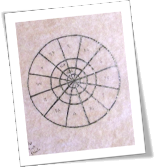 Classic Color Wheel
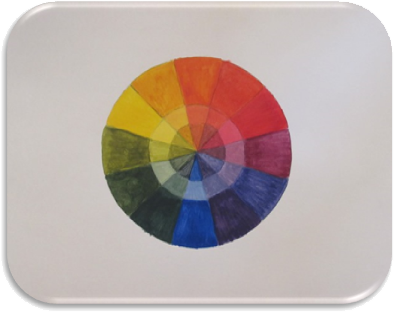
The first exercise was to create a color wheel with the three primary colors, three secondary colors and six tertiary colors by utilizing black, white and the three primary colors only. Additionally, each color would include its tint in a second ring and its shade at the center of the wheel.
I started this project by tracing a color wheel template on tracing paper and transferring it to 11”x14” Bristol board.
To produce the twelve colors needed to complete the classic color wheel, I utilized Liquitex Basics acrylic Cadmium Yellow, Cobalt Blue Hue and Primary Red. To create each hue’s tint, I used Titanium White and to create each hue’s shade I used Ivory Black.
Personal Color Wheel
The second exercise was to create an abstraction from the classic version of a color wheel by interpreting the image in a personal manner while simultaneously adhering to the pattern of the original.
Strategy
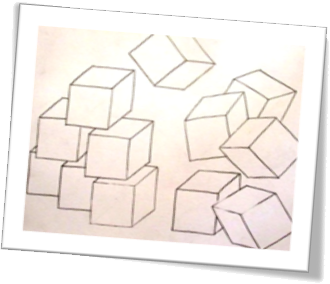
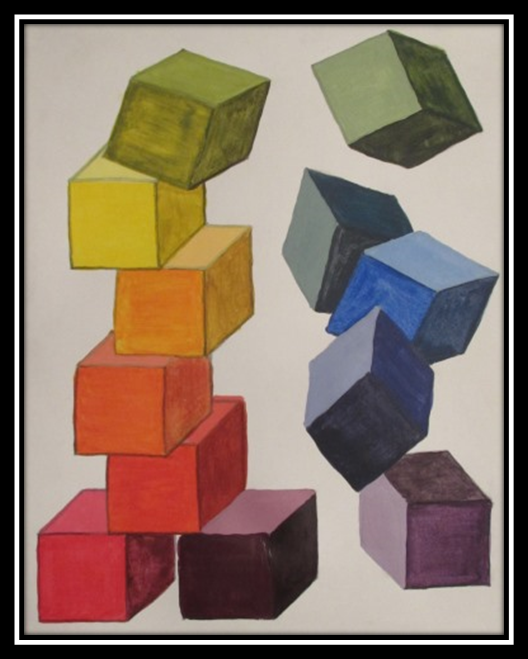
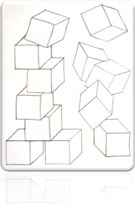
I began my process with a general vision of building blocks, stacked to a point and then tumbling down the opposite side of my composition. I chose this imagery for several reasons: first, the angular properties of square shapes directly contrasted with the gentle, circular properties of the classic ring, or wheel, layout; second, the positioning of such objects within my project could be more abstract without 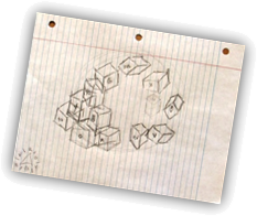 abandoning the structure of the color wheel; and third, the inherent ability to show only three sides of a cube allowed me to distinctly display each hue’s tint and shade by assuming an implied light source.
I quickly sketched my initial impression of some blocks being stacked on one side of a piece of notebook paper and had the remaining cubes fall down the opposite side, thus completing the imagined circle. I also included indications of which colors would occupy which blocks starting with red and continuing around the classic wheel ending with red-violet.
Visualization
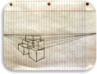
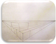
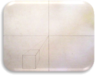
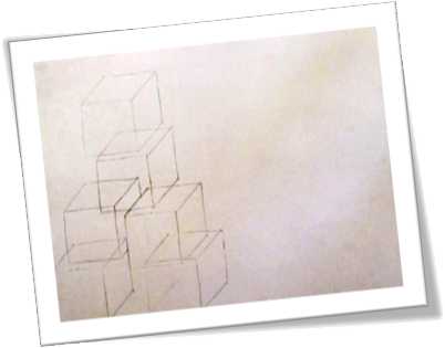
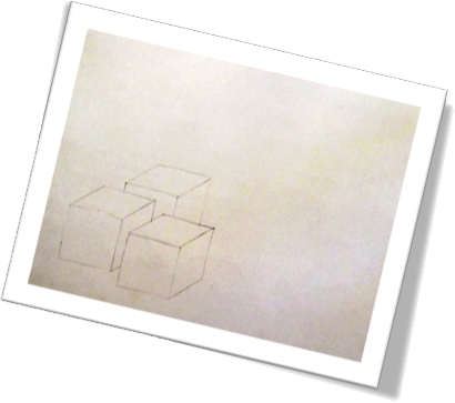
I experimented with several perspectives before deciding on my final scheme. Beginning with a simple two-point perspective, I quickly realized that this method might produce issues with the ability to view enough of the third side of my cubes at certain angles, unless I wanted to be completely above or completely below the horizon line. With this thought in mind, I experimented with three-point perspective and assumed a vantage point slightly above my subject. I found that I wasn’t happy with my choices of block positioning utilizing this method and wasn’t prepared to calculate each block dimension to ensure consistent proportion, so I moved on to an unassuming one-point perspective. After adding the first cube to this version, I knew I wouldn’t get the sought after effect in my final design, even though I did think it could work with this slightly abstract version. Then I came to the blindingly obvious realization that what I was looking for was, indeed, an abstract composition, so I threw out perspective entirely and concentrated on my basic shape: the humble cube.
Composition
Because I wanted to use the exact same cube dimensions for all twelve blocks, I created a transferable cube on tracing paper and began sampling block placement within my Bristol board. My first attempt at stacking the left side made me realize I’d have to be careful with my cube locations so that, as some blocks sat upon others, all three sides – or at least some portion of each – would remain visible. I 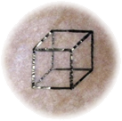 completed an entire version in a landscape layout with which I could have moved forward; however, I discovered that the stacked side seemed too tight for my liking and conflicted with the tumbling, loose side. So, back to the drawing board I went. I started my next attempt with a pleasant, unrestricted stack of cubes but recognized I now required more vertical space to complete the effect I desired. By taking everything I’d learned thus far and applying my newly discovered knowledge to a portrait layout, I finally found a composition with which I was satisfied to continue.
 Color Application
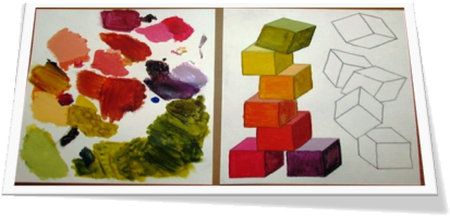
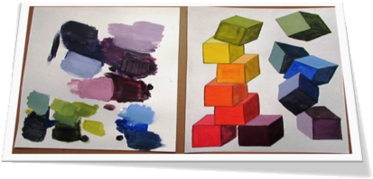
Now that I was ready to start painting, I needed to make some color placement choices. I knew that I wanted to start near the bottom of the stacked cubes and make my way through the primary, secondary and tertiary colors by climbing to the top of the stack and then following the falling blocks back to the bottom of the design. I decided to let my warm colors ascend through the work and
as they started to cool they would drop to the beginning and start their journey anew. This compositional plan lent credence to my piece by mimicking familiar heating and cooling behavior.
I assigned the innermost bottom block red-violet and moved in a clockwise motion through the warm hues, passing through red,
red-orange, orange, yellow-orange, yellow and yellow-green before dropping through the cool hues of green, green-blue, blue,
blue-violet and ending in violet.
I utilized a Simply Simmons Watercolor #4 round this time, but with all the same acrylic paints as before.


