Introduction
Color psychology is the study of color as a determining factor of human behavior. Some examples of various color significances and impressions are listed below:

Assignment One
Using Color-Aid Paper, answer six different personal questions involving the psychological responses to hues, shades and tints based on ordinary color experiences.

Discovery
I began this project by choosing the colors that I thought answered each question starting with the color that would represent me. I chose a deep, dark purple for a couple of reasons: first, purple has always been my favorite color; second, purple is a royal, strong, bold color that signifies authority, influence and complexity. I grew up in a stereotypical “boys should like green, blue and red; girls should like yellow, pink and violet” type society, so I instantly wanted to be different and I picked purple. I’ve loved the richness and strength of not only the color but the decision to be diverse.
 The colors I like to wear were chosen basically based on clothes I wear to work. As a white-collar worker in Information Technology, I dress casually but in professional attire.
  Black and tan slacks along with red and blue shirts are common, along with black shirts and blue slacks. Other colors are obviously common but we were limited to four. Conversely, colors I do not like to wear include yellows, peach hues, dark greens and plum shades.
 I chose the colors I’d like to see in my house by starting with a couple colors with which I have already decorated my home: dusty-rose and moss-green. To compliment these light and unsaturated choices, I added a light violet and sky blue.
 For the music video colors, I chose bold and bright yellows and oranges balanced with dark and solid greens and blues. The feeling I experienced from this combination of hues reminded me of many of the music videos of the 1980’s, when the extreme, loud styles clashed with the realistic colors in nature.
 I chose some interesting colors based on the challenge of finding three hues that might make me want to shop. Normally, bold, bright primary colors have this effect but I chose an analogous combination of green, blue and teal that indicate expensive, sophisticated purchasing; not that I could actually afford to go through with such an acquisition.
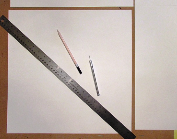
 I started each board by cutting a piece of Bristol board to the desired dimensions needed to display each set of color selections. To include a one inch border on each design, I measured the single color board to a 4”x4” square. I spaced
 the four and three color swatches by ¼” so the four-color version measured 10 ¾”x 4” and the three-color version measured 8 ½”x4”. Each board was measured and marked for each swatch placement, as well.
Rubber cement was utilized to affix each color sample to its background and then a rubber cement eraser was used to clean excess glue from the Bristol board and a kneaded eraser was used to clean the guidelines from each background.
Creations

Persona

Elegance

Vicious

Family

Cinematic

Gauche
Assignment Two
Color symbolism comes from the cultures in which we live. Certain colors and color combinations are associated with other cultures or places. Color is symbolic and can affect the way a viewer perceives a design or work of art.
Design a creative travel poster of your choice with color selections that reflect the place being advertised. Use Gouache or acrylic paints. Develop a color scheme that employs symbolic colors; choose colors for the type and background with good value and interesting contrast. Start by researching the country, place or tourist attractions. Consider the appearance you want to project and use images that reflect the culture and history of the place you want to showcase. Demonstrate an ability to choose colors based on their symbolism and psychology.
Research
Obviously, the first task was to decide upon a destination my poster was going to portray. I started this process by randomly researching several famous landmarks, monuments and memorials. I included each subject’s geographical location and national flag.
This chore alone didn’t narrow down my decision; on the contrary, it expanded the possibilities exponentially. I first examined each country’s flag for color inspiration. Brazil, Egypt and India were all promising, each containing four different hues. Italy, China and Japan utilized interesting colors; although, China and Japan were limited to two colors which reduced the base color palette. The United Kingdom, France, Russia, Australia and Chile all contained the same colors as the United States, which, while absolutely wonderful, I wanted to avoid for this project.
To further narrow my results, I created silhouettes of each monument I had studied as a muse for the final design.


The Torii of Itsukushima Shrine stood out as the most dramatic visual image and lent itself to many immediate design potentials. A close runner-up was the Cristo Redentor in Rio de Janeiro. After investigating the histories and significances of each monument, I returned to my original choice and moved forward with The Torii.
Additional Design Elements
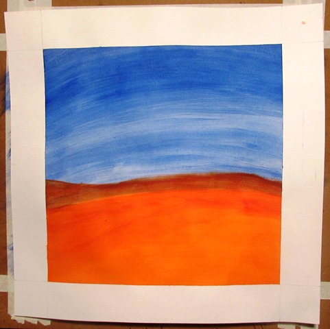
Starting with the simple silhouette of The Torii, I added the “sun” of the Nisshōki, Japan’s national flag. I then included a gradient background from a watery blue at the base of the image to a light yellow in the upper half of the composition. Lastly, a branch of light pink cherry blossoms were added to the lower, right hand corner of the piece.


The red circle from the Nisshōki signifies sincerity, brightness and warmth while simultaneously indicating bravery, strength and valor. While the white on the flag represents purity and honesty, I chose to utilize blue and yellow for two reasons: first, the blue in the bottom half of the design abstractly eluded to the water that the Torii is surrounded by at every high tide while the yellow in the upper half of the design symbolizes the morning sky in which the rising sun, or Hinomaru, of the Nisshōki perpetually resides.
The addition of the cherry blossoms represents the fragility and the beauty of life. To the Japanese it’s a reminder that life is overwhelmingly beautiful but also tragically short. Furthermore, a fallen cherry blossom symbolizes a fallen samurai who sacrificed his life for the emperor. In 1912, Japan gave 3,020 cherry-blossom trees to the United States as a gift to honor the growing bond between the two countries. The pink hue of the cherry blossoms symbolizes good health and life as well as purity and love.
I chose not to incorporate any text to my poster. I let my images and color choices speak for themselves.
Production
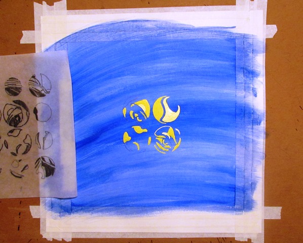
I utilized 18”x24” Illustration Board for this project. I added a two inch border with a soft pencil and taped off the border with masking tape to ensure crisp lines would be produced after painting.


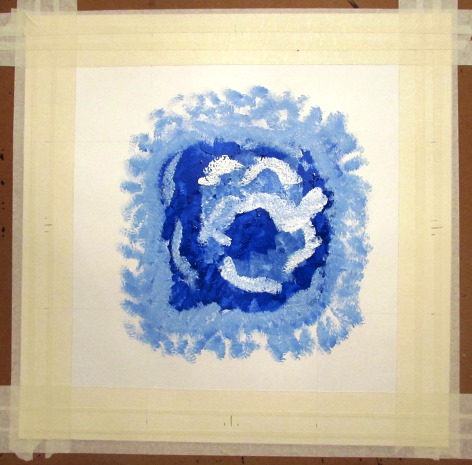
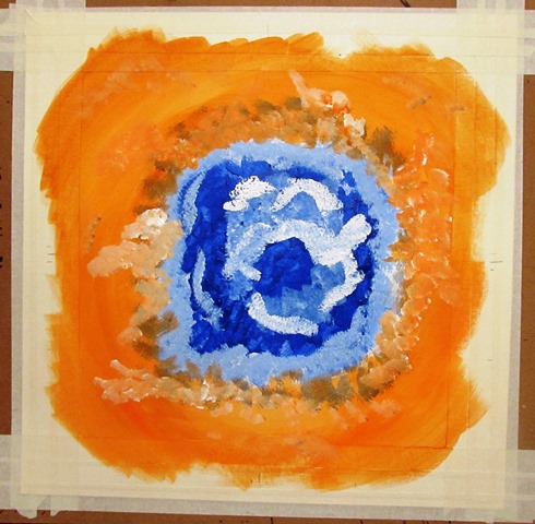
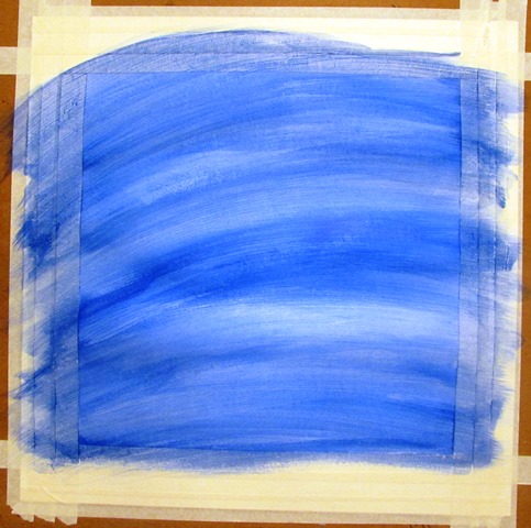
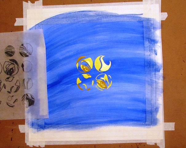
I began painting the background first, starting with the blue bottom half of the design. I spread a pure blue layer followed by two lighter blues created by adding white incrementally. Next, I added a pure yellow background to the other half of the composition. I incorporated a layer of light yellow by adding white and then mixed up a third layer of yellow-orange as a top coat.


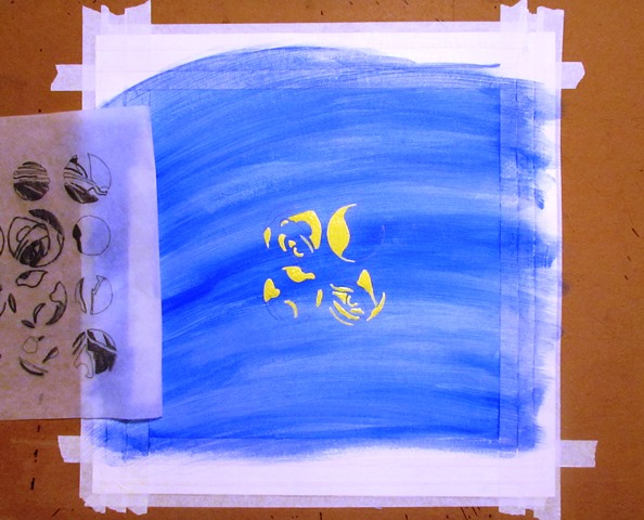
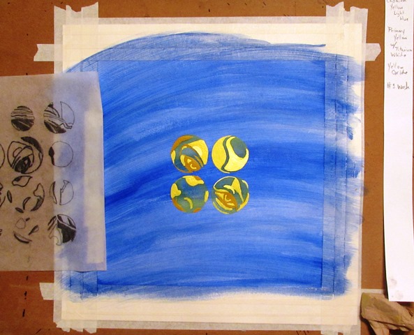
 The next element to add was Hinomaru, the rising sun. Slightly off-center, the red disc was placed in the upper left-hand side of the composition.
For the next two elements, I traced positive and negative images of the Torii silhouette and the cherry blossoms, respectively.


Once the Torii was transferred to the painting, it was painted with Mars Black acrylic paint and the same process was performed on the cherry blossom branch.


One hint, when transferring a detailed design, is to shade finished sections lightly as you trace. This ensures all the potions of the transfer are completed.
The cherry blossoms were painted with a pink and pink-white mixture to produce varied tints and shades, mostly within the branches and flowers with the branches containing more shade and the flowers containing more tinted hues.


The branch was extended into the border and off the composition completely while a few fallen petals were dropped into the border but not off the design. This last compositional choice symbolizes the start of life from the branch entering the image from the right side of the piece and represents the end of life by the fallen petals; however, the petals have not completely left the design just as our loved ones never leave our thoughts and memories. Between the two events lies the beauty of life, with some petals grouped together and some alone and fending for themselves, but all part of a bigger picture, a more important design.

Torii of the Itsukushima Shrine
View/Download PDF
Like this:
Like Loading...


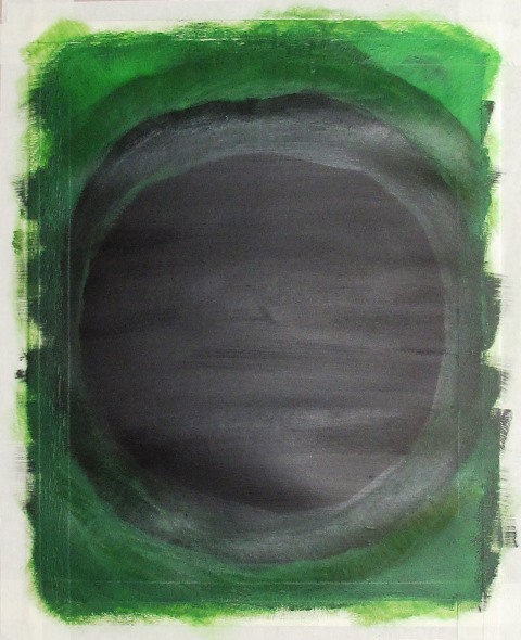
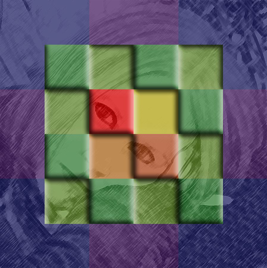
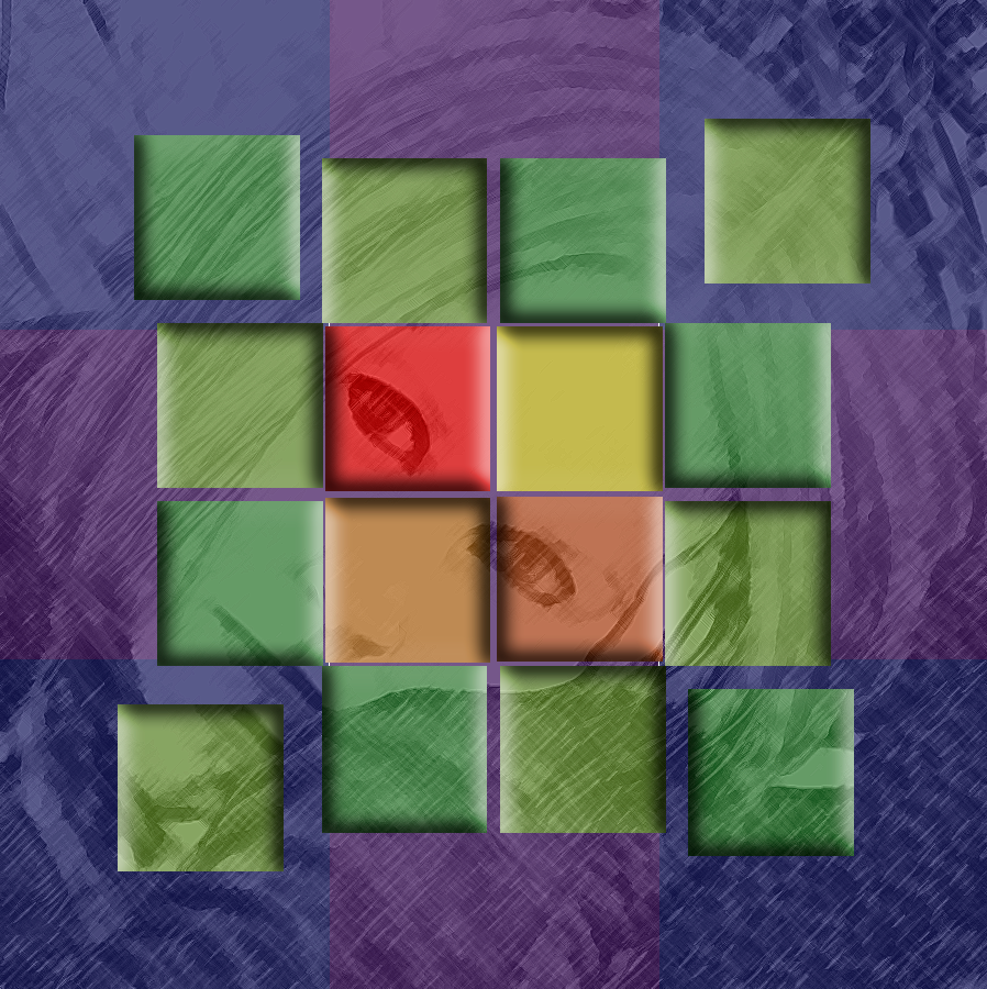
 Digital Prototype
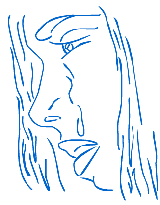
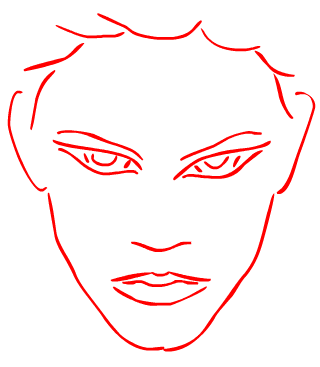
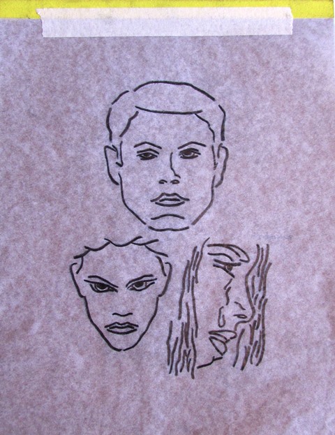
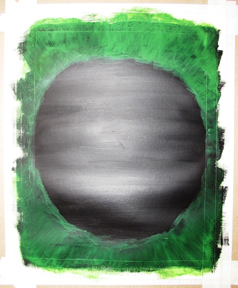
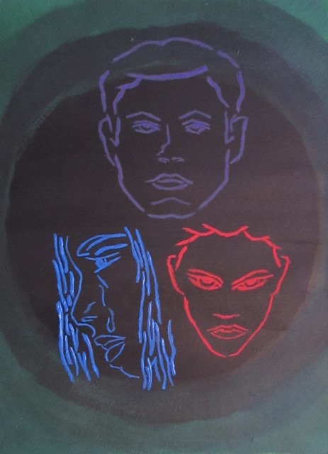
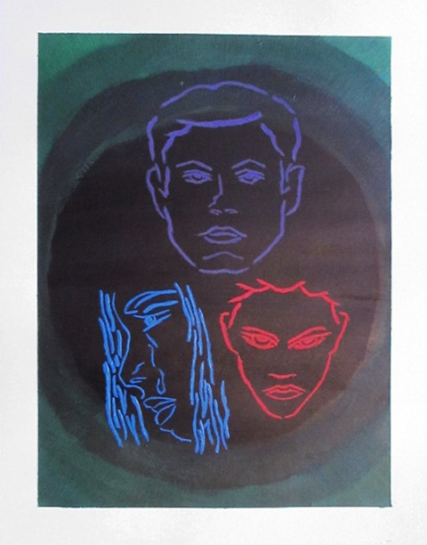
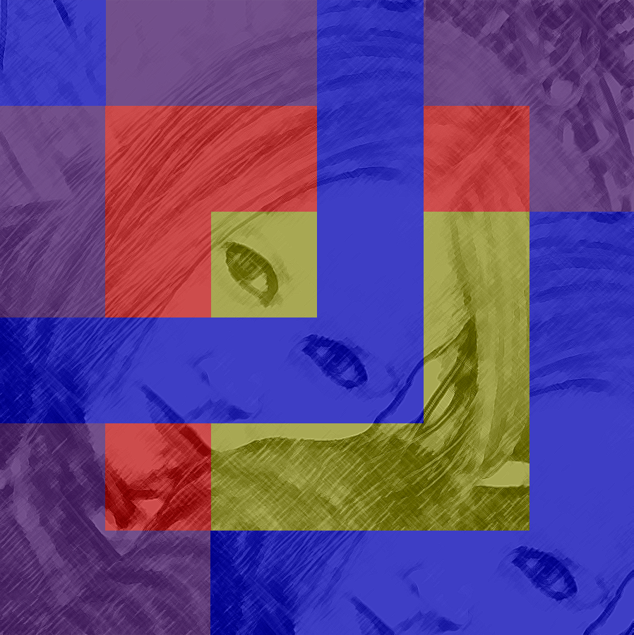
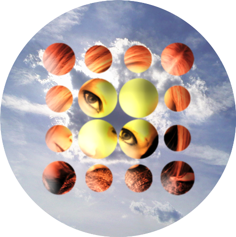
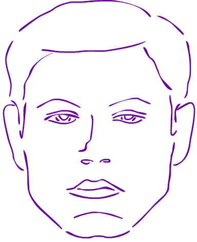 By simply combining three portraits in red, blue and purple on a background of green, I hoped to tell a story of a messy love triangle where bitterness and resentment dominated the tale. One character may be conceited and unkind which hurts another and makes them miserable and angst ridden while a third character could be irritated and seething.
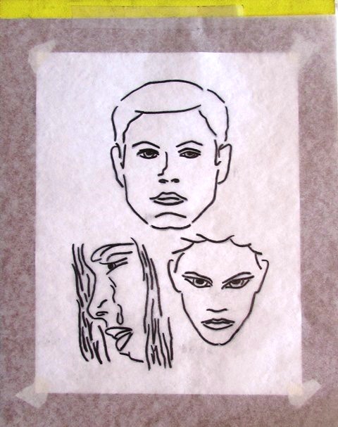


 Evil Baby


")
")
")
")
")
")
")

")
")


