
Contents
Project #2: State Stamp
Research
Start with Process Book and develop ideas. Always include the following:
- Find examples of at least 20 stamps
- Create at least 15 sketches
- Color Studies (Explore color for tone, mood and focal point creation)
- Create 2 high-end drafts of three most promising sketches
- Refine best stamp idea for final
- Analysis
- Final
Save as a Portable Document File (PDF) and submit with final project.
Criteria
The project will be executed in Adobe Illustrator
- Instructor will assign you a state
- Required Elements:
- Numerals “49” or the word “Forever” and “USA”
- Title (optional)
- Year
- Color mode – CMYK for Print
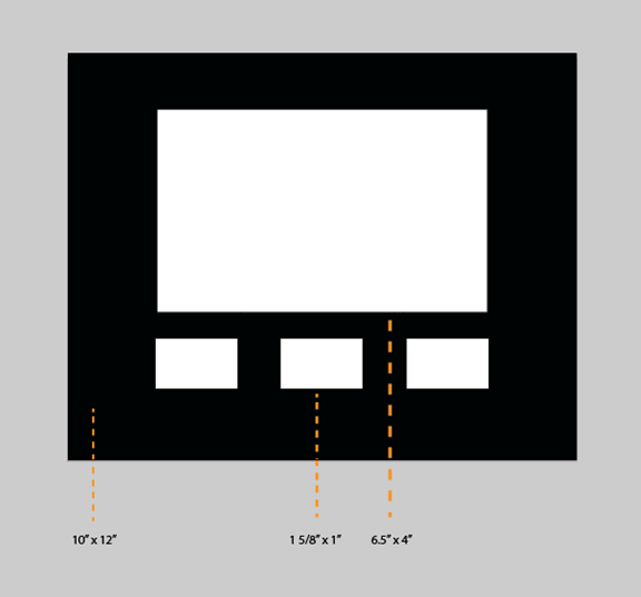
- SIZE: 6.5″ X 4” (horizontal only)
- Copy the stamp, reduce to 1.625″ x 1,” then make 2 more copies
- When designing consider:
- Composition
- Typography
- Color
- Visual Image & Slogan
- Develop the sketches into vector images with color
- Finalize your most promising idea
- Both large and reduced stamp will be mounted on 10 x 12” black board with tracing paper flap
Critique
Produce and submit two rough ideas for the critique discussion.
Final
The final design will be mounted black board with tracing paper flap sheet. You must have at least three drafts included with your final project.
North Carolina Stamp
Research:
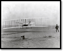 My investigation into the Tar Heel State, or Old North State, began with some generalizations and stereotypes of the state. It’s official motto is “Esse quam videri: “To be, rather than to seem” but most know North Carolina as the “First in Flight” state, thanks to the Wright brothers famous first powered flight at Kitty Hawk.
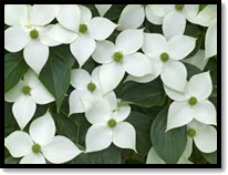
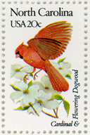
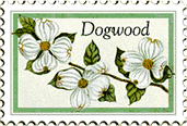
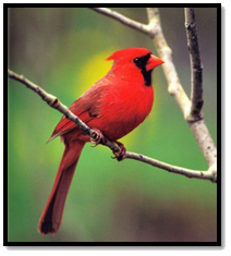 The state bird of North Carolina is the cardinal, which it shares with Illinois, Indiana, Kentucky, Ohio, Virginia and West Virginia; similarly, the state flower -the American Dogwood- is shared with Virginia. The state wildflower, however, is the Carolina lily.
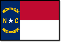
 The North Carolina flag is red, white and blue with gilt (yellow) letters and banners. The official salute to the flag reads: “I salute the flag of North Carolina and pledge to the Old North State love, loyalty, and faith.”
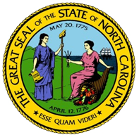
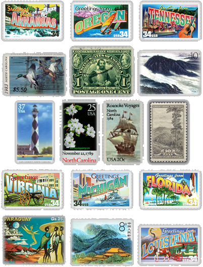
My next research step included collecting samples of previous stamps featuring North Carolina along with an example of the state seal.
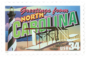
Included in my research were some stamps from other states and even other countries.
Thumbnails:
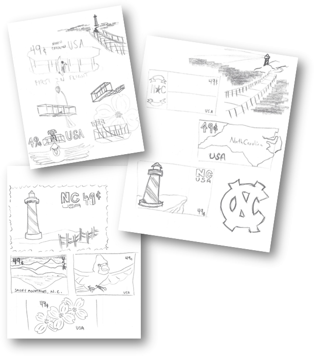
My initial thumbnails focused on the Wright brothers’ first aircraft designs that actually flew. The state bird and flower were scattered across some of these designs to add variety and balance. Alternative designs included varying depictions of lighthouses, the state flag, the Smoky Mountains, the North Carolina Tar Heels logo and even an outline of the states’ borders. Examples of a stamp with only the dogwood flowers and only a cardinal in flight were also included as possibilities.
Type Studies:
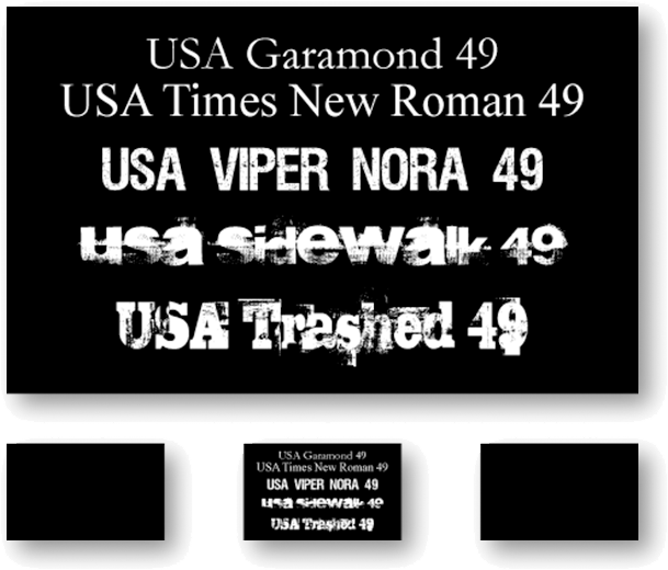
My typeface research started with a couple common fonts such as Garamond and Times New Roman. I also decided to experiment with some special fonts such as Viper Nora, Sidewalk and Trashed. I examined each font in a large sample and one-quarter the test size to mimic actual stamp proportions.
Color Studies:
The colors I experimented with varied between each rough draft based on the subject matter of the images incorporated.
Roughs:
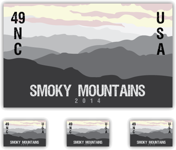
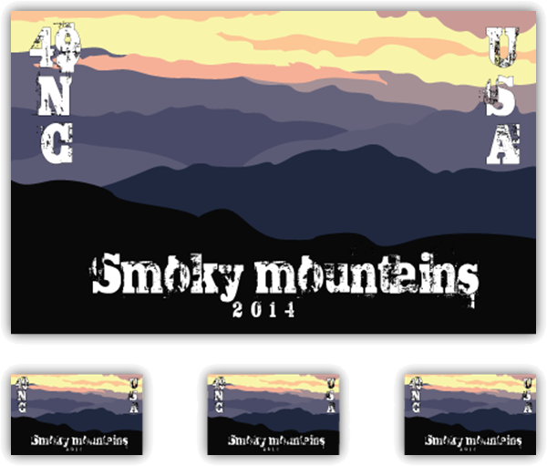
My first rough draft originated from the Smoky Mountains sketch. Beginning from the farthest element, the sky, my color palette ranged from a light yellow and pink to a multitude of grays.
- #F9F9DF – Sky
- #E6D2D3 – Clouds
- #F3F3F4 – Mountain One
- #E7E8E9 – Mountain Two
- #BDBEC0 – Mountain Three
- #939598 – Mountains Four & Five
- #6D6E71 – Mountain Six
- #3A3A3C – Mountain Seven
The font type utilized for this first sample was Viper Nora by pOPdOG fONTS . The title, stamp value, state abbreviation and USA were sized to 36 points while the year was reduced to 14 points. The title was rendered as light gray (#E6E7E8) and the year slightly darker (#A7A9AC). The rest of the text on the stamp was a very dark gray (#231F20), almost black.
My second version of the Smoky Mountains used more colors from my inspirational image.
- #F8F5AB – Sky
- #FCC597 – Cloud One
- #C99A95 – Cloud Two
- #FCC695 – Cloud Three
- #F6B097 – Cloud Four
- #A59096 – Mountain One
- #65637B – Mountain Two
- #494A67 – Mountain Three
- #5B5B76 – Mountains Four & Five
- #1F283F – Mountain Six
- #09090A – Mountain Seven
The font type utilized for this sample was Trashed by Gyom Seguin. The title, stamp value, state abbreviation and USA were still sized to 36 points and the year was again reduced to 14 points. All of the text in this version was black (#000000) and white (#FFFFFF).
My second rough draft consisted of a combination of two previous sketches. It included an outline of the state’s borders with a background of the state flag general design. Beginning with pastel versions of the flag’s red and blue, I offset the white with pure black text.
- #DC8E7F – Powder Red
- #7E7C9E – Powder Blue
- #FFFFFF – White
- #000000 – Black
The font type utilized for this example was Sidewalk by Segments Design. The state name was sized to 24 points and the class, value and USA were sized to 12 points. Finally, the year was reduced to 8 points and rotated 90 degrees.

My second version of the flag utilized a bold red and blue as well as the gilt, or yellow, which is also present in the state flag.
- #C02033 – Bold Red
- #202F64 – Bold Blue
- #FFF200 – Gilt Yellow
- #FFFFFF – White
- #000000 – Black
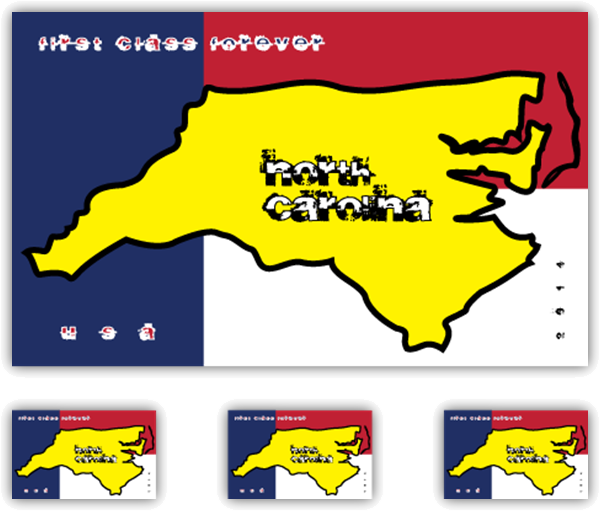
The font size and style remained the same as the first version – Sidewalk by Segments Design – but this time the state name was white with black accents; the class and USA were red with a white border and the stamp value was blue with a white border. The year remained unchanged.
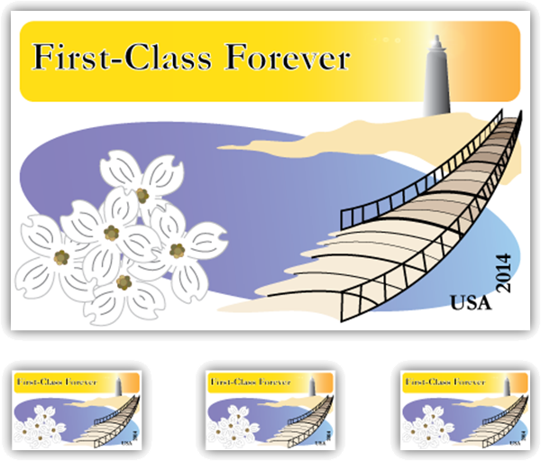
My third rough draft was another combination of previous sketches. This time I incorporated a lighthouse scene with a beach foot-bridge with North Carolina’s state flower: the dogwood. This model encompassed many more colors and effects than the previous two attempts including a flare of light.
- #FBB040 – Sky Gradient Right
- #FCF9D2 – Sky Gradient Center
- #FFDE17 – Sky Gradient Left
- #27AAE1 – Water Gradient Right
- #2E3192 – Water Gradient Left
- #FAE5B2 – Beach
- #F7ECD9 – Bridge One
- #E5D5BE – Bridge Two
- #D6C2AD – Bridge Three
- #C7B29D – Bridge Four
- #B29C88 – Bridge Five
- #937962 – Bridge Six
- #000000 – Bridge Seven
- #9B9057 – Flower One
- #737145 – Flower Two
- #847722 – Flower Three
- #746F44 – Flower Four
- #CAAD68 – Flower Five
- #BCA465 – Flower Six
- #C8B56F – Flower Seven
- #996632 – Flower Eight
- #A0A1A3 – Flower Nine
- #FFFFFF – Flower Ten
The font type chosen for this specimen was Garamond Bold in pure black (#000000). The class and value of the stamp were sized to 36 points with a white (#FFFFFF) border while the USA and year were reduced to 20 points with no border with the year rotated 90 degrees.
My second version of the lighthouse stamp simply changed the font from Garamond to Times New Roman and darkened all the hues of the design.
Analysis:
I needed to narrow my design choices down to a final draft, so I chose to investigate a couple strong designs further.
My first choice was to utilize the second version of the second design: the bold flag composition with the state outline. I needed to choose an alternative font, however, since the first experiments were illegible after being reduced to the size of a postage stamp.
I started with changing the Sidewalk font to a more traditional Times New Roman, as this was the font I liked most on my lighthouse design. For the value and class of the stamp, I adjusted the size to 26 points, bold, with a yellow fill and a half point stroke and centered the line of text across the top of the image. USA was also yellow with a black border, but at a bold 16 points. The year was a solid black, bold, 12 point font and the state name was a mixture of 48 point first letters and 24 point text in a bold, black font.
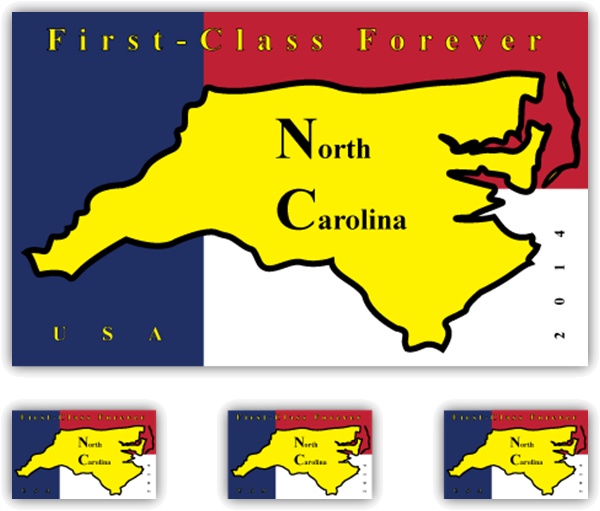
Just to be thorough, I wanted to experiment with Garamond, as well. For the value and class of the stamp, I adjusted the size to 28 points, bold, and kept the yellow fill and half point stroke. The line of text remained centered across the top of the image. USA stayed yellow with a black border, but at a bold 18 points. The year stayed a solid bold, black, 12 point font and the state name was still a mixture of 48 points for the first letters and 24 point text in a bold, black font.
Interestingly enough, I ended up liking the Garamond version better than the Times New Roman.
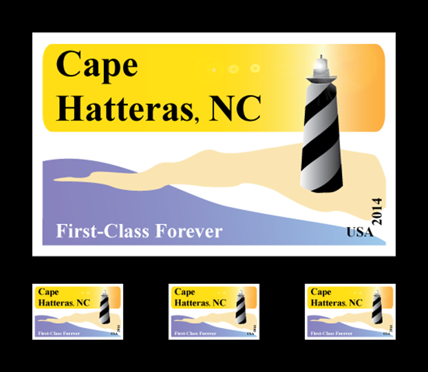
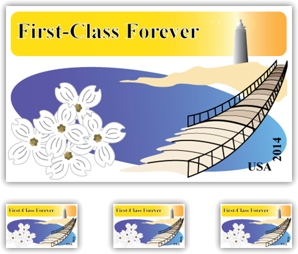
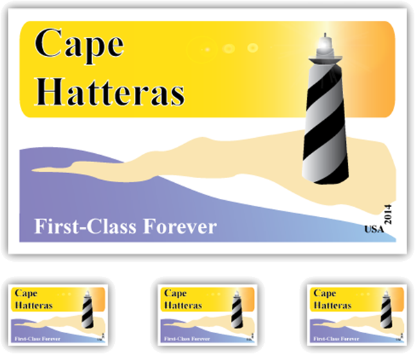
One last experiment was due: a lighthouse version that focused solely on the lighthouse. Not only did I enlarge and add details to the lighthouse itself, I removed and rearranged other elements such as the dogwood flowers and foot-bridge. The skyline banner was enlarged along with the abstract beach and the water was extended completely off the edges of the image and manipulated to flow organically within the piece.
The lighthouse was changed from a generic, small, unrecognizable object in the background to the main focus of the composition based on Cape Hatteras Light: a lighthouse located on Hatteras Island in the Outer Banks in the town of Buxton, North Carolina which is part of the Cape Hatteras National Seashore.
The font family remained Times New, bold and in pure black (#000000) with a thin white (#FFFFFF) stroke. The class and value of the stamp were sized to 26 points in white and moved to the bottom, left-hand corner. The USA and year were reduced to a bold 12 points. The stamp title was added to the top, right-hand corner in a bold 48 point black font with a 1 point white stroke. The light flare was also repositioned and enlarged.
Final:
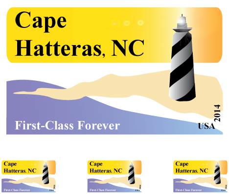 Based on the lighthouse version I redesigned as a final draft, I tweaked the image a little more before printing a master copy. I enlarged the year and USA to 18 points, removed the stroke from the title and added “NC” to the title, along with a comma. The comma, however, was reduced to 26 points to eliminate the distracting qualities it comprised when it was at a full 48 point font.
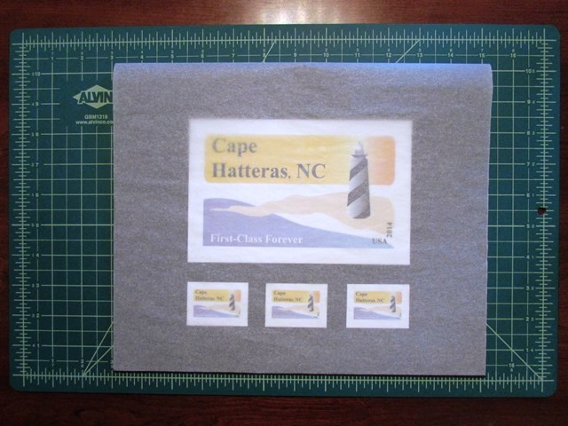
I printed the final composition on glossy premium inkjet photo paper and trimmed them with extra border for mounting. The large image included a quarter-inch border and the small images incorporated an eighth of an inch border. My black presentation board was carefully cut to 10” x 12” with a utility knife in a three-stroke process against a metal ruler.
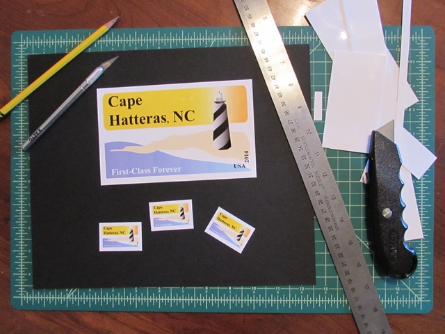

Once mounted with rubber cement, a rubber cement eraser was used to clean up the edges of the images and a white Mars Plastic eraser was utilized to clean smudges from the glossy paper. The flap was attached a half of an inch to the back of the presentation board and measured to reach the bottom of the composition, neat and square.