Monthly Archives: April 2014

Chromatic Novel

Assignment

Create a composition for a fictional book cover. In this case, you should be able to “judge a book by its cover”. Utilize your knowledge of color’s emotional symbolism, relativity, psychology and complimentary design.
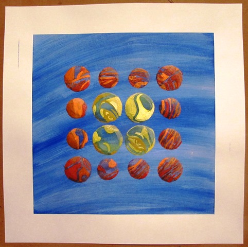
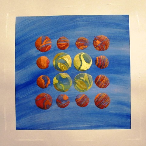
Blue Grief and SadnessDigital Prototype

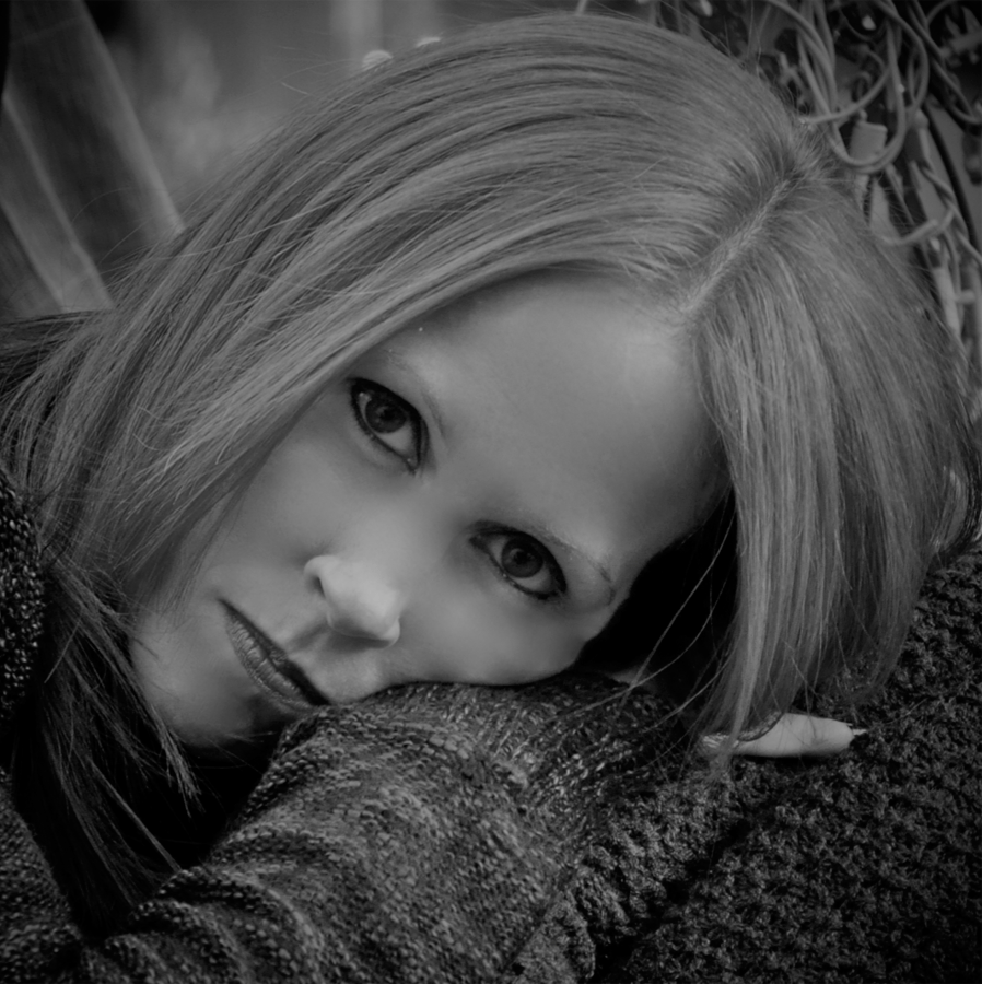
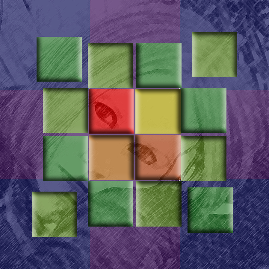
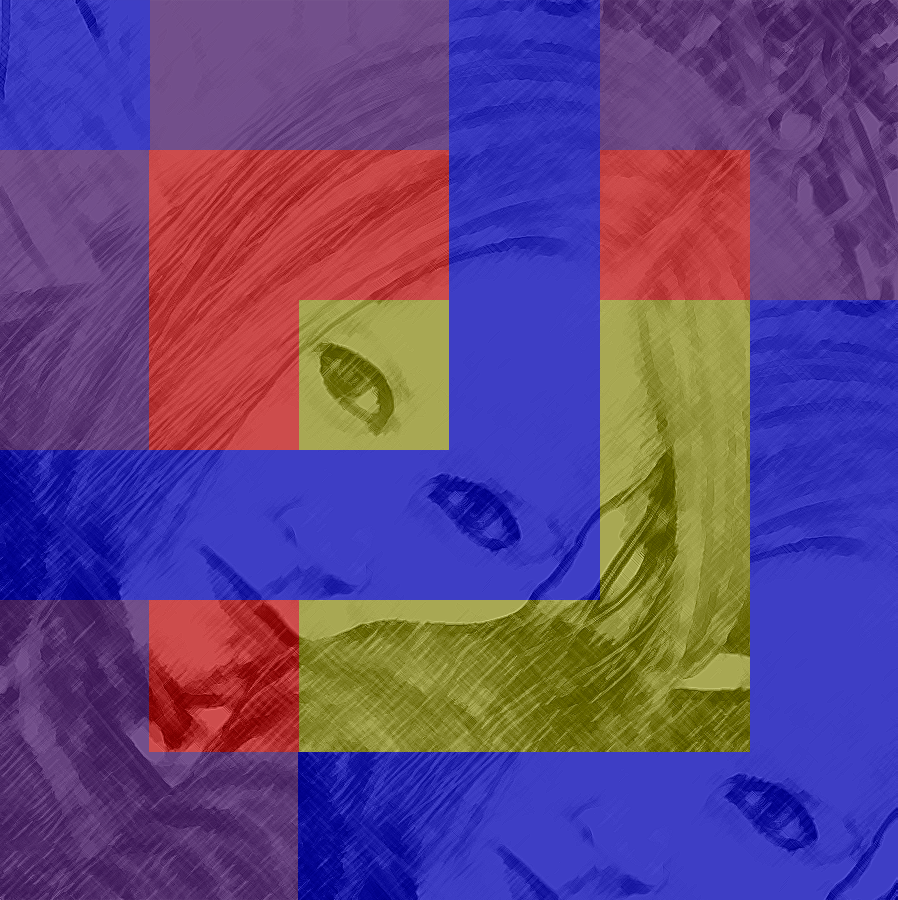
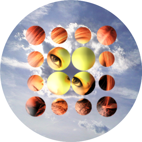
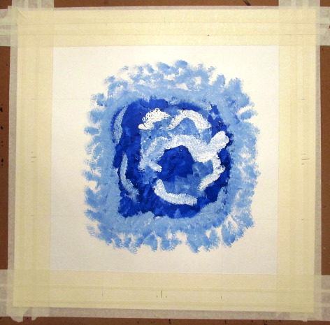
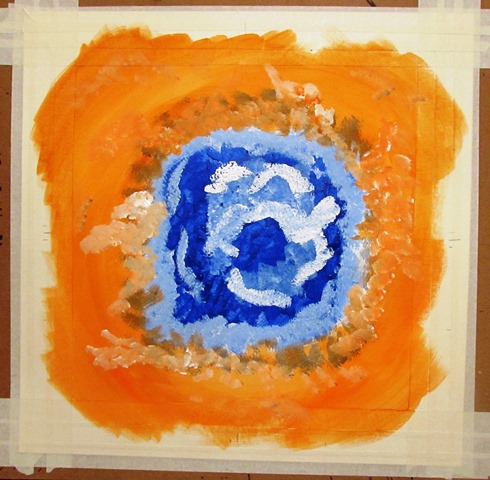
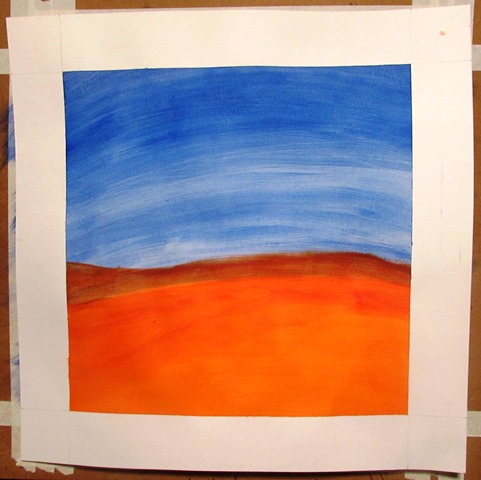
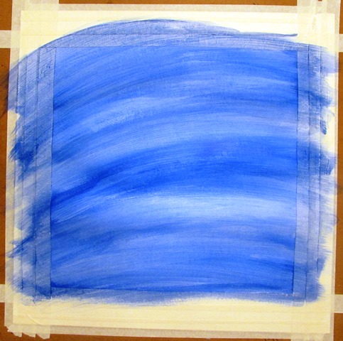
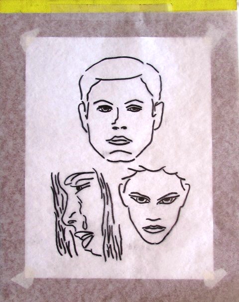
I began by visualizing my idea’s digitally. I wanted a simple composition that would use color as the main indication of which the fictional story contained within its pages would be comprised. The images, while important, would play a secondary role and merely support the hue choices of the background and each foreground figure.

Color Symbolism

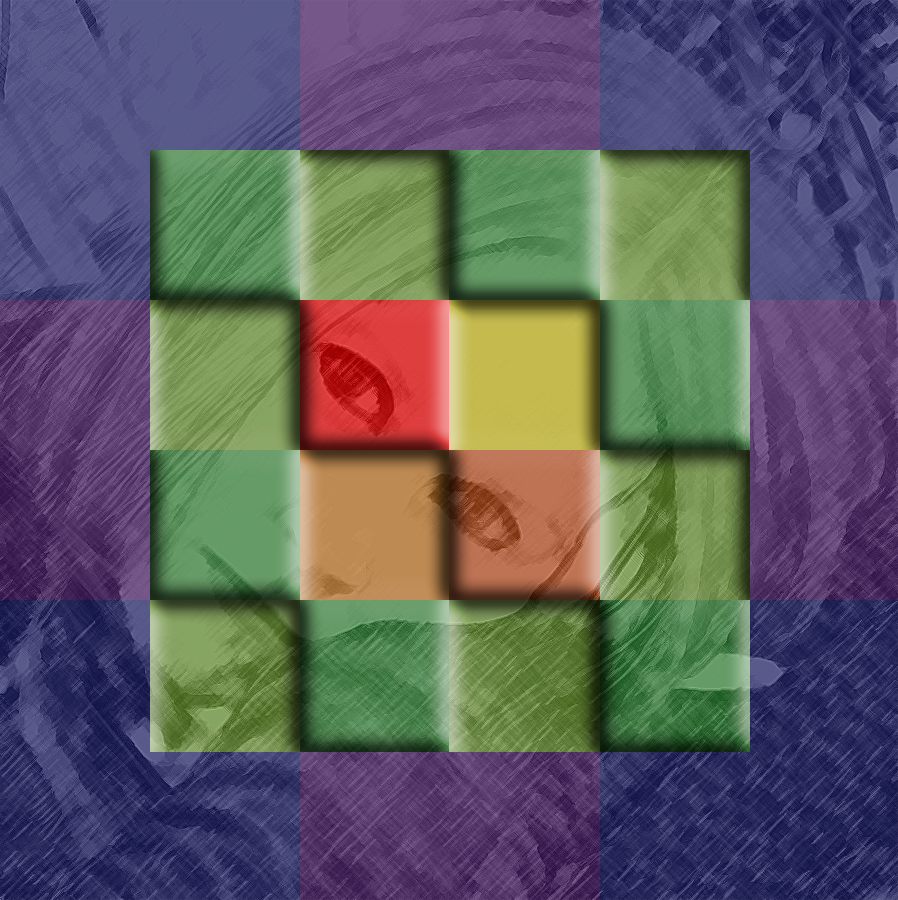
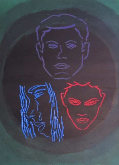
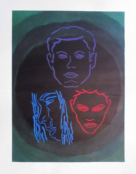
Blue was utilized to represent grief and sadness, red was employed to signify rage and anger and purple was used to indicate arrogance and cruelty and green was exploited to designate jealousy and envy.

Red Rage and AngerPurple Arrogance and CrueltyBy simply combining three portraits in red, blue and purple on a background of green, I hoped to tell a story of a messy love triangle where bitterness and resentment dominated the tale. One character may be conceited and unkind which hurts another and makes them miserable and angst ridden while a third character could be irritated and seething.


Jacket Creation

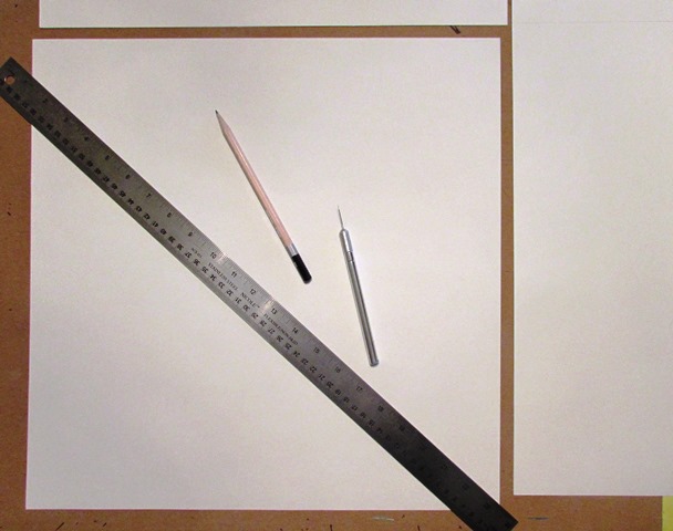
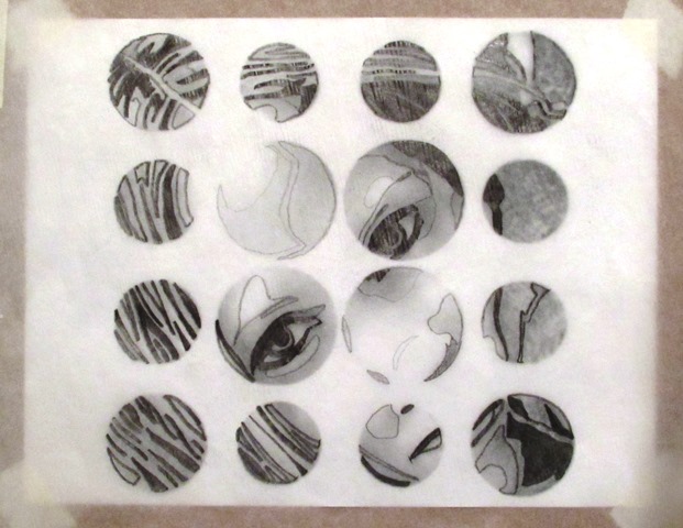
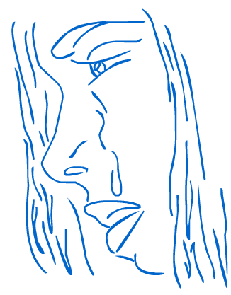
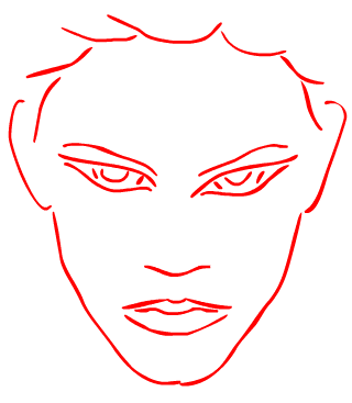
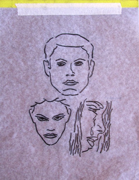
After digitally drawing my portraits, I outlined the positive images on tracing paper and copied the negative forms to prepare for the eventual transfer.

Positive Images Traced                        Negative Forms

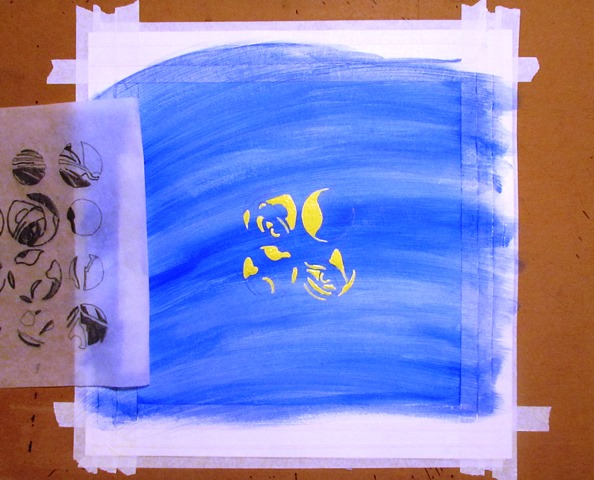
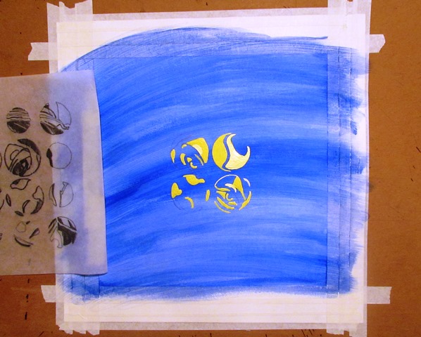
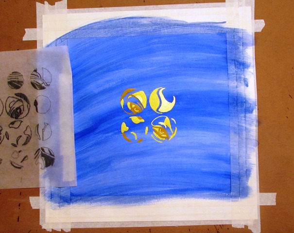
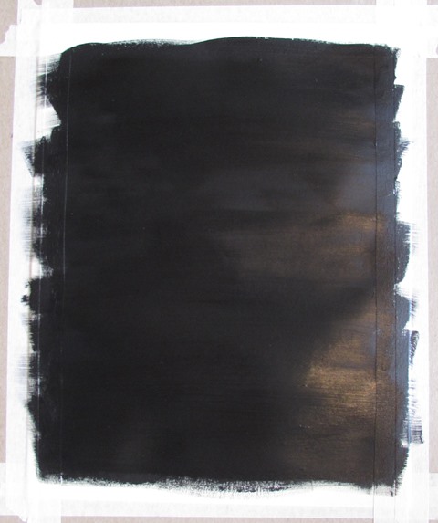
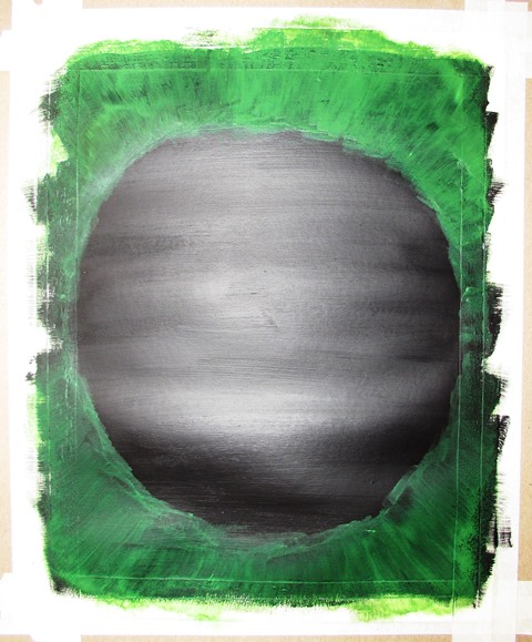
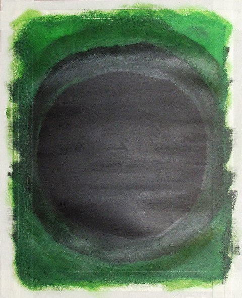
I secured my Bristol board with drafting tape and painted the background with Mars Black acrylic. Once it was dry, I mixed acrylic Green Neon with the same Mars Black to produce a glowing edge radiating from the pitch-black center of the composition. I then transferred the positive image of my three main characters, positioned strategically in their “triangle” and ready to receive their symbolic hues.

Mars Black Acrylic      Acrylic Green Neon      Glowing Radiating Edge

I painted the first character in Deep Violet gouache, the second with an acrylic Cerulean Blue Hue and the third in Carmine Red gouache.

Transferred Image           Deep Violet Gouache, Acrylic Ceruleam Blue Hue and Carmine Red Gouache

JUDGED
Judged

Critique

Since the project called for my peers to “judge a book by its cover” I jotted down some notes while my classmates analyzed my composition.

Some guesses ranged from a murder mystery to the Twilight Zone and even the Wizard of Oz. Eventually, thoughts turned to a love triangle and even got as specific as a childhood connection evolving into jealous relationships.

Once I explained my color symbolism, my peers and professor added some additional insight into my background. They noted that the ever-increasing darkness, finalizing in a pitch-black hue, could indicate an ominous ending to the story. As the overall tale was of a precarious situation, to say the least, the assumption was far from improbable.

View/Download PDF

Color Schemes

Assignment

Document seven color schemes utilizing modern photography. Explain your image selections and describe color balance within each composition as it applies to each color scheme.

Monochromatic

Color Scheme Examples

Monochromatic colors are all the colors, tints, tones, and shades of a single hue. The energy of such a color scheme is more subtle and peaceful due to a lack of contrast of hue.

Analogous

Analogous colors are groups of colors that are adjacent to each other on the color wheel, with one being the dominant color, which tends to be a primary or secondary color, and two on either side complementing, which tend to be tertiary.

Complementary

Complementary colors are pairs of colors which, when combined in the right proportions, produce white or black. When placed next to each other, they create the strongest contrast and reinforce each other. On the color wheel, complementary colors are directly opposite each other.

Split Complementary

The split complementary scheme uses a color and the two colors adjacent to its complementary hue. This provides high contrast without the strong tension of the complementary scheme.

Triadic

A triadic color scheme uses colors that are evenly spaced around the color wheel. Triadic color harmonies tend to be quite vibrant, even if you use pale or unsaturated versions of your hues. To use a triadic harmony successfully, the colors should be carefully balanced – let one color dominate and use the two others for accent.

Double Complementary

This tetradic scheme uses four hues arranged into two complementary color pairs in a square format positioning all four colors evenly spaced around the color wheel.

Tetradic

The rectangle color scheme uses four colors arranged into two complementary pairs. Tetradic color schemes work best when one color is dominant.

Photographic Examples

Monochromatic Color Scheme

Monochromatic Color Scheme

My monochromatic image consists of a yellow-orange hue including shades and tints. Shadows deepen into an almost black hue and highlights brighten to near white levels but the entire composition is merely various levels of yellow-orange.

Analogous Color SchemeAnalogous Color Scheme

To demonstrate an analogous design, I chose to display four cool hues including blue, blue-violet, violet and red-violet. While blue-violet dominates this image, obvious signs of pure blue and violet abound and most of the accent hues are variations of red-violet.

Complementary Color SchemeComplementary Color Scheme

I could have chosen any combination of a primary and secondary color to display complements: red and green, yellow and violet, blue and orange. Tertiary and secondary hue combinations could also have been utilized but I chose to use blue and orange in this study. I wanted to take photographs of naturally occurring hues but in this case I included a common man-made object into my design.

Split Complementary Color SchemeSplit Complementary Color Scheme

My split complementary composition utilizes green as its primary hue and is complemented by red-orange and red-violet. The overall impression of pink given by using red-orange in darker portions of the image and applying a lighter red-violet hue as highlights enables the various shades and tints of green to stand out in the design.

Triadic Color SchemeTriadic Color Scheme

To exhibit a true triadic scheme, each hue used should be evenly spaced around the color wheel. With this thought in mind, I chose the tree primary colors: red, yellow and blue. Red became my dominate hue while blue and yellow accented the composition.

Double Complementary Color SchemeDouble Complementary Color Scheme

The term double complementary is just a version of the tetradic color scheme in which the hues utilized are laid out in a square pattern around the color wheel. I used red-violet, orange, yellow-green and blue to create my double complementary color scheme. By allowing the orange and blue hues to spread out within the image, the red and green areas sprinkled around the design create movement.

Tetradic Color SchemeTetradic Color Scheme

Another pattern that contains two pair of complementary hues is the rectangular tetradic scheme. In my composition I chose red, orange, green and blue. One hue of each pair acts as a dominate color while separated by their complement which is used in larger amounts but greatly dispersed throughout the image.

View/Download PDF

Saturation

Assignment

Create two compositions: one should be in low saturation and consist of a narrow value range; the other should be in high saturation and consist of a broad value range.

The composition can be any original idea of design, self-portrait, or copy of a photograph. The color medium utilized should be any paint medium or color-aid paper if constructed of solid shapes. Recommended size: no larger than 8”x8”.

Definition

Saturation defines a range from a pure hue (100%) to gray (0%) at a constant lightness level. A pure color is fully saturated.

From a perceptional point of view, saturation influences the grade of purity or vividness of a color or image. An unsaturated image is said to be dull, less colorful or washed out but can also give an impression of being softer or less harsh.

Preparation

To begin, two copies of an identical landscape were traced and transferred to Bristol board. The identical images were specifically chosen to compare the visual impacts and differences saturation can produce. Both images were painted with gouache.

High Saturation

High Saturation

I selected Cobalt for the sky background that occupied the upper portion of the composition. Next I painted the grass-covered hill in Permanent Green with patches of Light Green and brush of the same hue. To complement both the sky and the grass, the mountains were painted in Bright Orange and Carmine Red with Lemon Yellow highlights. To complete the work, the clouds were painted in a washed-out version of the same Cobalt and the tints were produced by utilizing a sponge-like application with the wash.


Low Saturation

Low Saturation

I used all of the same hues in both images and the same brushes for the same colors and the same techniques for every section; however, in my second version I added a gray to each color that was a mixture of Ivory Black and Bright White.

 High Saturation

Low Saturation

View/Download PDF

Color Emotions

Introduction

Color alone can affect a viewer’s acceptance of an image and whether they find the image pleasant or distasteful. Take a cute and lovable Minion, for example. With their gentle yellow tint and unassuming whites and tans, they are very nonthreatening and are even considered lovable.

MinionPrototypeCute to Ugly

By changing his mild yellow tints and shades to harsh, unpleasant green variations, I made him instantly less friendly. Additionally, I chose to color his iris’ a sickly, pastel yellow and his sclera, or the “whites of his eyes”, a dim red. Lastly, changing his teeth to dark grays and browns and throwing some magenta in his mouth and pupils, the change is complete. We now have a Noinim, or anti-Minion: a horrible, offensive, nasty variation of a once adorable character. Sorry, Illumination Entertainment.

Traced Image

Image Creation

First I traced the Minion, both as a positive image and then the negative image, so it could be transferred to Bristol board. After the transfer, and perhaps one step later than recommended, I painted the background in a light yellow hue. This color choice was based on its clash with the planned greens of my Noinim.

Image Painting

I started by painting the clothing and accessories that wouldn’t change color: namely, the goggles, overalls, gloves and boots. Then I chose several shades of green that would alter a viewer’s perception of the character. By modifying the eyes, hair and mouth of our new underling, we further change the observer’s initial appeal to that of aversion. A few final additions completed the composition: a shadow in a blue-green shade and a horizon line to add some limited depth to the abstract landscape.

Transfer Background Clothing & Accessories

Noinim

Noinim

Chalk Boy

After a class critique, my Minion was deemed a zombie but still considered too cute to meet the requirements of color alone changing the emotion of an image. I disagreed but was willing to try a free-form sketch with chalk of a cute cartoon boy.

Chalk Boy

While this version of color emotion technically meet my professor’s expectations, I had to produce something a little more professional to meet my personal standards.

BabiesEvil Baby

I started by searching the internet for some of the cutest baby pictures I could find. Finally, I settled on three possibilities:

Modifications

After experimenting with all three, I picked one and started manipulating the brightness, contrast, mid-tones, hue and saturation.

Some of the adjustments I tested included negatives, highly saturated darkened images, green and blue monochromatic forms, sepia exposures and high-contrast violet vector masks.

 Original Baby Negative Baby High Saturation
Monochromatic Green Sepia Exposure Violet Mask

Eventually, I made some specific hue selections, separated the background, highlights and shadows and applied a light, mustard yellow; several shades of dark and light greens; and a peach-orange hue.

Baby Face

Transfer

I traced the positive image but instead of tracing the negative and transferring the positive form, I decided to transfer the negative image to Bristol board.

Trace Positive
Negative Transfer

Painting

I started by producing the background color which was a mix of Bright Orange and Yellow Ochre gouache. Next, the main bright hue utilized for most of the baby was created by mixing a tint of Cadmium Yellow and Titanium White acrylic. The green hues were applied from lightest to darkest, beginning with a Light Green gouache mixed with Titanium White acrylic followed by a, slightly darker, pure Light Green gouache. The shades and shadows were created by mixing Permanent Green gouache and Mars Black acrylic. Finally, the darkest hue was made with Emerald Green gouache and Mars Black acrylic.

Background & Highlights Adding Light Green Adding Medium Green
Addidng Dark Green Adding Outline

Completion

A three-inch border was taped off with masking tape before applying the paint; however, the border was trimmed away from the image after it finished drying.

 Evil Baby

View/Download PDF

Dalíesque

Assignment

Create an original composition while representing and paying tribute to the great master: Salvador Dalí. (This particular artist was my choice. Any artist could have been selected as long as they were well-known for a unique style and significant color choices.)

Galatea of the SpheresInspiration

In the early 1950’s, Dalí painted Galatea of the Spheres. He had been greatly interested in nuclear physics since the first atomic bomb explosions of August 1945, and described the atom as his “favorite food for thought”. Recognizing that matter was made up of atoms which did not touch each other, he sought to replicate this in his art at the time, with items suspended and not interacting with each other.

After marrying Gala in 1934, Dalí started to sign his paintings with his and her name and stated, “Tis mostly with your blood, Gala, that I paint my pictures”. Gala acted as his agent and aided in redirecting his focus.

Prototype

I wanted to pay homage to Dalí by mirroring some of his color choices, unique suspension theme and even his inspirational muse. Of course, my muse is my beautiful wife, Jennifer.

I began by selecting a photograph of my muse:

Muse Photograph

Sky, Sun, Clouds
I then selected a background image consisting of a blue sky
and the sun concealed by some white, fluffy clouds.

Experimentation

I converted the original image to a pencil sketch to simplify the design and tested different styles such as a couple colorful cubism motifs, some chalk variations and even a Warhol-like design.

Cubism Motif 1 Pencil Sketch Cubism Motif 2
Chalk Variation 1 Warhol-like Design Chalk Variation 2

Finally, I settled on a photographic sphere-based theme to more closely resemble Galatea of the Spheres and positioned it on top of my sky background.

Photographic Sphere-based Theme

Bristol BoardCreation

First, I trimmed a piece of Bristol board to 16 ½” square. This size allowed me to leave a 2” border and a 2 ¼” padding. The border was protected with drafting tape.

My first attempt at a free-hand, haphazard background was a disaster. I decided to clean it up by planning a two-tone, abstract landscape; unfortunately, I wasn’t pleased with the result for this design. I settled on a simple, sky-blue wash and was quite happy with the outcome.

Free-hand, Haphazard Disaster Free-hand, Haphazard Disaster Two-tone, Abstract Landsacape Sky Blue Wash

Digital Design Contours
I copied contours of my digital design onto tracing paper and then transferred them to my background, starting with the center four spheres. I chose to radiate my warm colors, golden-yellows and deep oranges, from the center of the design to the edges. By placing these hues on my cool, rich blues, I intended to mimic some of Dalí’s color choices and placements.


Details

I began with the center four sections of the image and utilized Cadmium Yellow Light Hue as my basic yellow hue. I then mixed Primary Yellow with Titanium White to create my highlight tint. Next, I chose to indicate shades with Yellow Oxide and finished by creating a wash from my basic yellow to cover each circle and produce a sphere effect. The last two steps were to produce a reflective light and shadow on each sphere which I did by generating a new shade wash from my basic yellow and adding Mars Black and then making a tint wash from my previous highlight hue.

Cadmium Yellow Light Hue Primary Yellow with Titanium White Yellow Oxide
Basic Yellow Wash Highlights & Shadows

The sections surrounding the center four spheres would eventually fade from the center of the design toward the edges but started with a basic Cadmium Orange Hue. Next, I mixed this basic orange with Titanium White to produce my highlight tint. I utilized Cadmium Red Light Hue to create a dark shade for each circle around the composition. To generate the sphere effect, I created a wash from my basic orange and coated each circle. Again, the last two steps were to make a reflective light wash from my highlight orange and a shadow wash by adding Mars Black to my previous dark shade.

Cadmium Orange Hue Cadmium Orange Hue with Titanium White
Cadmium Red Light Hue Basic Orange Wash

Border Revealed


After the design dried and the drafting tape was removed, some blemishes were reveled within the border; so, I used some pure Titanium White to abstractly add almost invisible lines randomly around the entire border.

Jennifer Dalíesque
Jennifer Dalíesque

View/Download PDF