Monthly Archives: November 2013

Bio-Toy

Assignment

The bio-toy project was designed to allow a student to create a three-dimensional work of art based on the limited impressions of another student’s autobiography.

The toy should not be bought. Any safe materials may be used to create the toy and resources or small objects may be purchased to complete the design. Creativity is highly encouraged.

Each student’s autobiography will be written in class, within a short, 15 to 20 minute time-frame. The statement should be two or three paragraphs, including some background information, likes and dislikes and future plans of desired places to go or things to do.

Autobiography

There’s a wolf spider living in the corner of my house. Whenever I draw near, she scuttles into the cracks of the siding and waits until I’m gone. I think we tend to get along well, if only because we have some things in common. Wolf spiders are the shyest of their species – they dislike being around others and will often escape quickly when approached. It’s like they have a social phobia. Oh, I’m familiar with that, more than I’d like to be. Spiders are wonderful creatures and I love them. I’ve often adored many things that others tend to fear. I sometimes consider myself a spider. Crafting an intricate web of a strong façade, a mask, and lying in wait, hiding in the corners, hoping a nice little fly may come to pay me a visit.

Of course, unlike the spider, I won’t wrap you up and save you for dinner.

Inspiration & Research

This autobiography instantly brought to mind a mask, both metaphorical and literal. I was torn between a couple of options for creating a mask of which my recipient could hide behind, remove or even a little of both. If I included a full mask with a securing band it may suggest that wearing the mask was preferable to facing your fears. A half-mask was strongly considered as its properties of only concealing a portion of the wearer’s face could suggest a partial hiding away or merely hiding from some fears, while facing others. I chose a full mask with no binding ties to indicate that, when needed, the mask could be worn for safety or avoidance but only temporarily. This mask would need to be consciously worn and would take effort, hopefully encouraging the wearer to wear it less as fears were faced and trials overcome. It would always be available, however, on those occasions when everything seemed too much and a shelter was required. With any luck, one day the mask would hang on a wall and be a gentle reminder of the strength the recipient would eventually find by both wearing the mask and, more importantly, removing it.

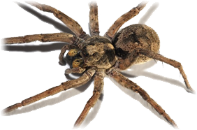
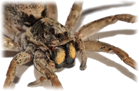
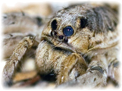
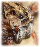
Obviously, the mask needed to resemble a wolf spider and there are many versions: some ugly and scary, some cute and fuzzy, some seem large and menacing while others are small and unassuming. I chose to go with soft and cuddly selection, even if no one would truly want to embrace a spider, a stuffed animal version came to mind. I gathered a few pictures of the variety I was interested in replicating from a couple of angles to visualize some aspects of the spider I wanted to incorporate into my design: legs, eyes, pelt, etc.

Wolf Spider 1Wolf Spider 2
Wolf Spider 3Wolf Spider 4

Creation Process

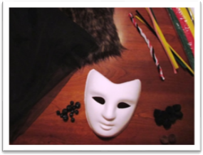
SuppliesI began by gathering supplies. I already owned some pipe-cleaners and pom-poms and a flimsy mask template but I knew I needed quite a few more things to complete the project. While browsing a craft store for additional materials, I ran across a perfect sample of fur in the fabric department and nearby I acquired a sturdy, hardier mask of paper-mâché. I knew I’d like to find a material to cover the eyes of the mask that was still transparent enough to see through so the mask would be functional, even though it was being designed as a decorative item. I searched for a stretchy, nylon material but was unsuccessful in finding something appropriate; but as I looked, I found a string of beads that would suite nicely for the eyes of the spider. A quick trip to a nearby fabric store presented me with a thin, mesh material that I felt could be layered until it was dark enough to provide the desired effect.
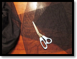
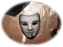
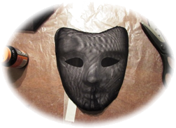
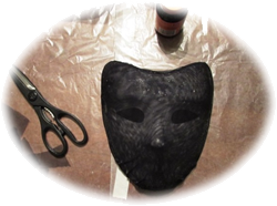
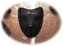
Mesh MaterialFirst, I needed to cover the mask with several layers of the mesh material to ensure the eye socket effect was produced. I cut my fabric into four equal squares, appropriately sized to encompass the entire surface of the mask. Next, I used rubber cement to affix each layer tightly across the eyes and pulled taut from the forehead to the chin.


Layer 1Layer 2
Layer 3
Layer 4

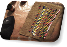
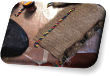
The legs were my next challenge. I wanted them to be flexible and pliable but they also needed to compliment the design and form of my project. To accomplish this feat, I combined four pipe-cleaners in a twisting fashion for each leg and then covered each leg in the pelt of fur I planned on utilizing for the majority of the face. I used rubber cement to fasten the pelt around the pipe-cleaners and secured them with binder clips until they dried, at which time I cut the excess material from each spider leg.

Pipe Cleaner LegsPelt Cover

Spider Eyes


I attached the eyes to the mask before any additional material was added. Trying rubber cement and fabric glue didn’t effectively fasten the beads permanently to the mesh material so super glue was needed to finally secure the spider’s eyes. Four large beads were used to mimic the images of the spiders I had selected, one pair near the mask’s eye sockets and another pair higher on the head. Four smaller eyes were added, two under each eye socket, to complete the effect.
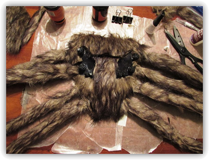
 

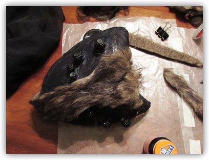
Final ConstructionThe last stage of construction required covering the majority of the face of the mask with fur while simultaneously, attaching the legs to the outer edges of the piece. I added patches of the pelt, carefully trimmed to fit around the eyes, down the center of the mask. Each leg was attached to the sides of the mask by cutting a slit in the material with an X-acto knife, running the end of the pipe-cleaners through the hole and gluing the opened ends on the inside of the mask. A black pom-pom was added to each leg, effectively capping the leg and providing a simulated foot. The remaining exposed areas of the mask were subsequently covered with pelt as appropriate. Two brown pom-poms were included near the mouth area to resemble mandibles. As a final, compositional effect, the legs were adjusted into appropriate positions.

Wolf Spider Mask
Wolf Spider Mask

View/Download PDF

Behind the Mask

She hid her face and turned away
A timid grin and gentle blush
Belied the strength behind her gaze
And power in her tender touch

She veiled her heart and built her walls
Of solitude and privacy
But deep within her secret lair
Longed a beast of dynasty

Her gates stood tall, her fences strong
A guise of faintness worn with pride
Controlling dread thru dominance
Negating what she’d cast aside

Her fear unfounded left me cold
I wondered but I dared not ask
Of beauty she refused to see
Concealed so far behind the mask

Then I saw plainly what she veiled
A smile shielding darker pain
A laugh, a shrug, a careful glance
I knew it well, it knew my name

The walls of shielding built by hands
Who hurt and bleed and scarred from years
Of giving, loving, taking naught
But disdain and forgotten tears

Her fright familiar, left me cold
Still I wondered but could not ask
Of beauty she refused to show
Concealed so far behind the mask

I viewed her mirror and what I saw
Was bold and true, divine and grave
Fierce and daring, gracious, strong
Loving, epic, pretty, brave

While I looked on, it warmed my soul
There was no longer need to ask
Of beauty she could never hide
Revealed from far behind a mask
© Daniel E. Barndt ~2013

Figure & Ground

Assignment

The Figure/Ground assignment is designed to better understand how the former relates to the latter while utilizing variety, harmony and unity.

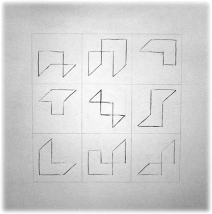
By selecting one sketch from the Symbol Grid project, a series of abstracted images will be created that will reflect similar design traits while completing an overall design in a grid pattern.

The relationship between the figure and the ground refers to a viewer’s ability to distinguish an object from its general surroundings. Comparisons between figure and ground share the following generalities:

  • Ground is usually larger and simpler than figure
  • Figure usually appears on top of or in front of ground
  • Convex shapes tend to be figures and concave shapes tend to be ground
  • Unbroken shapes tend to become figures and segmented shapes tend to become ground
  • Figures are considered dominate
  • Darker colors tend to form figures
  • Figure and ground of the same shape become ambiguous
  • Strong figure/ground relationships exude simplicity
  • Weak figure/ground relationships convey ambiguity

The final composition will fill a 12”x12” grid, divided by 4” squares in three rows and three columns centered within a 3” border on Bristol board. Tools needed include a ruler, a soft pencil, an X-acto knife, various erasers and permanent markers.

PreparationSymbol Grid

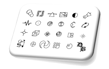
My first step in this project was to decide upon one of the twenty-three symbols from the Symbol Grid assignment to abstract into nine different images. After careful consideration, I choose my icon for transparency.

Transparency

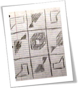
Next, I sketched several preliminary design concepts for the final figure/ground composition. My plan was to use the inherent created shapes within the cubed design to generate non-figurative contours without deviating from the original object.

Preliminary Design ConceptsQuantified Segments

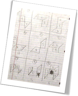
Draft VizualizationAfter producing a series of acceptable shapes based on my transparent cube, I wanted to ensure I was evenly distributing the preëxisting components into my new forms. To accomplish this task, I numbered each segmented shape and quantified them, in turn, resulting in seven distinct parts of my cube. This method afforded me with the knowledge that I had initially used an in proportionate amount of my seventh portion and too few of my second and third. By modifying a couple of shapes, I easily rectified the inaccuracy.

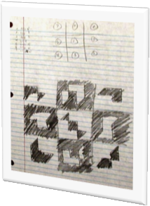
The last step in my preparation was to organize my new forms into appropriate and complimentary locations within the predetermined grid formation. I then quickly sketched a draft to visualize the final layout.

Creation

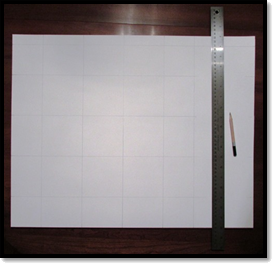
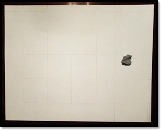
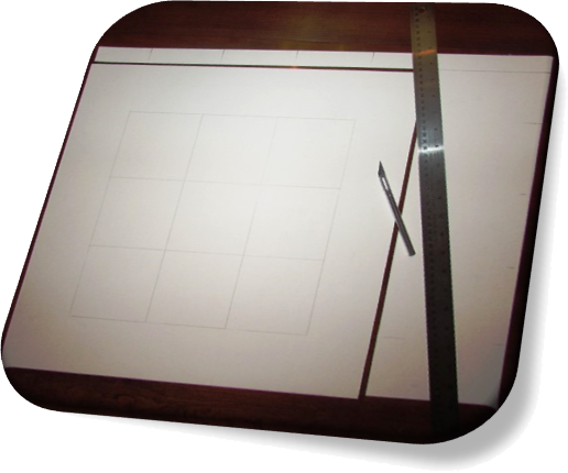
To prepare my Bristol board, I measured the exterior dimensions and marked a one inch section to remove from the horizontal edge and a six-inch section from the vertical, resulting in a perfectly square surface to divide into my composition’s grid of 4” squares. By including three rows and three columns, the final design would equal twelve inches squared.

I then removed the pencil marks from the 3” border of my grid with a kneaded eraser and cut the previously marked excess material from the sides of my Bristol board.

Preparing Bristol BoardCleaning BordersTrimming Edges

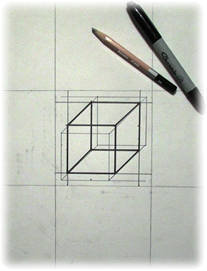
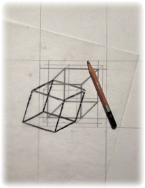
To ensure I would have a size-appropriate original image from which to produce accurate transfers, I recreated my transparency cube within a 4”x4” square in my sketchbook. Using tracing paper, I transferred exact replications of my pre-planned forms based on the specifically combined segments of my transparency cube.

4x4 inch CubeTracing TransferCube Segments

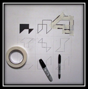
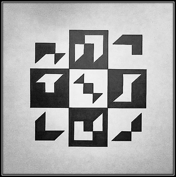
Inking Figures & GroundsTo finalize my composition, I outlined each new form with a permanent marker, taped off the negative areas and filled in the figure with permanent marker. In every other square of my grid, I reversed the method to tape off the positive space and filled in the ground with permanent marker. In each case, the figure stood out from the ground as a smaller, more detailed shape appearing on top of the ground.

On a side note, every new form is created, not only exactly from the original shape, but in the exact position within its respective square in which it would reside if the complete cube were recreated, in whole.

Case In Point

Chapter eight of Art Fundamentals: Theory and Practice by Ocvirk, Stinson, Wigg, Bone and Cayton dove into many aspects of Space, beginning with spatial perception and the major types of space. Spatial indicators, spatial properties of elements and structured ambiguity were also covered in great detail. The chapter rounded out with three-dimensional applications of space.

Case: Space – Near & Far

Space can be actual or illusionary and refers to the interval, or measurable distance, between points or images. When images are created with a singular point of view they are said to be presented in a two-dimensional format; however, in physical works of art, when actual space exists and is treated as an element, the three-dimensionality is more than an illusion or manufactured point of view.

There are two major types of space: decorative and plastic. Decorative space has a height and width but very little depth; in contrast, plastic space refers to the environment in which objects appear. There are two sub-categories of plastic space and deep, infinite space. Shallow space limits the viewer’s penetration into the pictorial space but deep and infinite space creates a spatial perception that extends well beyond the immediate pictorial surface and contains atmospheric perspective.

There are many spatial indicators to represent space and our comprehension to its depth: detail – both sharp and diminishing, size, position, overlapping, transparency, interpenetration, fractional representation, converging parallels, linear parallels and intuitive space.

Elements have spatial properties and the variations are endless but some of the basics include how space relates to line, shape, value, texture and color.

Structured ambiguity refers to space generated by elements and shapes that are vague and appear to fluctuate between being positive, or figures, and negative, or grounds.

Low relief, or bas-relief, sculptures have spatial limitations; whereas, installations, or architectural settings, beckon the viewer to see the artwork from all angles. These are both examples of three-dimensional applications of space. Four-dimensional space integrates time and motion into the experience of a work of art.

In Point

As chapter eight was expansive, Dr. Giampa required five bullet points be developed and I chose to utilize her empathy method to explore the unique characteristics of the types of space, spatial indicators, elemental spatial properties, structured ambiguity and three-dimensional space.

Types of Space

I’m space. Sometimes I’m very shallow and decorative and become flat and contain little depth but other times I seem much more three-dimensional and am considered plastic. When I feel like showing this deeper side of my personality I don’t always show it all at once. I can reveal just a little depth and limit your view into my pictorial space. When I do this I am showing my shallowness and can be compared to a stage with sides and a back wall. If I’m feeling even more generous with my depth, I may become deep or even infinite, letting you see far into an illusionary distance, far beyond my pictorial plane.

Spatial Indicators

My spatial indicators are many and varied. If I want you to see things that appear close to you I make their detail extremely sharp, or I can make them blurry and obscure their details creating the illusion that they are farther away from you. I can also use size to indicate an objects closeness or distance. The smaller the object, the further away it seems; alternatively, the larger an object, the closer you may think it is. If I show you a point of reference, such as a horizon line, and then position objects accordingly, I can provide you with the illusion of my depth based on your real world experiences. I can also overlap objects, obscuring parts of the objects that seem to behind another and I might even use transparency, when you seem to be seeing an object through a closer item, to create various illusions of distance. If you need more help establishing a sense of depth, I can utilize interpenetration, where two objects pass through each other, to produce either an illusion of how shallow or deep I may want to appear. I’ve also been known to do some strange things with fraction representation, in which I combine several spatial aspects in one object or scene. If I use converging parallels to indicate my properties, I angle away from you and one pair of my parallel lines appear to eventually meet. I can also use linear perspective in which I utilize imaginary sight-lines, called guidelines, and extend to a vanishing point, normally at eye level along the horizon line. Below this line there is a ground plane and above it resides a sky plane. The angle from which you view me is considered your location point and is indicated by an imaginary vertical line.

Elemental Spatial Properties

I have many relationships with the elements of design and when I interact with line, or vice versa, movement is implied either toward you, the viewer, or away from you. The types of lines utilized within a composition can also change your perception of me. I work similarly with shapes and how they relate to each other and the environment in which they exist. Value is also an important controlling element for creating illusions of my depth. Light and shadow from the real world are every day experiences, so replicating these values within a pictorial surface will result in similar foreground/background relationships. If I contain sharp, clear or bold textures they may seem to advance while fuzzy, dull and minuscule textures seem to recede. Likewise, contrasting colors can create an illusion of closeness or distance based on warmth, coolness and analogous intensity and hues.

Structured Ambiguity

If I become vague or unreadable or the objects within me cannot be determined as figures or ground, I am considered ambiguous and uncertain, or structured ambiguity. Usually, this is an undesirable state and is caused by equivalency where too many elements are so similar there is little or no contrast. To avoid this, size of objects should be varied, the types of values should contrast appropriately, shape types should not all equal each other and a variety of texture, colors and intensities should define positive and negative areas.

Three-dimensional Space

I am an illusion in pictorial art; however, in the three-dimensional arts, I actually exist and must be treated as an element. I can be restricted in a linear, decorative manner or represented with great spatial independence. An example of each could be bas-relief sculptures and architectural installations, respectively. If you add time and motion into a work of art I become four-dimensional and evolve as the viewer experiences a design of this type.

Final Composition

Transparent Cube
Transparent Cube

View/Download PDF

Case In Point Mapping based on research by
Dr. Joan Giampa http://www.joanmariegiampa.com/teaching/my_research.html