Research the 7 Principles and 16 Sub-principles of Design
- Harmony
- 1.1. Repetition
- 1.2. Rhythm
- 1.3. Pattern
- 1.4. Closure
- 1.5. Shared Edges
- 1.6. Overlapping
- 1.7. Transparency
- 1.8. Interpenetration
- Variety
- 2.1. Contrast
- 2.2. Elaboration
- Balance
- 3.1. Symmetrical Balance
- 3.2. Approximate Symmetrical Balance
- 3.3. Asymmetrical Balance
- 3.4. Radial Balance
- Proportion
- 4.1. Scale
- 4.2. Golden Mean
- Dominance
- Movement
- Economy
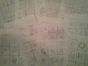
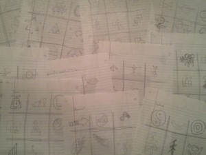
Sketch 9 Thumbnails for each Principle
First I quickly sketched each Principle with an ordinary number two pencil on lined notebook paper.
Once I had a general idea of the 9 ideas for each symbol, I drew quality versions in my Sketchbook and made each the approximate size of the finished product. I sketched the first layer with a 4B pencil (I prefer this weight for general sketching and drawing) but went back over each sketch with a 6B pencil (a slightly softer graphite produces a nice dark edge and shades quickly and effectively).
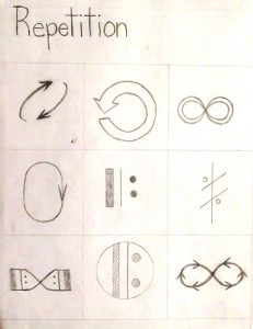
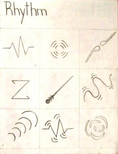
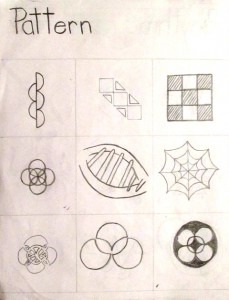
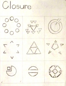
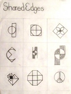
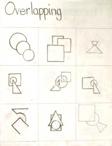
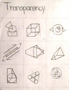
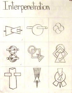
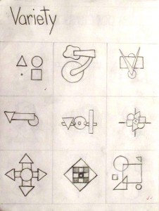
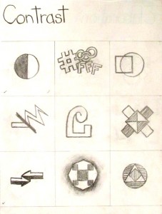
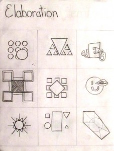
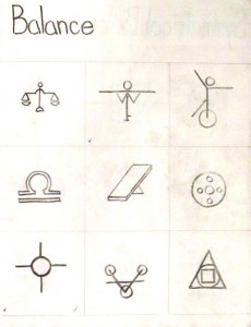
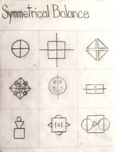
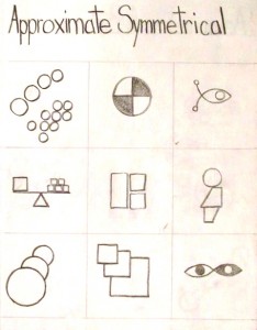
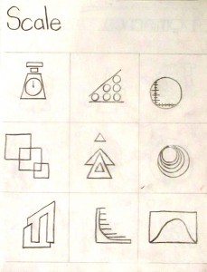
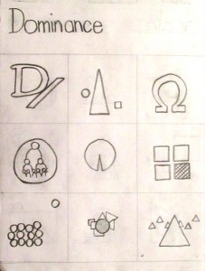
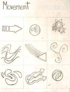
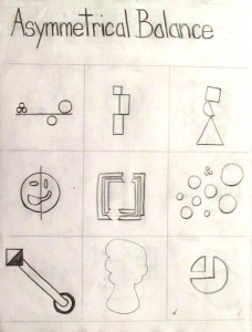
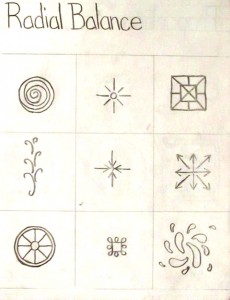
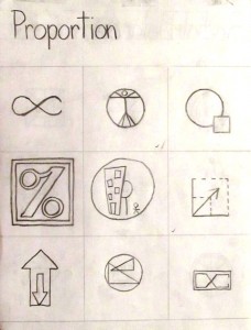
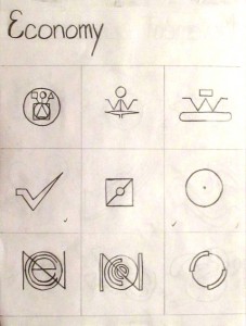
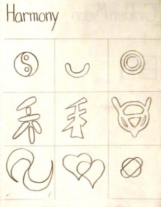
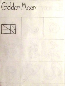
Every other page is covered by a piece of tracing paper to protect both pages from smearing graphite and accidental image transfer.
Transfer Preparation
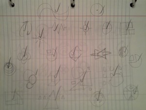
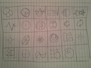
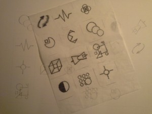
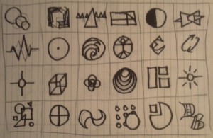
After sketching and re-sketching 9 versions of each Principle, a favorite was chosen of each. I then quickly sketched each favorite symbol on one sheet of notebook paper – grouped by complexity, similarity and balance – to decide where in the final composition each symbol would reside. Next, I sketched a quick mock grid to place each symbol in an appropriate cell.
I based my positioning of each symbol on the approximate weight, position, movement and assumed modifications I might make while transferring the symbols. The twenty-fourth cell was reserved for my signature icon.
Grid Creation
Trimming an inch from the long edge of a 19”x24” sheet of Bristol paper with an X-acto knife provided me with a 6×4 grid of 3” squares with a 3” border. A ruler, T-square and drafting triangle were used to measure and outline the grid.
Image Transfers
Because of the extra work completed in week one – producing quality and to-scale sketches – the transfer process was simplified for most of the symbols and required no, or very little, modification. A piece of tracing paper and an 8B pencil allowed me to copy each symbol to my 18”x24” Bristol sheet.
Each image was traced from my sketchbook to tracing paper. The tracing paper was flipped over and the negative was traced (to add graphite to the negative image). The tracing paper was then placed in the appropriate position on the Bristol grid, positive side facing up, and traced once more; thus, transferring the exact image desired in the appropriate location within the composition.
Once all the images were transferred from my sketchbook to my Bristol board, I traced over my draft version of the layout with permanent marker to visualize how the final project would look.
After finalizing each image with permanent marker and adjusting the weight of specific images to balance the overall composition, all the grid pencil marks and visible marks within each individual image were completely erased and the completed image was checked for stray marks and blemishes.
Documentation of the entire process was completed at each stage of the composition development.
Learning Process
In preparation for this project, Dr. Giampa expected the class to read two Chapters of Art Fundamentals: Theory and Practice by Ocvirk, Stinson, Wigg, Bone and Cayton and then develop a Case In Point map for each to dissect and scrutinize what we learned.
Case In Point – Form, Design, Composition
The first assignment was to summarize Chapter Two which was based on Form but included the Elements of Art, the Principles of Organization and covered the creation of Space and Visual Unity. I found the exercise very helpful in understanding the specifics of not only the individual elements but the principles, as well. For example, while I originally included the elements in my Case, stating that they included line, shape, value, texture and color, I expanded upon this very general declaration as a bullet in my Point by specifying that not all the elements are always used together but many of them are automatically combined within a design and organized to establish good form. By summarizing the information contained in the textbook and then expanding upon it by engaging in deeper thinking about each main point I found most important, my thoughts were focused and succinct and I then applied this new perspective to my design in progress. I found it extremely helpful while choosing the location of the symbols within my grid based on harmony and variety. Movement and economy were also strongly considered centered on my recent investigation into the Principles of Organization.
Case In Point – Fundamentals of Art
After learning about Space and Visual Unity, the Elements of Art and the Principles of Organization, the same process was applied to Chapter One and the three Components of Art: Subject, Form and Content. Again, I started with a general encapsulation of the chapter, briefly covering the evolving nature of art, Organic Unity and Abstraction. The main points I wanted to discuss, however, were the components themselves and how Subject is essentially the topic or “what” of a design, Form is the “how” or development of a piece and Content is the intention, meaning or “why” of the art. By drilling down into each component I explained how the subject of art may be representational or nonrepresentational and the more abstract the representation becomes, the less identifiable the subject becomes until it reaches a nonobjective state. I described Form as an overall union of the elements of art utilizing the principles of organization and indicated that the message, emotion or mood of a work of art is considered its content. Each of these investigations into the deeper meanings of what was explained in the textbook helped me comprehend the essence of art and with this foundation I could move on to the creation stages of my projects.
Self-Critique
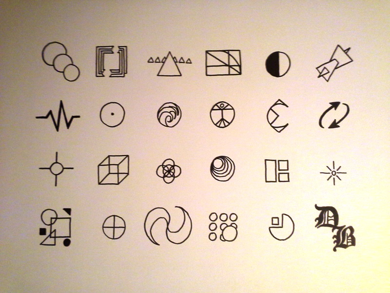
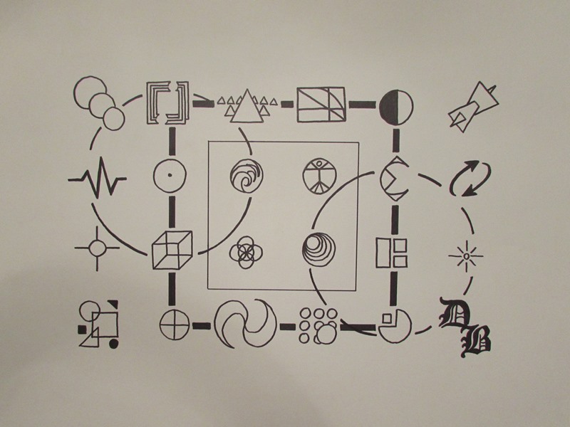
The symbol grid is a visual manifestation of the 23 principles and sub-principles of design. Each icon is representational of a separate and distinct idea or method utilized while planning a composition. The overall subject is a key to design and a guide to development. By approaching the component of “what” as a representational subject, the symbols are physically characterized as individual icons. Even in cases where the principles are more abstract, a physical manifestation is utilized as each symbol is developed. Line, shape and value are obvious while texture and color are not generally employed (other than basic black and white, of course).
While many of the elements of design were employed in each symbol, the principles of organization were needed to combine the icons into a single composition. Balance and proportion were utilized to arrange the symbols into various locations on the grid and some icons needed extra weight, or value, to balance their corresponding images while others needed directional adjustments to ensure fluid movement was achieved within the design. To address the “how”, or organization, component of the piece directly indicates the principles of organization and how they were used to place each icon in its specific location within the grid. Round objects were offset by sharp, jagged icons while darker symbols were placed within the composition based on lighter designs surrounding that area. The direction of some icons was adjusted to indicate internal movement. Balance, economy, proportion and contrast were all apparent in the organization of the piece.
When completed, the overall design felt cold and mechanical. While personally meaningful, the distance between objects resulted in an impersonal and detached product. The thought and effort poured into the project was neither apparent nor represented which left the piece hard and empty. Analyzing the “why” component of the work revealed this disappointment. Energy and soul were a large part of the creation of the composition but the fact that the end result was devoid of feeling made the piece emotionless and isolated. The remoteness of each symbol emitted an automated, rigid, measured sensation. Some movement was apparent within the design but as a whole the image became very static and hollow.
Redesign
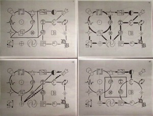
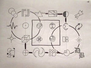
Not happy to leave my Symbol Grid in its current, disconnected state, I experimented with some compositional additions that kept to the spirit of the project. To that extent, I decided to go with some of the basic building block shapes that every symbol within my project contained: the square and the circle. I simply printed photographed copies of my project and drew my ideas on the prints.
After four prints and about 10 design experimentation’s, I chose an idea based on print number four.
As you can see, even the final version is slightly different from the chosen print experimentation. After adding the initial shapes to tie the piece together, the broken square – previously placed in the background as the farthest element from the viewer – was moved forward to reside within the middle ground of the piece. The circles were also darkened in contrast to the central square but nowhere near the thickness of the aforementioned broken square. The contrast in value between the four additional elements and the opposition to their traditional, assumed behavior regarding perspective – darker shapes advance while lighter shapes recede – leveled the image, once again, to a flat surface; however, with the modifications in place, the overall design became fluid, stimulating and sincere.
Case In Point Mapping based on research by
Dr. Joan Giampa http://www.joanmariegiampa.com/teaching/my_research.html


