

Assignment
200 Lines is an exercise in utilizing straight lines, and straight lines only, to create an abstract design that shows space. Materials needed to complete the project included pencils, erasers, a ruler, permanent markers and an 18”x24” Bristol board. The composition could be horizontal or vertical but no border would be employed. The end result was expected to show a development of each student’s line variety.
Development
 I started this project by creating a series of lines based on the physical characteristics of line: measure, type, direction, location and character. Where measure refers to the length and width of a line, it implies much, much more. For instance, thick lines can communicate a sense of stability and thin lines may suggest movement.
Some examples of different types include straight lines, curved lines and angular lines – each having distinct characteristics. Straight lines may seem rigid or stiff while curved lines are often stimulating and exciting. Angular lines might be confusing or interesting, depending on their implementation.
The direction and location of a line can change its emotion and psychological response from the viewer. Slanting a line upward may inspire a sense of strength while slanting it down could diminish its vitality. Lines high in a design could appear to soar while those same lines lower within an image may seem to plunge. Horizontal lines may indicate serenity while vertical lines can be interpreted as ambitious.
The character of a line can be implied by both the medium and surface utilized during the creation of a design. In this project both were chosen beforehand but care was taken to understand the difference between the sketches and preliminary designs on notebook and sketch paper verses the final composition on Bristol board.


After my initial sketches on notebook paper, I transferred some of my line experimentation’s to a sketchbook in pencil and then tested the change in look and feel when outlined in permanent marker. I took the same approach in sketching preliminary design ideas, starting on notebook paper, transferring to my sketchbook and finally adding marker to emulate the final project materials.


 To ensure the final design was in compliance with the basic instruction regarding using only straight lines, a few revisions of the composition were created and a completely straight-lined version was sketched. Ultimately, this sketch would be the basis of the final project.
Sneak Preview
Case In Point
Chapter Three of Art Fundamentals: Theory and Practice by Ocvirk, Stinson, Wigg, Bone and Cayton was assigned in preparation of this assignment as a study in line. In addition to the physical characteristics of line previously mentioned, the relationship between line and shape, value, texture and color were discussed as well as the spatial characteristics of line, line as representation and expression and three-dimensional applications of line.
Case
Line is the most basic, yet arguably the most utilized, element of design. Whether physical or implied, two-dimensional or three, the line provides movement, structure, description and definition to an image or sculpture. The measure of a line refers to the physical dimensions of a line – the width and length: measurable proportions. When describing types of line, one can be referring to the direction, or multiple directions, of a line. A line can be straight, curved, graceful or abrupt. Each of these directions, combined with differing measures, has the potential to produce many different emotions and feelings within a viewer. To expand upon direction, there are different implications regarding the course of a line: horizontal lines may indicate stability while vertical lines might suggest poise. Diagonal lines are more likely to imply movement or anxiety and a line may contradict its basic nature by the overall direction of its course. Another element of line is its location within a composition. While heavy lines high in an image may suggest to the viewer a sense of imbalance and a contradictory representation may cause the viewer to reject the objects location within the design, serene lines in appropriate and expected locations within a work of art may exude a peacefulness and calmness in the viewer. There are also many illusions that may be created by an artist depending on the location of specific lines. A line, every line, has character. Many times this character is defined by the medium used regarding the artist’s instruments and surface as well as the method by which the artist utilizes their implementation. Shapes are created by their outer edges and defined by the lines which produce those edges, or contours; in addition, cross-contours indicate the rise and fall of a shapes surface. The value of a line refers to the lightness and darkness of a line in contrast to its background. Close, thin lines may represent a darker area even better than thick lines or completely darkened ranges of a surface. Hatching and cross-hatching are popular methods of indicating shading by varying the quantity, direction and intimacy of lines. Texture may also be inferred via line by producing a rough or smooth look by the artist’s use of surface and instrument regarding medium choice. The color of lines within a composition can create the illusion of receding or advancing images based on the choice of warm or cool colors just as thick and thin lines may indicate advancing or retreating shapes. Calligraphic lines may be considered specific to fancy writing techniques; however, more often than not, these lines are fluid, implied – even abstract – lines that visually represent the artist’s intent and produce the desired effect within a design. Gestural drawing, on the other hand, is very free and quick sketch-like lines which can characterize movement and flexibility within an arrangement.
In Point
I chose to further develop my Case In Point map on Line by utilizing the empathy strategy pointed out by Dr. Giampa in which I discussed three bullets from the Case above by exploiting the line’s point of view.
Direction
As a line, my direction decides the feeling a viewer senses by looking at the shapes I produce. If I stand tall and straight, I imply a sense of composure, ambition or hope while when I move level and horizontally I exude tranquility and constancy. By changing my mind and moving diagonally, the viewer may feel nervous, a sense of motion or impulsive tendencies. If I slant upward, I radiate strength, suspense and positivity; in contrast, if I slant downward, I issue a sense of decreasing energy.
Location
My location is important to a viewer because my visual weight changes in the eye of the beholder. Expectation makes up a large part of this visual suspense and I can generate serenity out of commotion just by altering my location within a composition. High in a design, my diagonal lines can appear to climb while lower in the design they may appear to dive.
Value
By changing my value, I transform from dark to light and based on my background I can increase and decrease the contrast of the shapes and lines I define. Utilizing wide lines, I appear to have a dark value while thin lines make my value lighter; similarly, many lines close together make my value darker and generously spaced lines will appear light.
Design
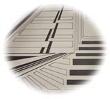
Once I decided on a starting point, it was time to draw my initial design on Bristol board with a ruler and an 8H pencil (the softer, the better). I painstakingly spaced certain lines at specific intervals to ensure proper repetition, thus allowing certain patterns to develop. Adding permanent marker to the image permitted me to see where my value choices needed development and how my use of straight lines could produce an illusion of curved images. Some connected lines indicated shapes that other individual lines reproduced, thus proving similar effects could be made with diverse techniques. Implied lines were used to indicate the interpenetration of inferred shapes.


By varying the thickness of the lines in my design, I balanced the overall composition and created harmony within distinct areas as well as contrast with surrounding elements. While some thin lines were meant to seem farther away from the viewer, others were intended to create a sense of weight and value. Specific lines and their implied counterparts were added to disrupt the assumed location of imaginary shapes depending on the focus of the viewer. Instead of threading adjacent elements, these lines purposely throw the same area of the composition forward in one perspective and backwards in another. Movement is created, not only by the direction of these lines but by the demand upon the viewer’s eye to constantly move in an attempt to disentangle the illusion. Continuous, angular lines were utilized to subtly draw the more curious and scrutinizing viewer into neighboring regions of the image. In one case, a single uninterrupted line angles 45 times (technically becoming 45 separate lines) to cross three distinct parts of the design. Other lines are a meager centimeter long but are vital to the overall impression of a distinct shape.


Overlapping lines were incorporated into the design to provide variety and depth while also adding scale and proportion and interest levels to the interpenetrated shapes. By balancing the contrast between light and dark, several lines were deepened and thickened and additional components were included to enhance movement.
Within this project, all of the basic elements have been utilized, specifically shape – mostly implied – contrast – dark versus light, curved verse angular lines, connected verses suspended shapes – and, of course, line in all its glory. Color is used in its purest sense of black and white and texture, although subtle, is included in several areas. By combining all of the Elements of Art and using the Principles of Organization, an innovative, cohesive piece of artwork has been fashioned out of one plain sheet of Bristol board and various permanent markers.

Bigger On The Inside
Case In Point Mapping based on research by
Dr. Joan Giampa http://www.joanmariegiampa.com/teaching/my_research.html


