Color Theory

Color Relativity

Assignment

The Color Relativity projects are based on Josef Albers’ color theory exercises and are designed to demonstrate the phenomenology of color and investigate the interaction of color.

Using the color theories of value, subtraction and complementary (simultaneous) contrast, resolve the following problems with Color-Aid paper mounted on Bristol board.Exercise Format

  1. Make one color appear as two.
  2. Make one color appear as the opposite ground.
  3. Make two colors appear as one.

Terminology

Value is the lightness or darkness of a color. The more white you add to a color or hue, the lighter the value. When you add white to lighten a color, it is called a tint. The more black you add to a color, the darker the value. When you add black to a color to darken it, the resultant color is then called a shade. If you add gray to a color, it results in a tone.

A subtractive color model explains the mixing of a limited set of colorants to create a wider range of colors, each the result of partially or completely subtracting (absorbing) some wavelengths of light and not others. The color that a surface displays depends on which parts of the visible spectrum are not absorbed and therefore remain visible.

Simultaneous contrast is the tendency of a color to induce its opposite in hue, value and intensity upon an adjacent color and be mutually affected in return.
Cutting Bristol BoardExercise One

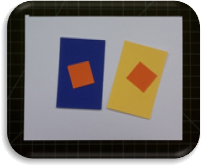
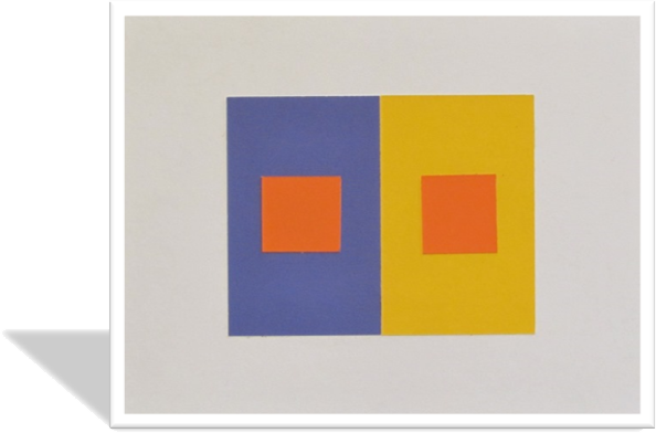
The objective of this experiment is to have one foreground color look like two different colors by placing it on two different backgrounds.

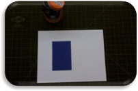
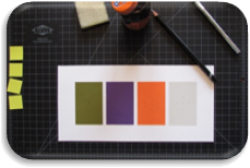
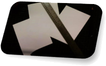
I began this project by cutting Bristol board to size, specifically 5 ½”x7”, with an X-acto knife and a ruler on a self-healing mat.

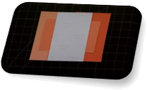
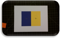
After testing several color combinations, I settled on a dark blue background and a light yellow background with an orange foreground. The Color-Aid paper I utilized was 2”x3” and I extracted two 1” squares for the foreground. The next step was to simply attach each background to its Bristol board counterpart and, in turn, fasten each foreground color to the appropriate background. To ensure I centered each piece correctly, I measured and marked every component, either by cross-hairs or guideline marks.

Color TestingAttaching BackgroundsCentering Foregrounds

The final result creates the illusion of the square on top of the yellow background being slightly darker than its natural hue and the square on top of the blue background seems slightly lighter than its natural hue.
Duplicity
Duplicity

Exercise Two

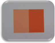
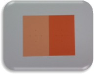
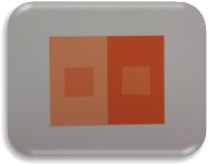
Hue ExperimentsThe objective of this experiment is to have one foreground color look like its opposite background color of two different backgrounds.

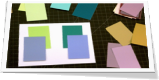
This project was actually the most challenging and I skipped to exercise three and came back to this one after giving my eyes a chance to recuperate. The difficult part of this task was solving the problem of making three colors seem as only two, with the foreground of study one mimicking the background of study two and vice versa. While the backgrounds are different, the foreground of each is the same hue.
Measured & MarkedIt took quite a while to experiment with many colors, shades and tints before I found an acceptable series of peach swatches that accomplished my desired effect. By placing the two background hues beside each other with the third color crossing both and then breaking the connection with a piece of white paper, I could visualize the result: the figure in study one mimicked the ground in study two and the figure in study two mimicked the ground in study one. Happy with my choice, I measured and marked my Bristol board to apply the background pieces and then marked the dimensions of the foreground squares.

 Backgrounds Center Marks Foregrounds

While similar to exercise one, where one color darkened on a light background and lightened on a dark background, exercise two also added the transformation influence to complicate the illusion.
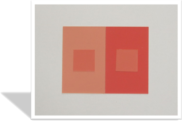
Masquerade
Masquerade

Exercise Three


Blue Swatches

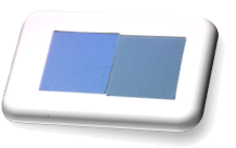
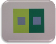
The objective of this experiment is to have two different foreground colors on two different backgrounds appear as the same color.

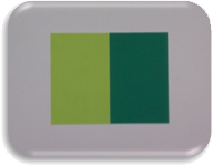
I began this project by selecting two different blue swatches that I wanted to appear as the same color. To accomplish this task, I experimented with several different backgrounds and settled on two different shades of green: one a light, yellow-green to offset the darker blue and the other a darker moss-green to enhance the light blue. Again, I affixed the background pieces first, painstakingly measuring and gluing with rubber cement. After each piece dried, I cleaned the edges with a rubber cement eraser to ensure a clean presentation.

Shades of GreenCementing BackgroundsAffixing Foregrounds

The final result creates the illusion of both squares being the same hue while, in reality, they are actually different colors displayed on different backgrounds and simply appear to be the same.
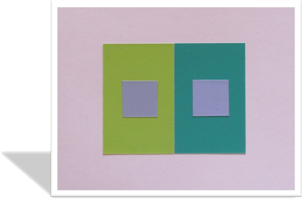
Impersonation
Impersonation

One additional project was added to Albers’ three original exercises: a value demonstration in a series of four ground hues with one identical figure color on each.

Exercise Four
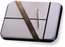
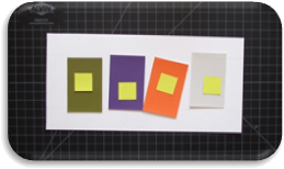
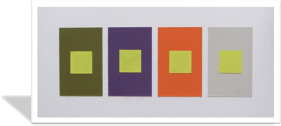
Custom Bristol BoardThis experiment demonstrates the value change a single color displays while being placed upon different backgrounds of varying hues, shades and tints.

To begin, I needed to cut a custom piece of Bristol board to encompass four ground samples but this time they would be separated by some white space. To ensure my piece was consistent and professionally displayed, I planned the placement of each 2”x3” swatch ¼” apart with a 1 ¼” boarder. With these internal dimensions decided, the Bristol board itself would measure 5 ½”x11 ¼”.
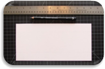
GuidelinesSmall tick-marks and light guidelines were added to the prepared Bristol board to ensure proper placement of each value display. Before permanently affixing each ground and figure, I visualized the order of hues by placing each on the Bristol board: starting with the darkest hue and shade and moving left to right until reaching the lightest hue and tint. I choose a dark green, royal purple, primary orange and a light gray as my backgrounds and a light yellow as the foreground color that would be displayed as each figure.

Visualizing HuesAttaching Backgrounds

Next, each ground was attached to the Bristol board with rubber cement and the center of each was measured and marked to prepare for the figures. A rubber cement eraser was utilized to clean up any extra glue and the four figure squares were measured and cut for placement.

The final result creates the illusion of each square changing in value as it is viewed on different backgrounds thus demonstrating the relationship between figure and ground from a color theory perspective.

Fluctuation
Fluctuation

View/Download PDF

Analogous Designs

Warm Vs. Cool

Assignment

The analogous project’s intent is to demonstrate the differing impressions that cool and warm colors can have upon an identical design.

Analogous Colors

Terminology

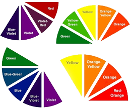
  • Analogous colors are groups of colors that are adjacent to each other on the color wheel, with one being the dominant color – which tends to be a primary or secondary color – and two on either side complementing – which tend to be tertiary.
  • Warm colors are often said to be hues from red through yellow, browns and tans included.
  • Cool colors are often said to be the hues from blue-green through blue-violet, most grays included.

Kitchen CompositionPreparation

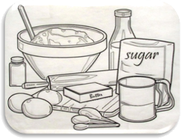
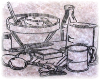
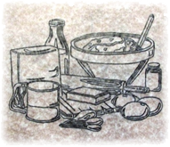
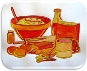
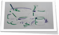
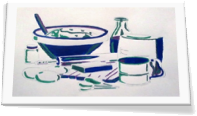
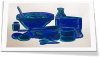
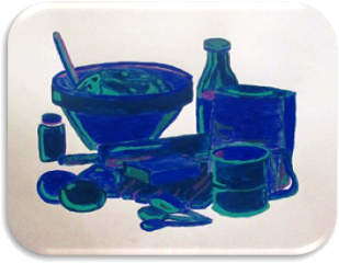
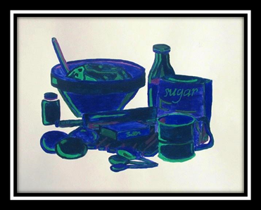
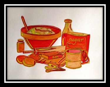
I chose to recreate a design I had previously used while experimenting with simple black and white values: an abstractly, modest kitchen composition with exaggerated highlights and shadows.

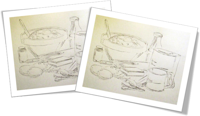
The first step was to transfer the positive image to tracing paper and then copy the negative image on the opposite side of the tracing paper with a soft pencil. Once the tracing paper was ready, the image could be transferred to two different pieces of Bristol board: one for a cool composition and the other reserved for a warm version.

 Positive TraceNegative Trace

Transfers

Warm Composition

My warm analogous design consisted of a yellow to red color palette where yellow appropriately represented the highlights and red signified the shadows. Between these two primary colors I utilized several tertiary colors including two versions of yellow-orange and two types of red-orange.

 Warm Composition

I was informed that my warm composition gave an impression that it had been developed with watercolors as opposed to the gouache paints I utilized; so, during the cool composition I attempted a thicker application.

Cool Composition

My cool analogous design consisted of a violet to green color scheme with green indicting the highlights and violet suggesting the shadows. Sandwiched between these two secondary colors I incorporated several tertiary colors including two forms of blue-violet and two variations of blue-green.

In both designs I added two colors at a time and then touched-up highlight and shadow areas after the composition was completely dry.

Colors 1 & 2Colors 3 & 4Colors 5 & 6

Critique

The results of my thicker application of paint were not pleasing to me personally but I did learn something, or perhaps realized something I already knew: art is created for the artist; if others appreciate the outcome, then that’s simply an added bonus. A second lesson learned was that the media is not important and neither is the ability of a viewer to recognize the media utilized. The work is the significant feature, not what created it or if an external party can identify the process employed. When technique becomes more important than the creative process or the piece itself, you’ve successfully destroyed the spirit of art.

Cool Composition

The last touch was to add the lettering to each design. I chose to utilize the lightest color for each: for the warm design, yellow; for the cool design, green.

Final Compositions

Warm Kitchen
Warm Kitchen


 Cool Kitchen
Cool Kitchen

View/Download PDF

Color Wheels

Assignment

The color wheel project is designed to better understand the relationships between the twelve most common color divisions along with their tints and shades and to develop painting techniques and mixing skills via practical exercises.

Terminology

  • A color wheel, or color circle, is an abstract illustrative organization of hues around a ring that shows the associations between primary colors, secondary colors and tertiary colors as well as display complementary color affiliations.
  • Hue refers to a pure color: one without tint or shade.
  • Tint is the mixture of a color with white, which increases lightness.
  • Shade is the mixture of a color with black, which reduces lightness.
  • Primary colors are sets of colors that can be combined to make a useful range of colors. For human applications, three primary colors are usually used, since human color vision is trichromatic. These colors cannot be created by mixing others.
  • A secondary color is a color made by mixing two primary colors in a given color space.
  • A tertiary color is a color made by mixing either one primary color with one secondary color, or two secondary colors, in a given color space.
  • Complementary colors are pairs of colors which, when combined in the right proportions, produce white or black. When placed next to each other, they create the strongest contrast and reinforce each other.


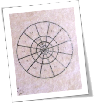
Tracing TemplateClassic Color Wheel

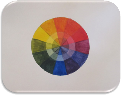
The first exercise was to create a color wheel with the three primary colors, three secondary colors and six tertiary colors by utilizing black, white and the three primary colors only. Additionally, each color would include its tint in a second ring and its shade at the center of the wheel.

I started this project by tracing a color wheel template on tracing paper and transferring it to 11”x14” Bristol board.

To produce the twelve colors needed to complete the classic color wheel, I utilized Liquitex Basics acrylic Cadmium Yellow, Cobalt Blue Hue and Primary Red. To create each hue’s tint, I used Titanium White and to create each hue’s shade I used Ivory Black.

Classic Color Wheel

Personal Color Wheel

The second exercise was to create an abstraction from the classic version of a color wheel by interpreting the image in a personal manner while simultaneously adhering to the pattern of the original.

Strategy

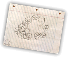
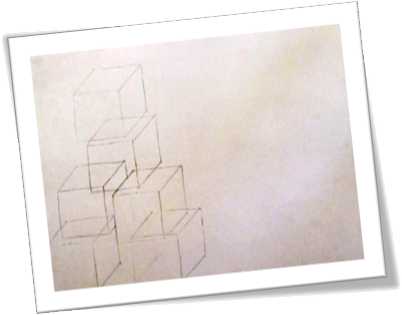
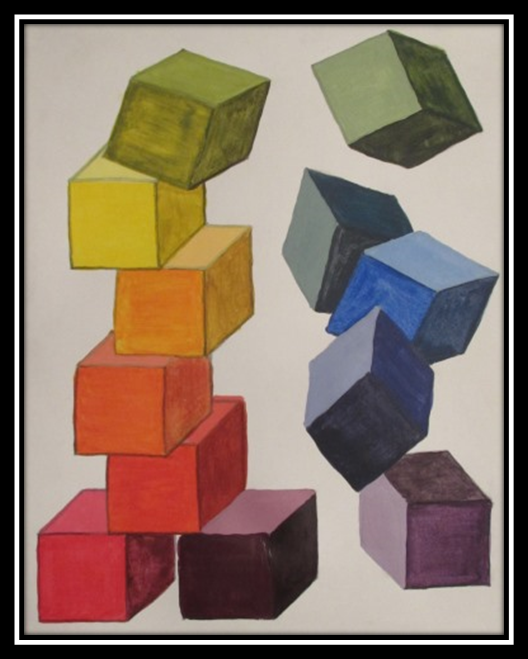
I began my process with a general vision of building blocks, stacked to a point and then tumbling down the opposite side of my composition. I chose this imagery for several reasons: first, the angular properties of square shapes directly contrasted with the gentle, circular properties of the classic ring, or wheel, layout; second, the positioning of such objects within my project could be more abstract without Layout Sketchabandoning the structure of the color wheel; and third, the inherent ability to show only three sides of a cube allowed me to distinctly display each hue’s tint and shade by assuming an implied light source.

I quickly sketched my initial impression of some blocks being stacked on one side of a piece of notebook paper and had the remaining cubes fall down the opposite side, thus completing the imagined circle. I also included indications of which colors would occupy which blocks starting with red and continuing around the classic wheel ending with red-violet.

Visualization

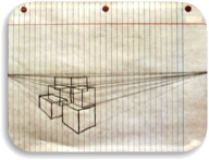
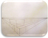
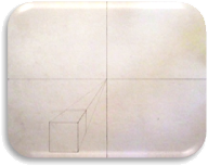
I experimented with several perspectives before deciding on my final scheme. Beginning with a simple two-point perspective, I quickly realized that this method might produce issues with the ability to view enough of the third side of my cubes at certain angles, unless I wanted to be completely above or completely below the horizon line. With this thought in mind, I experimented with three-point perspective and assumed a vantage point slightly above my subject. I found that I wasn’t happy with my choices of block positioning utilizing this method and wasn’t prepared to calculate each block dimension to ensure consistent proportion, so I moved on to an unassuming  one-point perspective. After adding the first cube to this version, I knew I wouldn’t get the sought after effect in my final design, even though I did think it could work with this slightly abstract version. Then I came to the blindingly obvious realization that what I was looking for was, indeed, an abstract composition, so I threw out perspective entirely and concentrated on my basic shape: the humble cube.
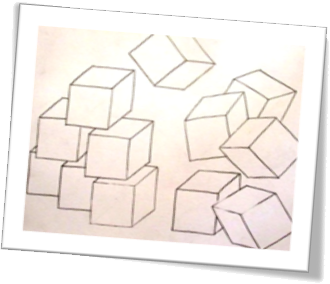
Two-Point PerspectiveThree-Point PerspectiveOne-Point Perspective

Composition

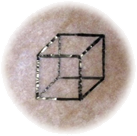
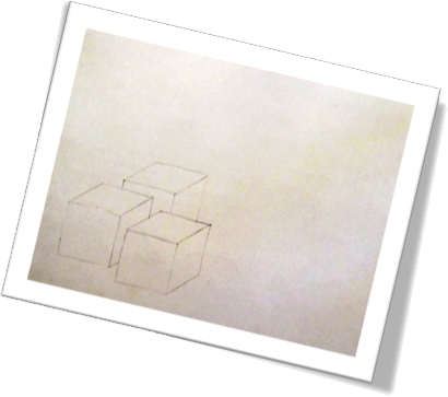
Because I wanted to use the exact same cube dimensions for all twelve blocks, I created a transferable cube on tracing paper and began sampling block placement within my Bristol board. My first attempt at stacking the left side made me realize I’d have to be careful with my cube locations so that, as some blocks sat upon others, all three sides – or at least some portion of each – would remain visible. I Transparent Cubecompleted an entire version in a landscape layout with which  I could have moved forward; however, I discovered that the stacked side seemed too tight for my liking and conflicted with the tumbling, loose side. So, back to the drawing board I went. I started my next attempt with a pleasant, unrestricted stack of cubes but recognized I now required more vertical space to complete the effect I desired. By taking everything I’d learned thus far and applying my newly discovered knowledge to a portrait layout, I finally found a composition with which I was satisfied to continue.
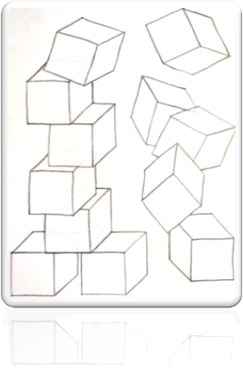
Stacking BlocksSecond Set of BlocksLandscape Design

Portrait DesignColor Application

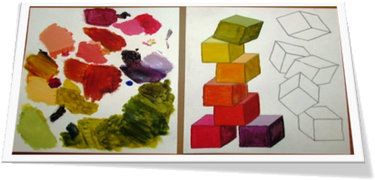
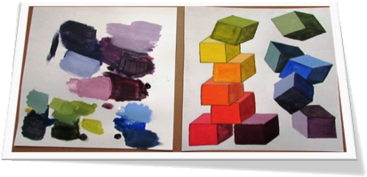
Now that I was ready to start painting, I needed to make some color placement choices. I knew that I wanted to start near the bottom of the stacked cubes and make my way through the primary, secondary and tertiary colors by climbing to the top of the stack and then following the falling blocks back to the bottom of the design. I decided to let my warm colors ascend through the work and
as they started to cool they would drop to the beginning and start their journey anew. This compositional plan lent credence to my piece by mimicking familiar heating and cooling behavior.

I assigned the innermost bottom block red-violet and moved in a clockwise motion through the warm hues, passing through red,
red-orange, orange, yellow-orange, yellow and yellow-green before dropping through the cool hues of green, green-blue, blue,
blue-violet and ending in violet.

I utilized a Simply Simmons Watercolor #4 round this time, but with all the same acrylic paints as before.


Warm Colors

Rising Hues

Cool Colors

Color Cubes
Color Cubes

View/Download PDF