
Contents
Project #3: Poster
Research
Start with Process Book and develop ideas. Always include the following:
- 3 very rough sketches (you may work at half size, 5 x 7″)
- Type Studies
- Color Studies
- 3 High-end Digital Drafts
- Analysis
- Final
Criteria
Final execution will be in InDesign. All graphics and imagery will be created in Photoshop.
- Tutorials for special effects type in Photoshop:
http://creativenerds.co.uk/tutorials/70-photoshop-ttorials-for-creating-perfect-typography/
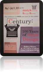
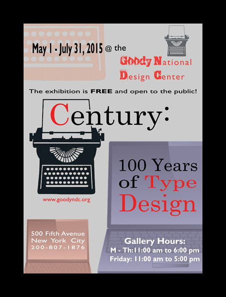
You will produce a poster for a Design Exhibition called: “Century: 100 Years of Type Design”
You must be able to combine imagery with type to clearly communicate both the subject and the information details to a wide-ranging audience.
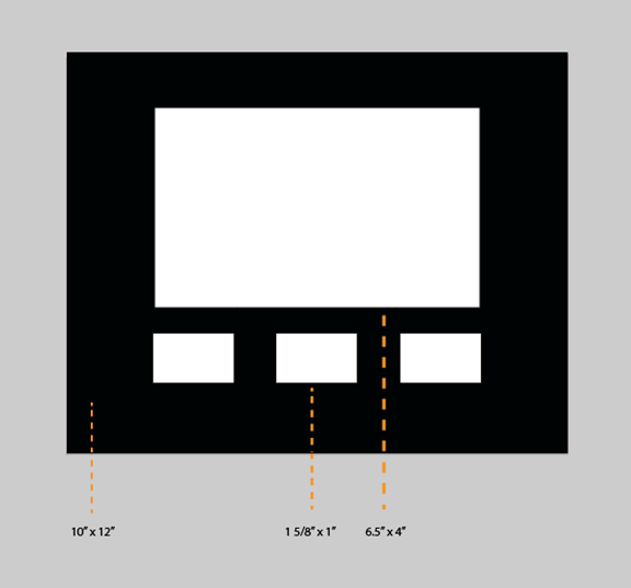
- Size 10″ x 14,” Portrait (vertical)
- Resolution is 300 ppi
- Color Mode: Full color, CMYK (choose colors that are going to best represent your poster)
- Consider all the design principles you have learned: Emphasis, contrast and flow…etc.
- Use all the text below (you will decide what the best order should be and which text should stand out)
- Use or combine at least two high quality images that will grab attention
- DO NOT download random images from the web (No JPEGS, GIFS, or PNGS… TIFFS only)
- Copyright-free imagery is okay (you may take your own photos)
- Use only two typefaces (this includes all weights, italics, upper and lower case, etc.)
Poster Text:
You must use all of this copy!
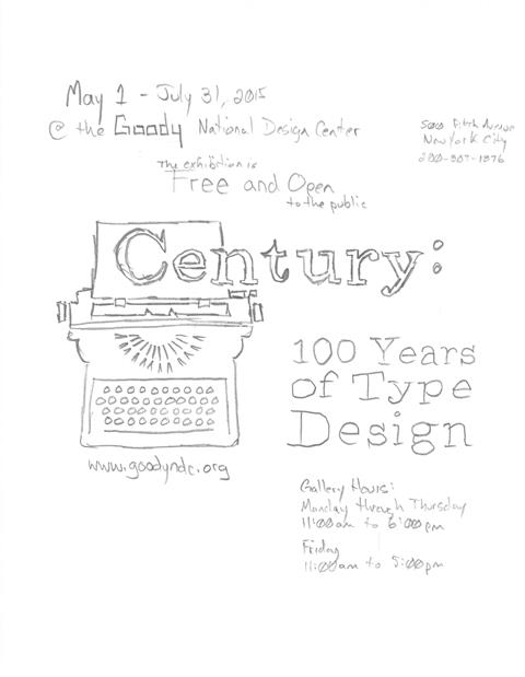
Century: 100 Years of Type Design
May 1 — July 31, 2015
At the GOODY National Design Center
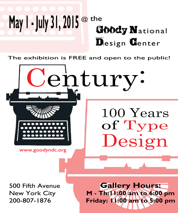
500 Fifth Avenue, New York City
200-807-1876
www.goodyndc.org
Gallery hours:
Monday through Thursday: 11:00 a.m. to 6:00 p.m.
Friday: 11:00 a.m. to 5:00 p.m.
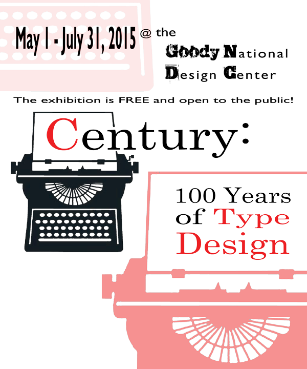
The exhibition is free and open to the public.
GOODY (NOTE: use “GOODY” as the word-mark logo. You decide the typeface, style and size)
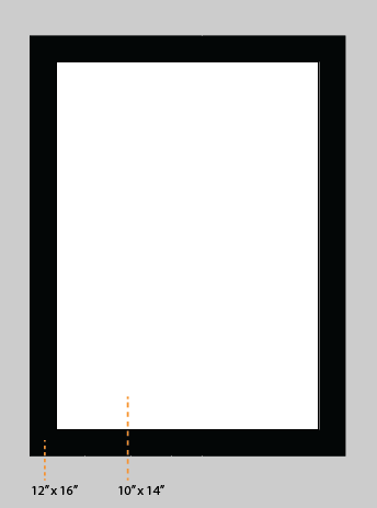
Print the poster and mount it on a 12” x 16” black board
Critique
Produce and submit three rough ideas for the critique discussion.
Final
Add flap. You must have at least three drafts included with your final project.
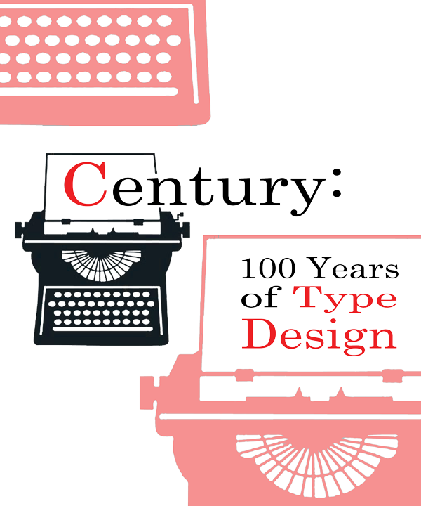
Century: 100 Years of Type Design
Research:
My research began, naturally, with an investigation into the event itself which was hosted by the American Institute of Graphic Arts (AIGA). Other areas of interest revolved around the actual history of typography.
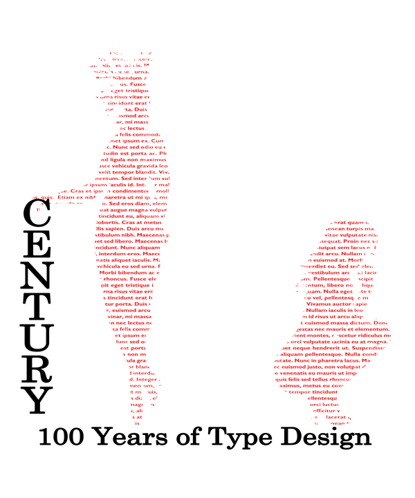
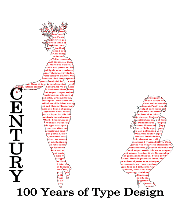
Some initial ideas included images of vehicles from the early 1900’s to present, sleek designs that would indicate not only progress but movement and transportation of communication. An outline of a classic typewriter was explored to literally reference typography and offer opportunities to illustrate the early days of movable type into current type designs. Images of women, or at least their silhouette’s, were considered to simply display a century of change in style and progress while utilizing type itself as the form structure.
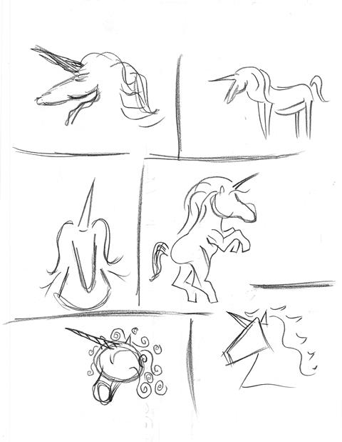
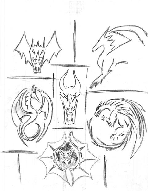
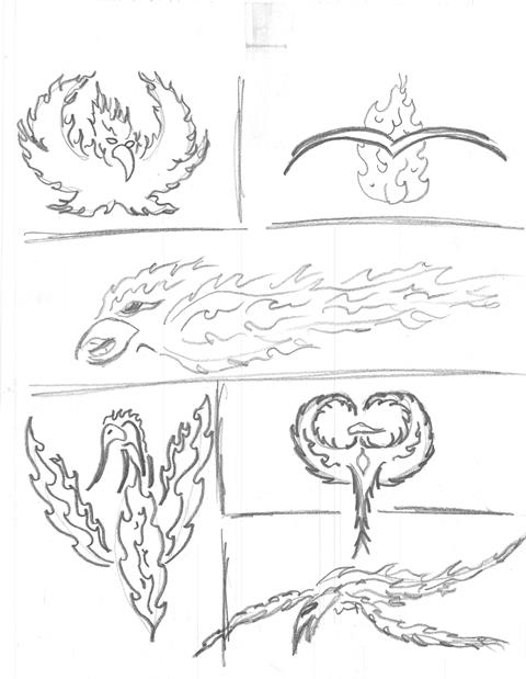
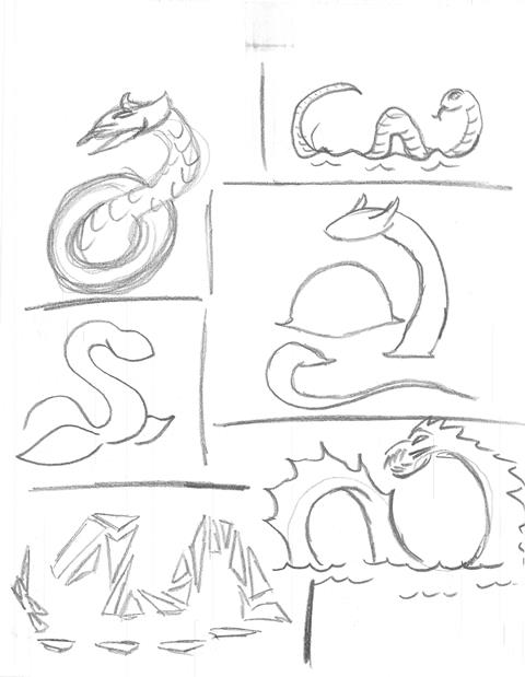
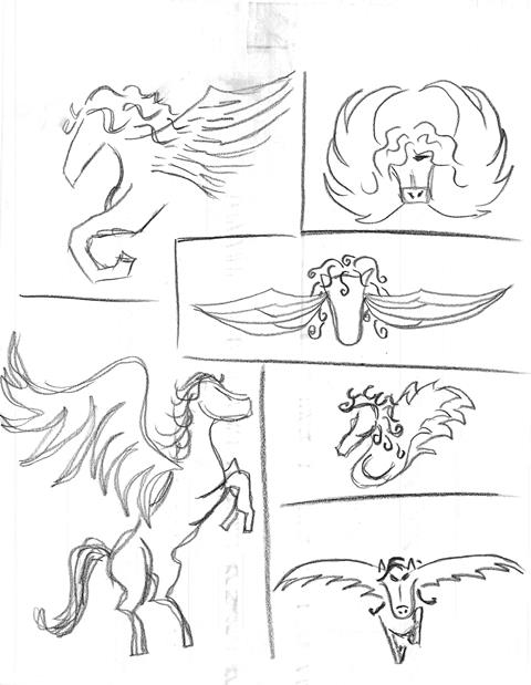
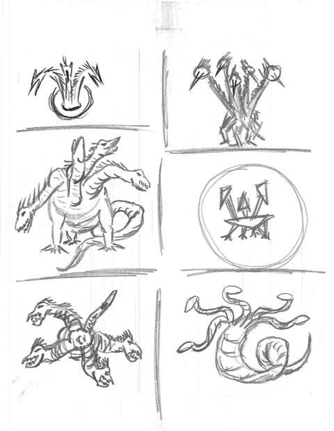
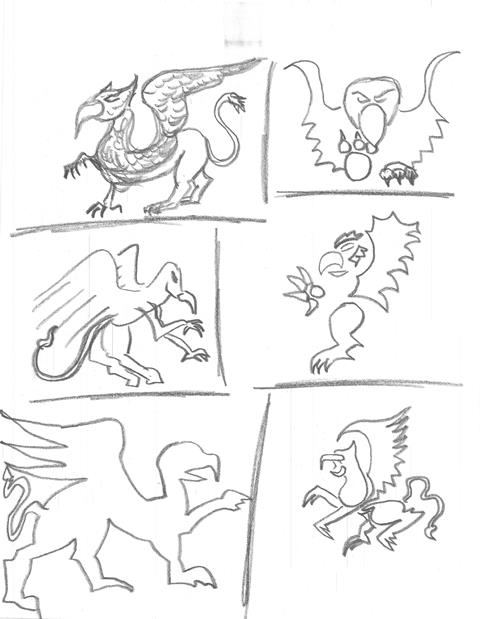
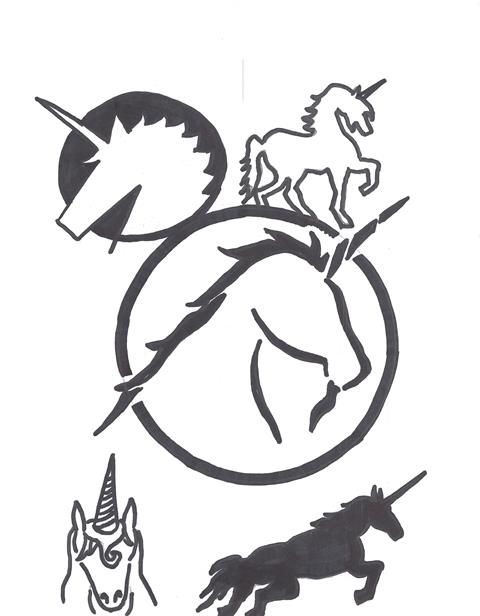
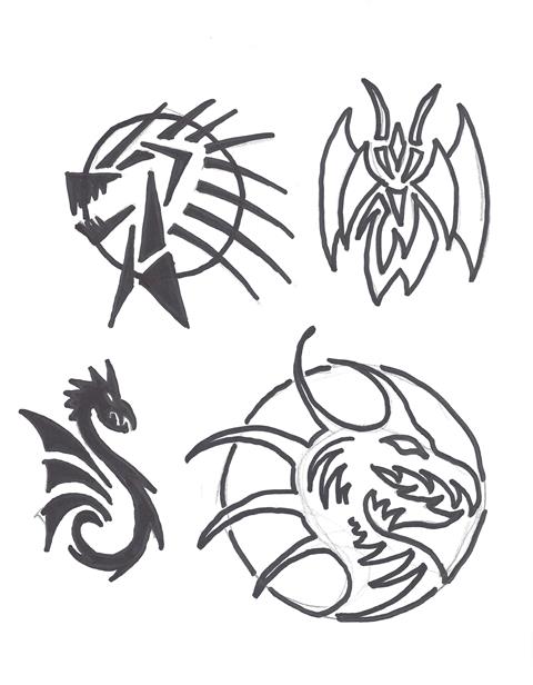
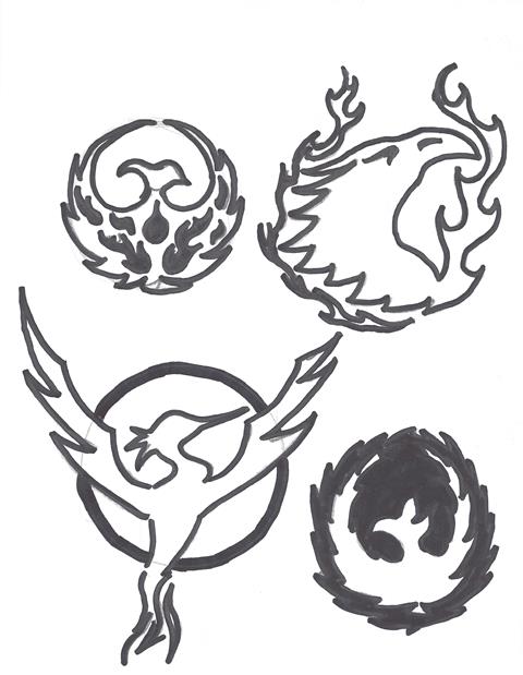
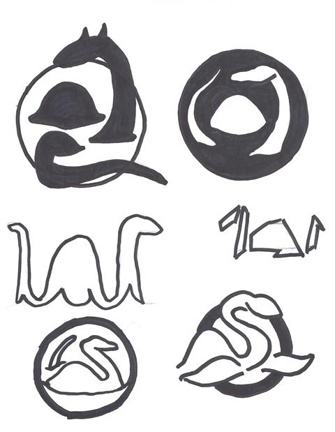
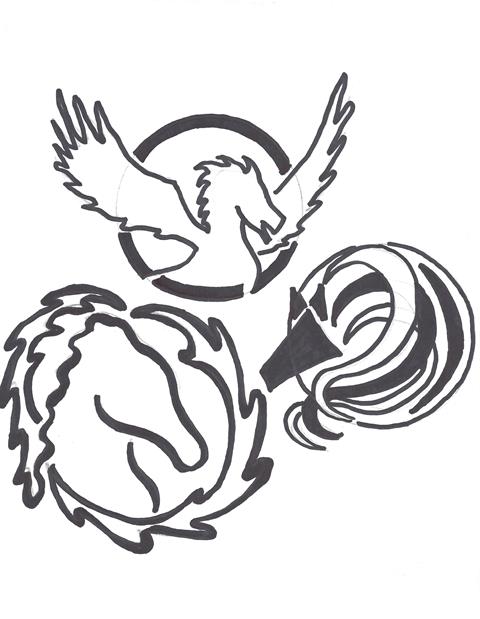
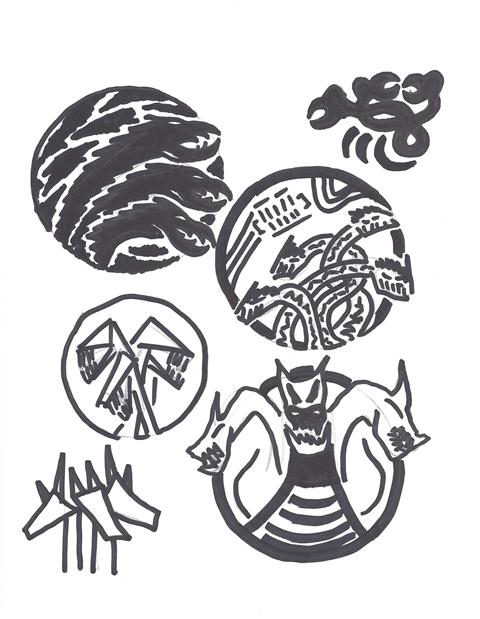
Thumbnails:
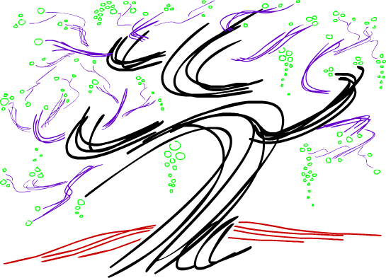
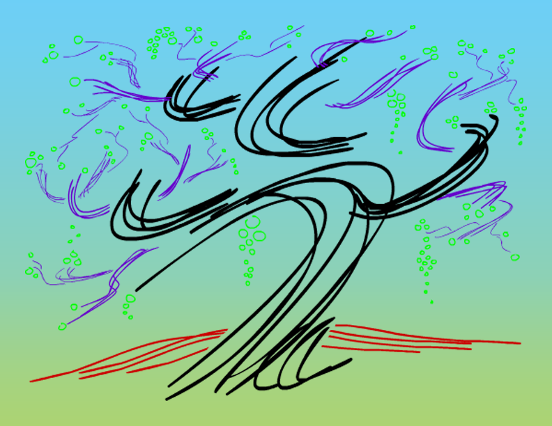
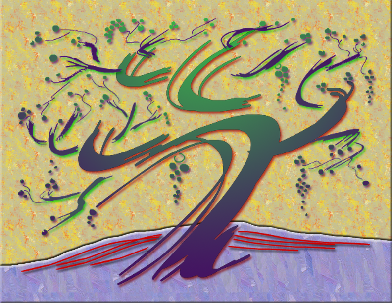
My original sketches were done in graphite but then overlaid each with black marker to accentuate the designs most prominent features. Most of the subtext is simply in placeholder position. No design definiteness exists in anything but the event title.

Type Studies:
The first typeface that interested me was Century. Its classic style and clean lines lent itself perfectly to the event in question; however, in the interest of thoroughness, I explored several additional fonts, one of which I hoped would serve as my secondary type.
After experimenting with several, I chose Gill Sans MT as my supporting typeface.
Color Studies:
I wanted to keep my color palette simple and by using black type, a white background and red accents, I was able to create eye catching compositions without complicating the design or distracting from the intended message.
Black: #000000

White: #FFFFFF

Red: #ED1F24

Roughs:
Each design went through several experimental phases and then I added the supporting information one section at a time.
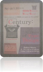
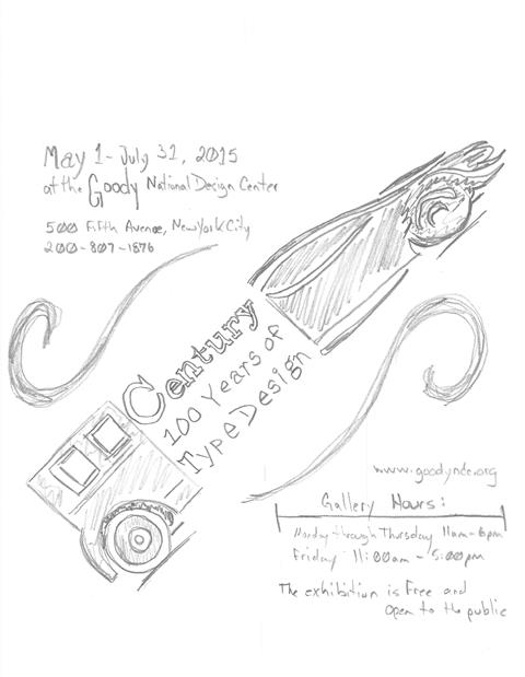
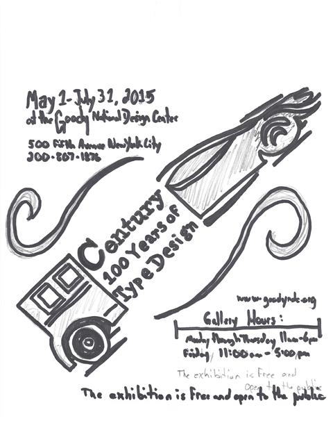
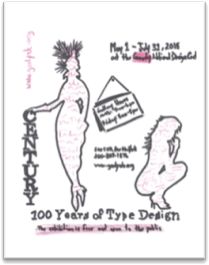
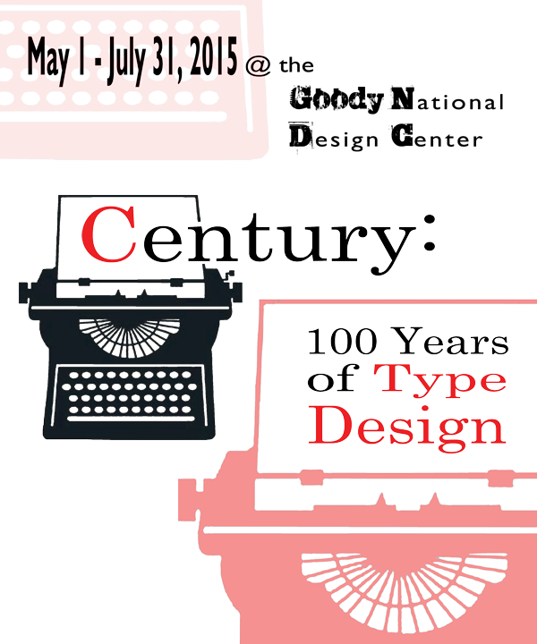
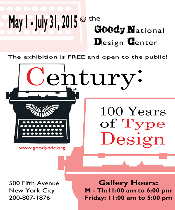
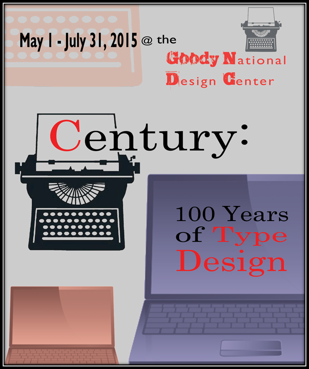
On the typewriter design, I moved my background images around and rearranged the main graphic position along with the poster title which began with a large, red “C”. Next, the dates and location of the event were given a secondary station in the hierarchy of font size and positioning atop a lightened version of the typewriter keyboard. The gallery name was uniquely stylized to indicate a proprietary typeface. The description tag-line separated the top third of the composition from the middle and bottom while continuing the flow of eye movement. The bottom third of the poster contained the address and hours of operation, the former in white space and the latter on top of another copy of the typewriter, this time, the top half which paper appeared to contain the events name, accented in red. The website was positioned below the main graphic in red, as well. The hours were cluttered with distracting white space in the graphic, so I chose to fill that image with red to create a smooth background for the text. Lastly, a light gray typewriter was added to the top of the design to balance the black and red images and include enhance repetition.


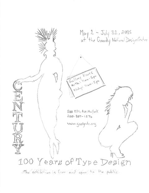
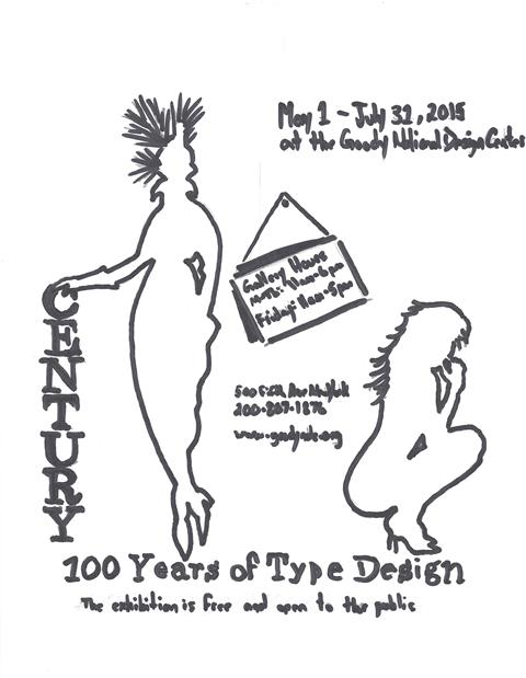
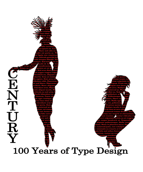
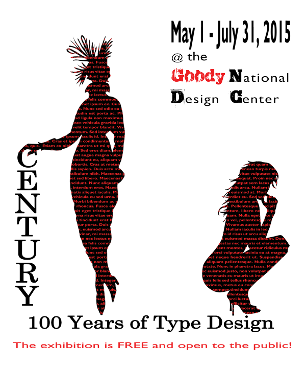
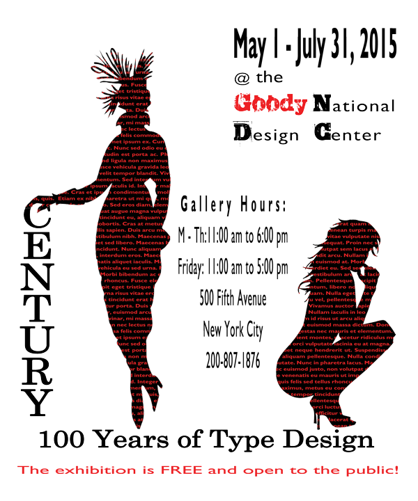
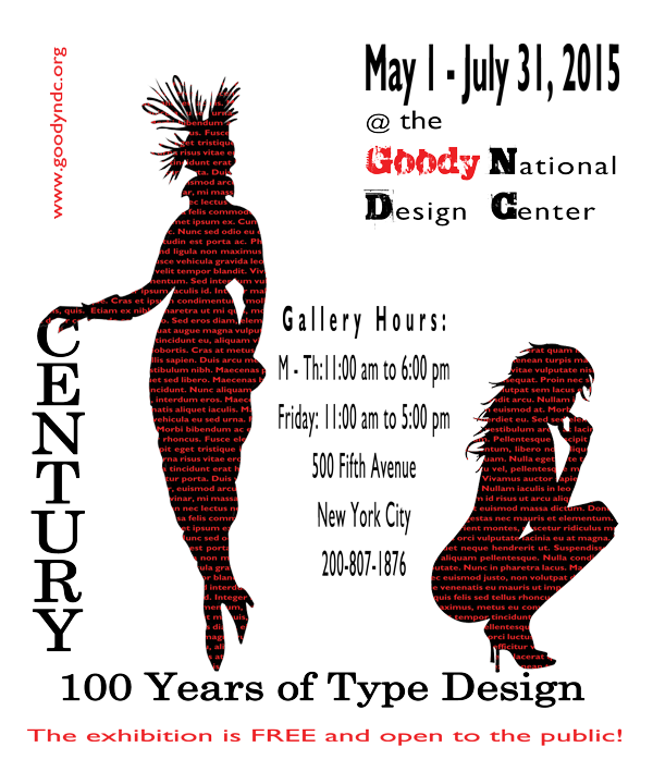
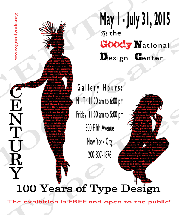
My second design, based on a silhouette of a woman in a 1914 outfit and a modern, high-heeled sexy silhouette was designed primarily for its eye-catching images filled with text. One version displayed free-floating red text on a white background, a second included an outline and a third experimented with red fonts with a black stroke. I finally settled on a black graphic with overlaid red text. I accented the composition with a red tag-line description under the event title of which the main name “Century” was positioned vertically on the left. The dates and gallery name were located in the upper right-hand corner with the branded text in red. The hours the event would be open, along with the address and phone number, were centered between the images and functioned as funnel movement back to the bottom of the design. The website was added, at a ninety degree angle, in the upper left-hand corner, subtlety aligned with the text on the right. One last version was attempted, with the event title enlarged, lightened and slanted across the background.


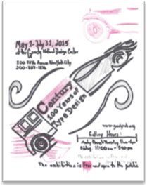
My last design would work better in a landscape format, but due to the requirements of the project I wanted to attempt a portrait version.
The title was sandwiched between the rear end of an old classic car and a front end new, sleek sports car. The dates and gallery were positioned in the top left-hand corner and the address and phone number were placed on a lightened graphic of the modern car. The website was colored red and attached to the roof of the classic car in the lower right-hand corner and the gallery hours were placed on the side of the image. The description of the event was centered across the bottom of the poster.
In a second version, the dates were changed from black to red along with the “Century” between the car images. A watermark of the front of the classic car was placed in the upper right-hand corner of the composition and a similar graphic was placed in the lower left-hand corner of the modern car. The word “free” was also colored red.
In the third version, the title and subtitle of the event were added as a watermark with “Century” in black and “100 Years of Type Design” in red.
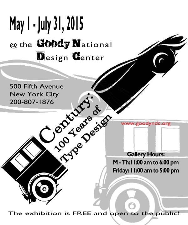


 One more version was attempted, this time with the classic car at the top of the design combined with the title, gallery hours, address and phone number. At the bottom of the composition, the subtitle and sport’s car silhouette were features with the dates of the event. Between the two elements resided the full title, subtitle and gallery name followed by the website’s URL.
Analysis:
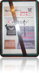
After evaluating each design with a panel of my peers, the typewriter composition was chosen as the poster I would develop further.
The first change was to include a modern image to balance the old fashioned typewriter. Where my antiquated machine represented the early days of typography, a modern laptop was exhibited to signify current type design.
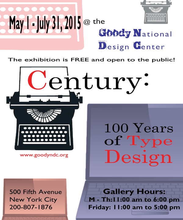
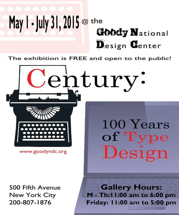 The small gray typewriter was removed from the upper right-had corner and an additional element was introduced by way of including another color, thus, increasing interest and contrast.
Blue: #333399

This new color was first utilized in the large laptop containing the subtitle of the event and reduced to 75% opacity.
Next, I experimented with background patterns and settled on a lightened stone image. The first version was still too dark; so, I increased the transparency of the background for each subsequent composition. I also edited the dates of the event to the new royal blue hue to add repetition which prompted me to slide the keyboard from the left to the right. At the bottom of the poster, I included a smaller version of the laptop to frame the address and phone number of the affair. By experimenting with the text color of the supporting information, I was able to visualize both black and white copy and measure its effect.
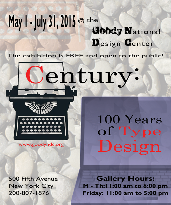
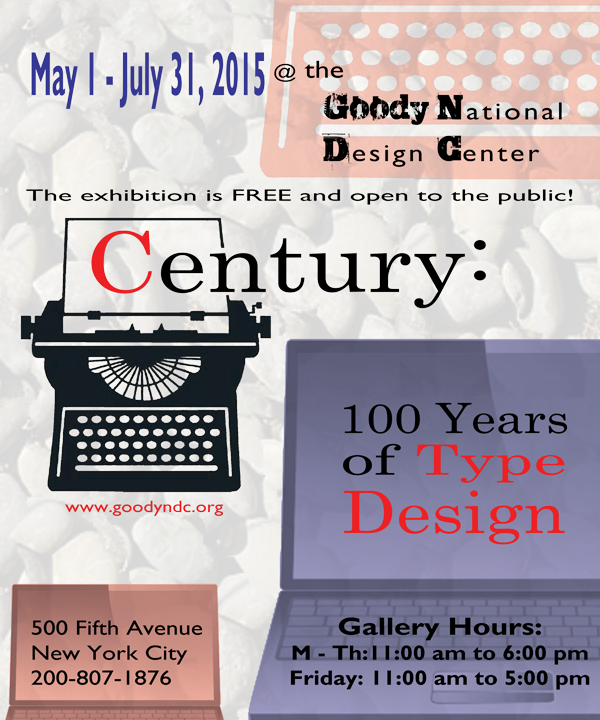

I decided the background was too busy, so I removed it from the design and focused on the positive elements, starting with changing the gallery hour’s text back to black.
I then moved the keyboard back to the left side of the poster and changed the gallery name to blue. I also added the small, light-gray typewriter image back to the upper right-hand corner of the design.
In an attempt to envision color variations, I changed the keyboard to a transparent blue and the color of the small typewriter to a transparent red. This alteration compelled me to change the small typewriter to red for balance and experiment with its size and position.
Continuing to primarily work in the top half of the composition, I experimented with the color of the gallery’s name by changing it to red; consequently, increasing contrast and prominently displaying important information. During this change, I altered the small typewriter back to gray.
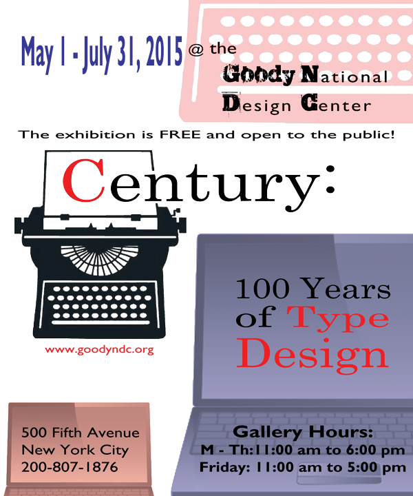
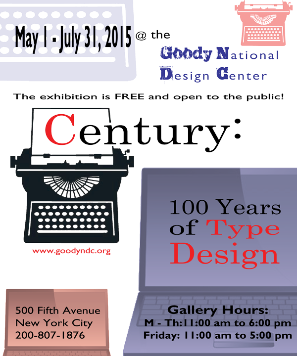
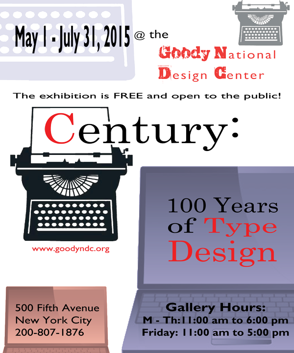
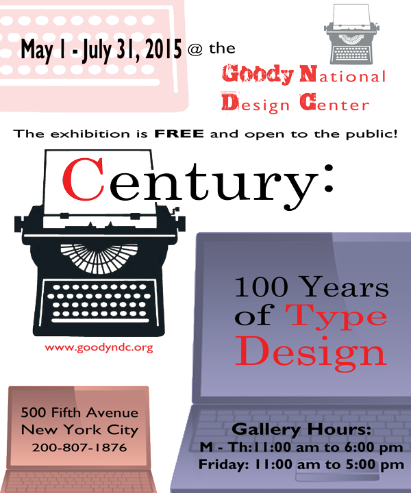
 In another version, I returned the left keyboard to its original red while adjusting the size, scale and baseline of the date’s font. I reduced the small typewriter so the entire image fit within the margins of the composition. Moving to the bottom of the poster, I adjusted the leading and horizontal scale of the address and phone number, as well as the positioning of the text and small laptop image.
My last variation was to include a background color: #E0E0E0 – otherwise known as Gray88.
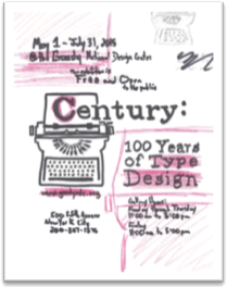
Final:
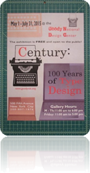
To prepare for my final execution, I documented my font details and removed the supporting text from my images.
Dates: Gill Sans MT, Bold, 25 pt, Smooth, #000000, 50 pt leading, 200% vertical scale, 120% horizontal scale, 12 pt baseline shift
@: Gill Sans MT, Regular, 23 pt, Smooth, #000000, 50 pt leading, 120% horizontal scale
the: Gill Sans MT, Regular, 30 pt, Smooth, #000000, 50 pt leading, 120% horizontal scale, left aligned
Gallery: Trashed, Regular, 30 pt, Smooth, #ff3333, 50 pt leading, 120% horizontal scale, left aligned
~sub-font: Gill Sans MT, Regular, 30 pt, Smooth, #ff3333, 50 pt leading, 120% horizontal scale, left aligned
Tag-line: Gill Sans MT, Regular, 20 pt, Smooth, #000000, 50 pt leading, 175% horizontal scale, centered
FREE: Gill Sans MT, Bold, 20 pt, Smooth, #000000, 50 pt leading, 175% horizontal scale, left aligned
Century: Century, Regular, 100 pt, Smooth, #000000, 50 pt leading, 120% horizontal scale, left aligned (“C” = #ff3333)
100 Years: Century, Regular, 50 pt, Smooth, #000000, 50 pt leading, 120% horizontal scale, centered
of Type: Century, Regular, 50 pt, Smooth, #000000, 50 pt leading, 160% horizontal scale, centered (“Type” = #ff3333)
Design: Century, Regular, 70 pt, Smooth, #ff3333, 70 pt leading, 120% horizontal scale, centered
URL: Gill Sans MT, Regular, 20 pt, Smooth, #ff3333, 30 pt leading, 120% horizontal scale, left aligned
Street: Gill Sans MT, Regular, 25 pt, Sharp, #000000, 30 pt leading, 120% horizontal scale, centered
City: Gill Sans MT, Regular, 25 pt, Sharp, #000000, 30 pt leading, 132% horizontal scale, centered
Telephone: Gill Sans MT, Regular, 20 pt, Sharp, #000000, 30 pt leading, 148% horizontal scale, centered
Hours: Gill Sans MT, Bold, 30 pt, Smooth, #000000, 30 pt leading, 120% horizontal scale, centered
~details: Gill Sans MT, Bold, 25 pt, Smooth, #000000, 30 pt leading, 111% horizontal scale, centered
 Some last minute edits included lightening the two laptop images from 50% transparency to 75% and changing the text of the gallery hours, address and phone number to white again. A final TIF was exported to allow the poster to be completed with InDesign. Adding the address and phone number with a different application required some adjustments to the characters and paragraphs: obviously, the font color was adjusted to #ffffff and the entire textbox was justified, to mimic its original configuration with the exception of the phone number. “New York City” was given a 2 point baseline shift to properly position the line of text within the font space.
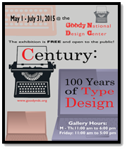
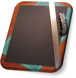 Once the poster was ready to be printed on a large sheet of paper, the black presentation board was trimmed to 12” x 16” and the excess paper was removed from the poster so the final dimensions measured 10” x 14”.
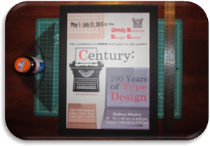 I utilized rubber cement to secure my print on its backboard and smoothed the design by placing a protective piece of paper over the poster and rubbing a drafting triangle across its surface, starting from the center and systematically moving to the edges.
The last feature to include was the protective flap of tracing paper, attached from the back of the presentation board by tape and trimmed at the edges on a 45 degree angle.