Introduction
The Bezold effect is an optical illusion, named after a German professor of meteorology, Wilhelm von Bezold (1837–1907), who discovered that a color may appear different depending on its relation to adjacent colors.
It happens when small areas of color are interspersed. An assimilation effect called the von Bezold spreading effect, similar to spatial color mixing, is achieved.
Assignment
Create your own pattern displaying the Bezold effect.
Pattern
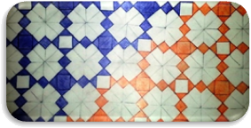
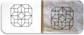
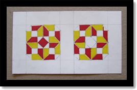
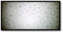 I began this project by producing a personal pattern based on my transparent cube design. First, I traced my cube four times, back to back, to connect each cube into a single repeatable form. I then copied the pattern across a piece of Bristol board until the design covered the entire background.
 Colorization
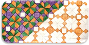
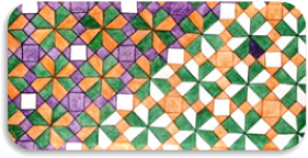
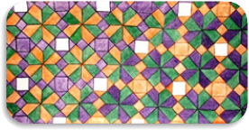
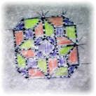
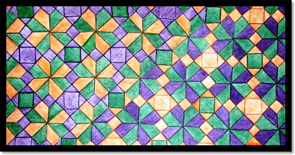
I chose to use a shade of violet and green along with a tint of orange. To visualize these colors as I intended to include them in my pattern, I filled in the template with the sample hues. I planned on utilizing green as my consistent figure, while the purple and orange shapes would exchange placement halfway across the composition.
I started coloring the exchanged shapes, first with purple and second with orange. I then filled in the left half of the composition with the alternated orange and the consistent green. Next, I completed the consistent green forms and finished the right side of the composition by coloring the alternated purple shapes.
The last modification I made was to fill in the white square negative spaces with the “background green” to ensure the design was composed of only three colors.
4 Cubes
Critique
I wasn’t entirely happy with the final result of this experiment; so, I wanted to explore some other possibilities for displaying the Bezold Effect.
Alternatives
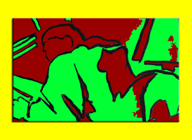
My first alternative design was based on a bicycle composition I had created in 1989. This time I altered the design by simplifying the multi-toned gray-scale hatching into two new compositions: one dominated by a light yellow tint and the other by a darker violet hue.
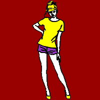
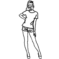
My second experiment started from a graphic sketch I utilized as an icon for tee-shirt designs on a popular website. The sketch was a simple, black and white outline of a woman with her hand on her hip. This time I only changed the background color and left the image hues identical in both graphics.
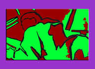
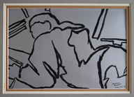
I wanted to experiment with another old design, circa 1989 – 1990, to demonstrate how differing adjacent colors can affect a pattern’s visual impact. Instead of altering the background, I only changed the frame of this image.
Bezold Cubes
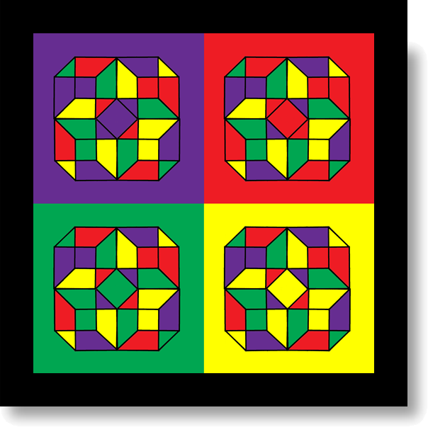
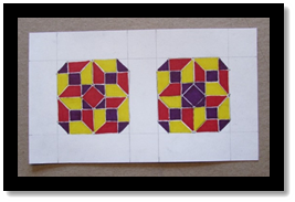
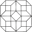 One last experiment was needed to complete my vision of the Bezold Effect. Returning to my quad-cube, I digitized my previous sketch of a transparent block, duplicated it and adjusted the pieces into position to complete the four-cube pattern.
Utilizing this basic design, I carefully chose a tetrad color scheme that would accurately display the visual 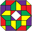 results I intended. I began with Violet and added its compliment of yellow along with red and its compliment of green.
The last step was to add four different backgrounds, one of each complimentary color used in the duplicated design; thus, a different effect was produced from each of the four individual images and to the overall composition as a whole.
Revamp
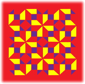
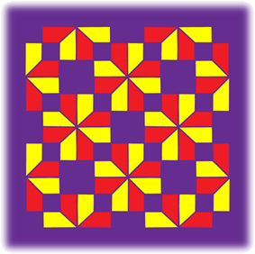
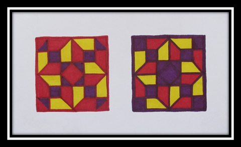
Since none of my previous experiments created the correct result the Bezold Effect describes, I chose to utilize only three colors and change the backgrounds of two images. I decided on removing green from my previous palate and kept red and purple as my primary (and background) hues with yellow as my third color.
Construction
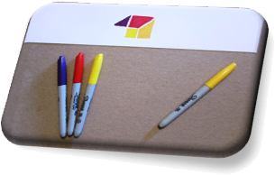
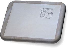
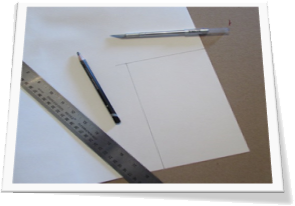
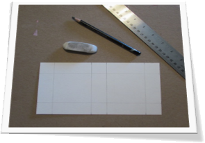
For this project I used Bristol board and permanent markers. I tested some shades and tints of the specific hues chosen. Next, I traced a small sample of my cube pattern to reproduce the effect desired. I also had to calculate the dimensions of my background media to include both images and a one inch border. Then I trimmed a piece of Bristol board to 4 ½”x9”, allowing for two 2” patterns, separated by an inch partition of white space.
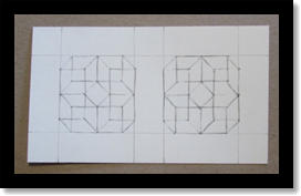
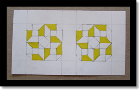
After transferring my cube design to both halves of the Bristol board, I began coloring in the parts of the images that would contain the yellow hue. I the proceeded to fill each designated red portion and eventually completed the pattern with the dark purple. By starting from light to dark, I was able to correct a small mistake while working on the red hue, where I lengthened a line beyond its shape due to a guideline that transferred too lightly.
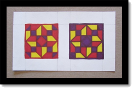 The last step was to add the actual background colors. I started by outlining each image in its respective hue and then adding an extra layer of thickness to the outside border. Then I simply outlined each individual shape and filled in the corners to complete the effect. Finally, I erased the outside guidelines and cleaned the image for presentation.


