Assignment
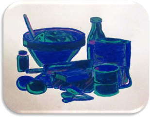
The analogous project’s intent is to demonstrate the differing impressions that cool and warm colors can have upon an identical design.
Terminology
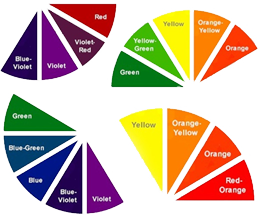
- Analogous colors are groups of colors that are adjacent to each other on the color wheel, with one being the dominant color – which tends to be a primary or secondary color – and two on either side complementing – which tend to be tertiary.
- Warm colors are often said to be hues from red through yellow, browns and tans included.
- Cool colors are often said to be the hues from blue-green through blue-violet, most grays included.
 Preparation
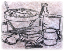
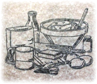
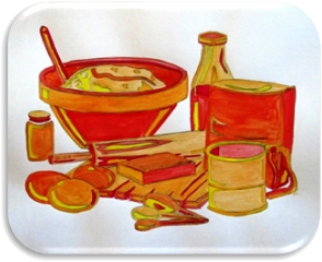
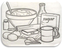
I chose to recreate a design I had previously used while experimenting with simple black and white values: an abstractly, modest kitchen composition with exaggerated highlights and shadows.
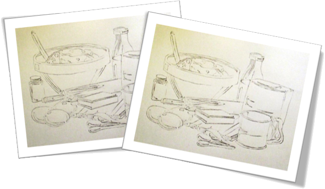
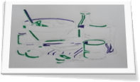
The first step was to transfer the positive image to tracing paper and then copy the negative image on the opposite side of the tracing paper with a soft pencil. Once the tracing paper was ready, the image could be transferred to two different pieces of Bristol board: one for a cool composition and the other reserved for a warm version.
Warm Composition
My warm analogous design consisted of a yellow to red color palette where yellow appropriately represented the highlights and red signified the shadows. Between these two primary colors I utilized several tertiary colors including two versions of yellow-orange and two types of red-orange.
I was informed that my warm composition gave an impression that it had been developed with watercolors as opposed to the gouache paints I utilized; so, during the cool composition I attempted a thicker application.
Cool Composition
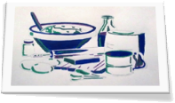
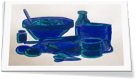
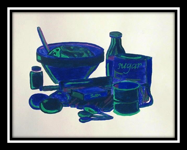
My cool analogous design consisted of a violet to green color scheme with green indicting the highlights and violet suggesting the shadows. Sandwiched between these two secondary colors I incorporated several tertiary colors including two forms of blue-violet and two variations of blue-green.
In both designs I added two colors at a time and then touched-up highlight and shadow areas after the composition was completely dry.
Critique
The results of my thicker application of paint were not pleasing to me personally but I did learn something, or perhaps realized something I already knew: art is created for the artist; if others appreciate the outcome, then that’s simply an added bonus. A second lesson learned was that the media is not important and neither is the ability of a viewer to recognize the media utilized. The work is the significant feature, not what created it or if an external party can identify the process employed. When technique becomes more important than the creative process or the piece itself, you’ve successfully destroyed the spirit of art.
The last touch was to add the lettering to each design. I chose to utilize the lightest color for each: for the warm design, yellow; for the cool design, green.
Final Compositions
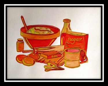
Warm Kitchen


