Parts of the Puzzle

Assignment

The Parts of the Puzzle exercise is a shape based project that requires imaginative problem solving within strict limitations.

Four 6”x8” compositions must be created while utilizing only three types of shapes: a circle, a line and a simple rectilinear shape.

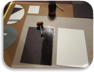
Black construction paper, white Bristol board and painted gray paper should be used to employ an achromatic design. (Black paper may be made by painting Bristol board, similar to the gray paper.) Construction of the project will utilize rubber cement, acrylic paint (white and black), an X-acto knife, a ruler and a rubber cement eraser.

  1. No study may have more than six positive shapes.
  2. The same components must appear in each study.
  3. Any component may be repeated, as necessary.
  4. Any component may be enlarged or reduced in any study.
  5. If a shape extends beyond the boundary of a study, it should be cropped.

Trim Bristol Board

Preparation

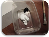
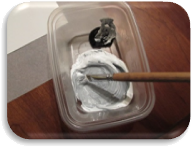
Knowing that I needed to create gray paper by painting white Bristol board, I started this process first. I cut approximately half of a large sheet of Bristol board for gray paper and left the remainder for my white shapes I would cut out later. Next, I took a large sample of white acrylic paint and a much smaller amount to black – approximately a 90/10 split – and started mixing the colors a little at a time with an old brush until I was happy with the shade of gray produced.
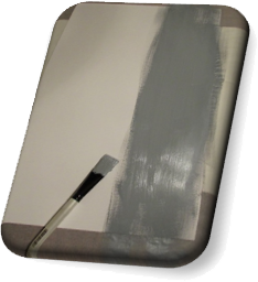
White & Black AcrylicMixing PaintGray Acrylic

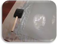
Cross-paintingBy utilizing a technique introduced by Dr. Giampa of painting vertically and then horizontally and cross-painting several layers in this manner a fairly solid gray was created. By brushing water into the mix and alternating the directional strokes, layer by layer, the actual brush marks were eliminated, little by little. I actually repeated this process a dozen times to smooth the surface of my gray paper as much as possible.

Halfway through my process, I noticed some inconsistencies in the paint. I wanted to eradicate these imperfections and rough areas before using the paper in my project so I smoothed the flaws with fine sandpaper before continuing with my layers of gray. One last attempt at removing brush lines was attempted by completing my last few repetitions with a sponge brush.


 Layers 1 - 3Layers 4 - 6Sanding Imperfections

Layers 7 - 9Wet-washingLayers 10 - 12

Case In Point

Chapter Four of Art Fundamentals: Theory and Practice by Ocvirk, Stinson, Wigg, Bone and Cayton was assigned to set the groundwork for this project as a study in shape. This chapter covered types, dimensions and expressive content of shapes as well as several compositional principles that apply to shape, such as harmony and variety, dominance, movement, balance, proportion and economy. Three-dimensional applications of shape were also mentioned.

Case

Depending on placement, shapes can create illusions of depth and dimensionality. Shapes are very expressive.

During the creative process, certain shapes can be planned and expected or develop themselves as the design evolves. Abstract shapes may morph into defined and recognizable shapes. Even negative space may become obvious shapes. All shapes have an outer edge – either implied or explicit.

Objective shapes are representational and more concrete than subjective shapes which appear much more abstract. Geometric shapes are very structured and defined – mainly consisting of a curvilinear and rectilinear contour. Biomorphic shapes, in contrast, are living, breathing forms; often they are thought of as natural and organic. The idea of implied, or amorphous, shapes is strongly connected to the principle of closure and indicates a shape that is not yet a shape – although, the human mind would argue otherwise.

Two dimensional shapes exist in any pictorial composition, although, through the use of the principles of organization, the illusion of three-dimensional mass may be created. Volume is the measurable space, or void, that will offset this mass and can also be implied in two-dimensional art. Planar shapes, however, are perceived as flat and have height and width but not depth. Equivocal space refers to the optical illusion of a shape seeming to change as the viewer’s perspective changes.

Shapes within a form will either work with the compositional layout or stand out from the design. Harmony may be achieved by producing shapes with similar characteristics while variety can be created with accents and changes to elements within a shape. Contrasting qualities of shapes suggest dominance and determine a viewer’s duration of attention. Subconscious association can also influence dominance. The angle or positioning of shapes (and other elements) can suggest movement. This movement can be toward the viewer, away from the viewer or simply within the image, from one area to another. The rhythm of movement can be smooth or jarring, quick or slow. Balance of one sort or another is almost always desired and may be achieved by the inclusion or absence of any elements and the development of many of the principles. By breaking down a subject of art into simple planer shapes, proportion and economy can become more manageable during the developmental stages of a composition. Objects in relationship to each other and their surroundings are more easily managed when containing less detail.

Artists may intentionally use certain shapes to invoke inevitable emotions from viewers. A spectator’s perception, imagination and sensitivity to form will all influence their appreciation of a piece of art.

Within three-dimensional artwork, mass is physical and measurable, as is volume, or areas within the piece that recede and hold space. Contours describe the shapes edges and the silhouette is a major example of a shapes boundaries. Secondary contours move the viewer’s eye around the work and join major contours together. The negative space of a three-dimensional sculpture is sometimes as important, if not more important, than the positive space as it moves the eye to opposite sides of an object and implores the viewer to experience the entire work.

In Point

By developing the bullets point of view, I’ve found deeper understand of each subject and happen to enjoy the process of personification. To that end, I employed that empathy to shape and three aspects of Chapter Four I found most important.

Type

As a shape, I can be defined or implied, abstract or representational, geometric or biomorphic. The beauty of being me lies in my ability to not only be all these things; I can also be several at one time! I may allow you to see my true nature or I may hide my contours and make you wonder if I am what I say I am. I can be rigid and mathematical or I can move and breathe just like you. I can even be both simultaneously or change right before your eyes!

Composition

However, you may want to be careful how you use me, who you put me next to and how often you duplicate me. My relationships are delicate and I can be quite temperamental. For example, if you want me to get along with all your elemental cliques, I suggest you keep some of us together. We like to mingle with family and friends; but if you start to clone us we can easily become bored and refuse to play nice. Some of us are dominant by being different but there is a balance to be found within this variety. My friends and I all have rhythm but it may not please everyone all the time. Like I said, be careful!

Emotion

If you upset me, I may not be predictable; then again, often times I am and you can use this knowledge to your advantage. Know your enemy! Scratch that. Know your observer (if you think you can). Their imagination, perception and emotions are influenceable, but only to a certain extent. To thine own self, be true!

Development

After reviewing the requirements, limitations and examples of this assignment, I had a vague idea of some personal elements I wanted to include and thought they would be instrumental in making my final design unique while staying within the guidelines. I was certain I would include circles of various sizes in each study, squares in alternating positions and sizes and straight lines, both horizontal and vertical, all the same width but of varying lengths.

I decided I would include exactly six shapes in each study but I used a random method of assigning how many repetitions of each would occur in which study by laying out a grid with the shapes on the left and the study number on top.

Random Assignment Method

By assigning one circle, two lines and three squares to Study One, I started a pattern that indicated Study Two would include four circles; however, since no study could have more than four shapes while still including a minimum of one of the two remaining shapes, Study Two could only include one line and one square.

Beginning Grid

This began a simple game of Sudoku, because Study Three and Study Four could only have two circles each. With three being the next logical number, Study Two was assigned three lines and left with one square. To round out the study varieties, Study Four was allocated two lines and two squares.

Final Grid

The resulting grid contained a happy coincidence of seven squares, eight lines and nine circles; thus satisfying an obsessive compulsive need for numeric order.

Thumbnail Sketch

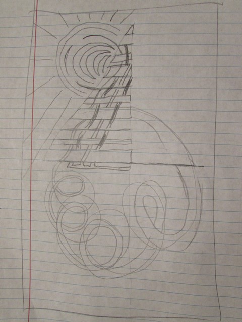
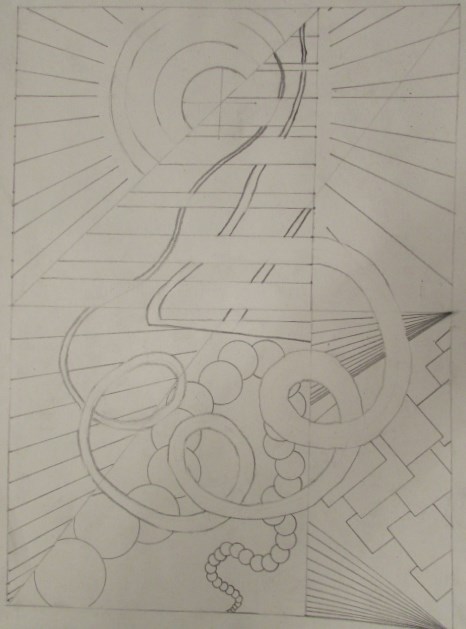
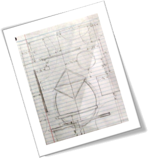
One of my initial desires for this project was to complete the four studies in such a manner that I could create one complete composition out of the four individual designs. To this end, I started reverse engineering by sketching the completed, combined image and breaking the design into four separate panels during the process. However, I didn’t simply sketch a composition and divide it into four pieces.

First I reduced the entire sketch to exactly half of the required project size. By designing in this manner, I made my sketch a manageable unit that fit within one piece of notebook paper and could be edited and experimented with to scale.

I started with a square that would share space with all four studies and, just to add a unique twist (literally), I rotated this square 45 degrees. Continuing with shared shapes in mind, I added lines that would cross panels. This allowed me to connect Study One with Study Two and Study Three with one horizontal line and one vertical line; likewise, Study Three connected with Study Four with two horizontal lines. This finalized the self-imposed line requirements. The last shared element needed to be a circle, thus ensuring at least one example of each shape would cross panels within the final design. This was accomplished between Study Three and Study Four.

Design SketchTo balance the lack of lines on the left side of my overall image, I added a square to Study Four precisely where the vertical line existed in Study Three. The last shape needed in Study Four was a circle and an empty area in the lower right-hand corner lent itself perfectly for a medium-sized shape to extend outside the bounds of the panel. Similarly, I added a smaller circle to Study Three in a position that not only balanced the individual panel but offset the small square in Study Four, thus completing a second study.

Next, I added an extremely large circle to Study One in the upper left-hand corner, which was intended to contrast with the many smaller shapes already included within the composition, harmonize with the overlapping circle in Study Three and Study Four and balance the opposing circle in Study Four. Two squares were needed to complete Study One and the first was included in the upper left-hand corner to extend off the panel and break up the large, flat area created by the gigantic circle. The remaining square was purposely reduced to arguably the smallest shape of all the studies and ironically shared space with the largest shape of all the studies. Set between the horizontal and vertical lines and diagonally between the conventional and rotated squares, this last element of Study One resided comfortably on top to the large circle and close to the center of the panel.

Study Two was left with a need to elegantly include four circles, the most shapes of one kind in any panel, while simultaneously maintaining a balance within the overall composition and executing an impartial image, strong enough to stand alone. Luckily, I had an idea for these four circles as soon as I noticed the numbers in my planning grid. While almost every shape in the other three studies were intertwined by means of overlapping shapes – the offsetting square and circle in Study Three and Study Four, respectively – Study Two would allow it’s four circles to float off the top of the panel from a free-standing position near the center of the design. The circles themselves overlap but are not connected to the other shapes nor are they allied with any other elements in the combined image. However, by wrapping around the line on the left side of the study and seeming to originate from the implied square in the lower left-hand corner, an economy and domination are produced concurrently.

Normally, I would never begin finalizing a project without attempting several variations, sketches and ideas. However, I was so inspired by the effortlessness with which this design presented itself and the simple complexity of which it was comprised, that I had no choice but to proceed.

Prototype
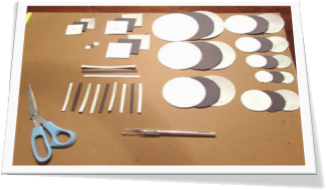
Sample ShapesOnce all the shapes were included in each study and arranged in their appropriate locations, it was time to visualize the values and their contrasting and harmonizing properties. To determine which shapes should be black, white or gray I needed a sample of each shape in each color. I basically measured my sketch, cut out one black shape from construction paper and two white shapes from scrap paper. To simulate gray, I colored in one of the duplicate shapes for each individual component. Then it was a simple matter of moving the samples around over simulated backgrounds. It’s important at this point to mention that I planned on utilizing two black, one white and one gray background. This decision was based on a practical need to economize my limited gray Bristol board.

If the shape arrangements within each panel while simultaneously appeasing a combined composition was a balancing act, then the value distribution of each study was the tight-rope in the center ring! To begin, I placed my gray background and one black background in the lower corners of my overall design because together they would weigh more than the black and white backgrounds in the upper corners.

Starting with Study One which was assigned a black background, the large circle was decidedly white for contrast. The line from Study One to Study two would become black to connect the panels and the background in Study One, since it overlapped the large white circle. The rotated square was made white to balance the study and the square in the upper left-hand corner was allocated gray, both to contrast with the white circle while tying the vertical line into the composition, as it was assigned gray as well. The tiny square was made black to stand out from the large white circle and harmonize with the black horizontal line.

Following the gray line into Study Three allowed me to change the value to black since it would overlap the gray background. The horizontal line in the lower portion of the study was white and stayed white as it crossed into Study Four. The white square from Study One was continued into Study Three and remained white while overlapping a black circle. Also overlapping this circle would be a gray line which crossed into Study Four above the white line. Lastly, the circle on the left of the panel was assigned a white value to stand out against the gray background.Prototype
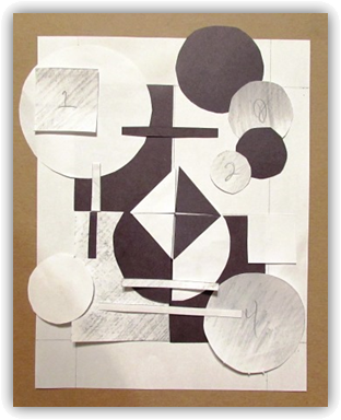
Two things happened when Study Three combined with Study Four: first, the black circle became a white circle to contrast against the suddenly black background; second, the square on top of the white circle become black, for the same reason. The white square on the right-hand side of the study was made white to stand out against the black background and to compliment the other lone shape in Study Three: the white circle. Lastly, the circle in the lower right-hand corner was given a gray value to add variety to this panel while at the same time tying into the adjacent panels and to contrast with the overlapping white line.

In Study Two, the square was continued from Study Four as black that contrasts perfectly with the white background. Alternating gray and black circles gradually grow and float off the study starting with gray and ending with black. This allows the largest black circle to offset the black square and be divided by the black horizontal line. The gray circles provide unity and variety at the same time while the white background provides the illusion of space and atmosphere.

Color Grid

Construction

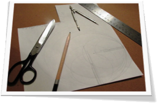
I measured a quarter inch border to cut shapes from the gray painted paper and used the same procedure to extract my gray background panel. For each straight-edged shape, namely the squares and lines, I used an X-acto knife and a ruler. Gray PaperFor each circle I cut the shape out with a pair of scissors, leaving a quarter-inch margin and then carefully cutting closer until an exact circle was removed. A 6”x8” section of Bristol board was cut as the background of each study, even the white panel.

Because I started my sketch and sample to a 1:2 scale, all I had to do to create perfectly sized shapes was multiple my sample shapes by two. For each circle, the diameter of the sample was measured and then divided by two to find the radius. Creating CirclesThe radius was multiplied by two and a compass was used on a scratch piece of paper to test the visual impact of the new shape. After confirming the new size was appropriate, the compass was used on the white, gray or black paper to create the final shape. (It may not seem important to go through the process of finding the radius as the new radius is simply the diameter of the sample shape; however, if I were to need to triple or quadruple the sample size, this procedure would be vital.) All the rectilinear shapes, squares and lines (which are essentially rectangles), were simply doubled in width and length. This method allowed my final composition to be a scale representation of its sketch.
Study 4 LayoutStudy 3 LayoutStudy 2 LayoutStudy 1 Layout

Documented GuidlinesOnce I had all of the appropriate shapes cut out of the black construction paper, white Bristol board and gray painted board, I arranged them together to visualize the final designs. To ensure each component was aligned correctly, I measured and documented guidelines to appropriately place each shape within its study.

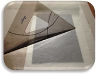
Employing the technique of applying rubber cement in a scoring method demonstrated by Dr. Giampa, horizontally on one element and vertical on the component to which it would adhere, each background, circle, square and line was affixed to each study until all four panels were complete. Smoothing the shapes to each other by covering the area with tracing paper and utilizing a drafting triangle to press from the center to the edges allowed each shape to be perfectly flat. Cropping shapes that extended beyond the limits of its panel occurred as necessary.


Applying Rubber CementScoring Rubber CementSmoothing Adhesive

Completed Project

Puzzle Pieces

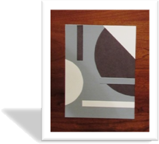
The final individual studies are each compositionally stable, interesting and independently successful.

Study 4 Study 3

Study 2 Study 1

Single Study

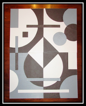
Additionally, the four studies can be combined to indicate a new, single design.

Single Study

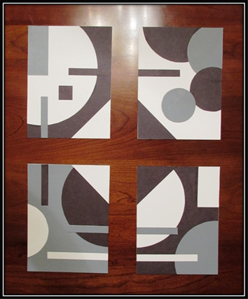
Complete Separation

My personal preference is to view the combined panels with some white space between each study.

Complete Separation

View/Download PDF

Case In Point Mapping based on research by
Dr. Joan Giampa http://www.joanmariegiampa.com/teaching/my_research.html

200 Lines

Assignment

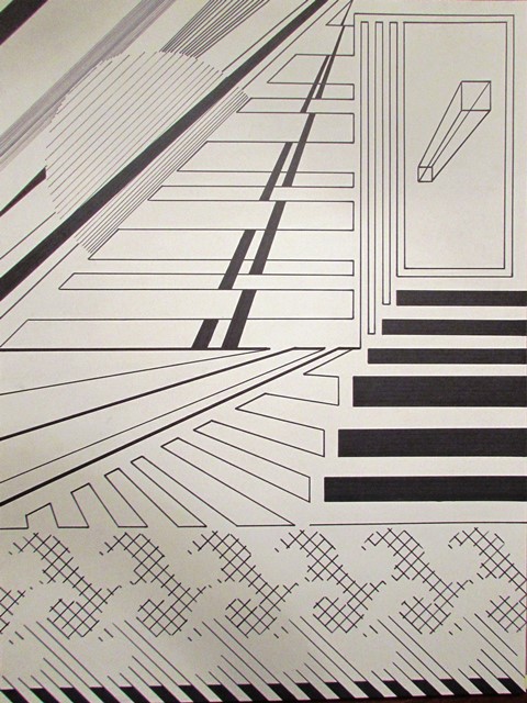
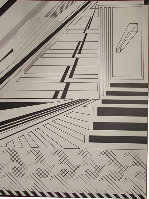
200 Lines is an exercise in utilizing straight lines, and straight lines only, to create an abstract design that shows space. Materials needed to complete the project included pencils, erasers, a ruler, permanent markers and an 18”x24” Bristol board. The composition could be horizontal or vertical but no border would be employed. The end result was expected to show a development of each student’s line variety.

Development

Series of LinesI started this project by creating a series of lines based on the physical characteristics of line: measure, type, direction, location and character. Where measure refers to the length and width of a line, it implies much, much more. For instance, thick lines can communicate a sense of stability and thin lines may suggest movement.

Some examples of different types include straight lines, curved lines and angular lines – each having distinct characteristics. Straight lines may seem rigid or stiff while curved lines are often stimulating and exciting. Angular lines might be confusing or interesting, depending on their implementation.

The direction and location of a line can change its emotion and psychological response from the viewer. Slanting a line upward may inspire a sense of strength while slanting it down could diminish its vitality. Lines high in a design could appear to soar while those same lines lower within an image may seem to plunge. Horizontal lines may indicate serenity while vertical lines can be interpreted as ambitious.

The character of a line can be implied by both the medium and surface utilized during the creation of a design. In this project both were chosen beforehand but care was taken to understand the difference between the sketches and preliminary designs on notebook and sketch paper verses the final composition on Bristol board.

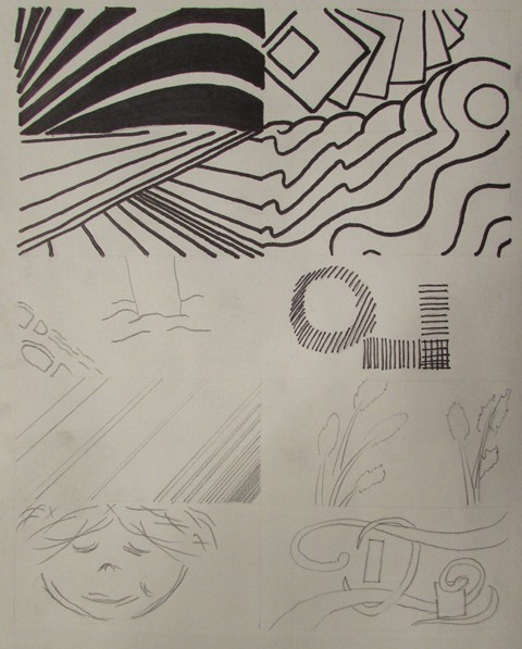
Sketchbook Sketchbook inked

After my initial sketches on notebook paper, I transferred some of my line experimentation’s to a sketchbook in pencil and then tested the change in look and feel when outlined in permanent marker. I took the same approach in sketching preliminary design ideas, starting on notebook paper, transferring to my sketchbook and finally adding marker to emulate the final project materials.

Notebook DesignSketchbook Design Design Inked

Straight-line SketchTo ensure the final design was in compliance with the basic instruction regarding using only straight lines, a few revisions of the composition were created and a completely straight-lined version was sketched. Ultimately, this sketch would be the basis of the final project.

Sneak Preview
Sneak Preview

Case In Point

Chapter Three of Art Fundamentals: Theory and Practice by Ocvirk, Stinson, Wigg, Bone and Cayton was assigned in preparation of this assignment as a study in line. In addition to the physical characteristics of line previously mentioned, the relationship between line and shape, value, texture and color were discussed as well as the spatial characteristics of line, line as representation and expression and three-dimensional applications of line.

Case

Line is the most basic, yet arguably the most utilized, element of design. Whether physical or implied, two-dimensional or three, the line provides movement, structure, description and definition to an image or sculpture. The measure of a line refers to the physical dimensions of a line – the width and length: measurable proportions. When describing types of line, one can be referring to the direction, or multiple directions, of a line. A line can be straight, curved, graceful or abrupt. Each of these directions, combined with differing measures, has the potential to produce many different emotions and feelings within a viewer. To expand upon direction, there are different implications regarding the course of a line: horizontal lines may indicate stability while vertical lines might suggest poise. Diagonal lines are more likely to imply movement or anxiety and a line may contradict its basic nature by the overall direction of its course. Another element of line is its location within a composition. While heavy lines high in an image may suggest to the viewer a sense of imbalance and a contradictory representation may cause the viewer to reject the objects location within the design, serene lines in appropriate and expected locations within a work of art may exude a peacefulness and calmness in the viewer. There are also many illusions that may be created by an artist depending on the location of specific lines. A line, every line, has character. Many times this character is defined by the medium used regarding the artist’s instruments and surface as well as the method by which the artist utilizes their implementation. Shapes are created by their outer edges and defined by the lines which produce those edges, or contours; in addition, cross-contours indicate the rise and fall of a shapes surface. The value of a line refers to the lightness and darkness of a line in contrast to its background. Close, thin lines may represent a darker area even better than thick lines or completely darkened ranges of a surface. Hatching and cross-hatching are popular methods of indicating shading by varying the quantity, direction and intimacy of lines. Texture may also be inferred via line by producing a rough or smooth look by the artist’s use of surface and instrument regarding medium choice. The color of lines within a composition can create the illusion of receding or advancing images based on the choice of warm or cool colors just as thick and thin lines may indicate advancing or retreating shapes. Calligraphic lines may be considered specific to fancy writing techniques; however, more often than not, these lines are fluid, implied – even abstract – lines that visually represent the artist’s intent and produce the desired effect within a design. Gestural drawing, on the other hand, is very free and quick sketch-like lines which can characterize movement and flexibility within an arrangement.

In Point

I chose to further develop my Case In Point map on Line by utilizing the empathy strategy pointed out by Dr. Giampa in which I discussed three bullets from the Case above by exploiting the line’s point of view.

Direction

As a line, my direction decides the feeling a viewer senses by looking at the shapes I produce. If I stand tall and straight, I imply a sense of composure, ambition or hope while when I move level and horizontally I exude tranquility and constancy. By changing my mind and moving diagonally, the viewer may feel nervous, a sense of motion or impulsive tendencies. If I slant upward, I radiate strength, suspense and positivity; in contrast, if I slant downward, I issue a sense of decreasing energy.

Location

My location is important to a viewer because my visual weight changes in the eye of the beholder. Expectation makes up a large part of this visual suspense and I can generate serenity out of commotion just by altering my location within a composition. High in a design, my diagonal lines can appear to climb while lower in the design they may appear to dive.

Value

By changing my value, I transform from dark to light and based on my background I can increase and decrease the contrast of the shapes and lines I define. Utilizing wide lines, I appear to have a dark value while thin lines make my value lighter; similarly, many lines close together make my value darker and generously spaced lines will appear light.

Design

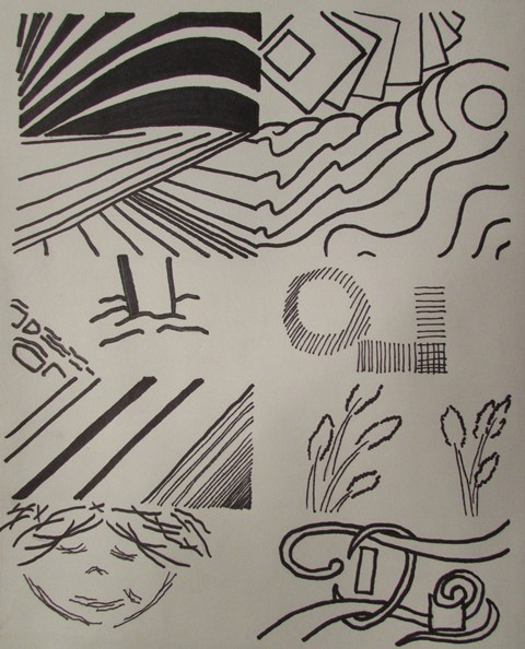
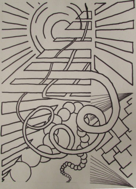
Once I decided on a starting point, it was time to draw my initial design on Bristol board with a ruler and an 8H pencil (the softer, the better). I painstakingly spaced certain lines at specific intervals to ensure proper repetition, thus allowing certain patterns to develop. Adding permanent marker to the image permitted me to see where my value choices needed development and how my use of straight lines could produce an illusion of curved images. Some connected lines indicated shapes that other individual lines reproduced, thus proving similar effects could be made with diverse techniques. Implied lines were used to indicate the interpenetration of inferred shapes.

Pencil LayoutMarker Layout

By varying the thickness of the lines in my design, I balanced the overall composition and created harmony within distinct areas as well as contrast with surrounding elements. While some thin lines were meant to seem farther away from the viewer, others were intended to create a sense of weight and value. Specific lines and their implied counterparts were added to disrupt the assumed location of imaginary shapes depending on the focus of the viewer. Instead of threading adjacent elements, these lines purposely throw the same area of the composition forward in one perspective and backwards in another. Movement is created, not only by the direction of these lines but by the demand upon the viewer’s eye to constantly move in an attempt to disentangle the illusion. Continuous, angular lines were utilized to subtly draw the more curious and scrutinizing viewer into neighboring regions of the image. In one case, a single uninterrupted line angles 45 times (technically becoming 45 separate lines) to cross three distinct parts of the design. Other lines are a meager centimeter long but are vital to the overall impression of a distinct shape.

Variety and DepthEnhanced Movement

Overlapping lines were incorporated into the design to provide variety and depth while also adding scale and proportion and interest levels to the interpenetrated shapes. By balancing the contrast between light and dark, several lines were deepened and thickened and additional components were included to enhance movement.

Within this project, all of the basic elements have been utilized, specifically shape – mostly implied – contrast – dark versus light, curved verse angular lines, connected verses suspended shapes – and, of course, line in all its glory. Color is used in its purest sense of black and white and texture, although subtle, is included in several areas. By combining all of the Elements of Art and using the Principles of Organization, an innovative, cohesive piece of artwork has been fashioned out of one plain sheet of Bristol board and various permanent markers.

Bigger On The Inside

View/Download PDF

Case In Point Mapping based on research by
Dr. Joan Giampa http://www.joanmariegiampa.com/teaching/my_research.html

The Symbol Grid

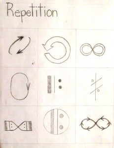
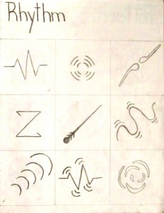
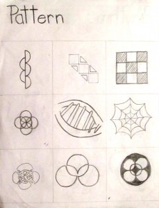
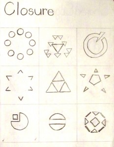
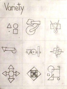
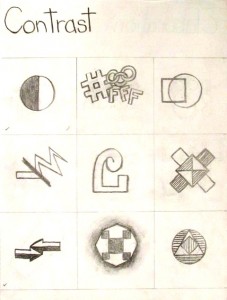
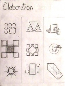
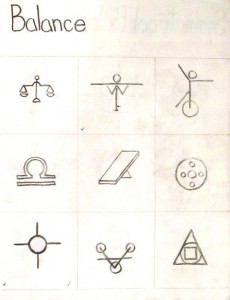
Research the 7 Principles and 16 Sub-principles of Design

  1. Harmony
    • 1.1.    Repetition
    • 1.2.    Rhythm
    • 1.3.    Pattern
    • 1.4.    Closure
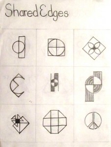
    • 1.5.    Shared Edges
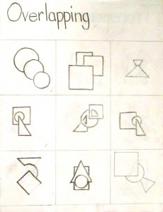
    • 1.6.    Overlapping
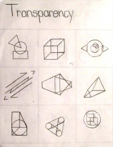
    • 1.7.    Transparency
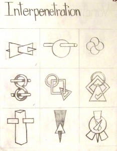
    • 1.8.    Interpenetration
  2. Variety
    • 2.1.    Contrast
    • 2.2.    Elaboration
  3. Balance
    • 3.1.    Symmetrical Balance
    • 3.2.    Approximate Symmetrical Balance
    • 3.3.    Asymmetrical Balance
    • 3.4.    Radial Balance
  4. Proportion
    • 4.1.    Scale
    • 4.2.    Golden Mean
  5. Dominance
  6. Movement
  7. Economy

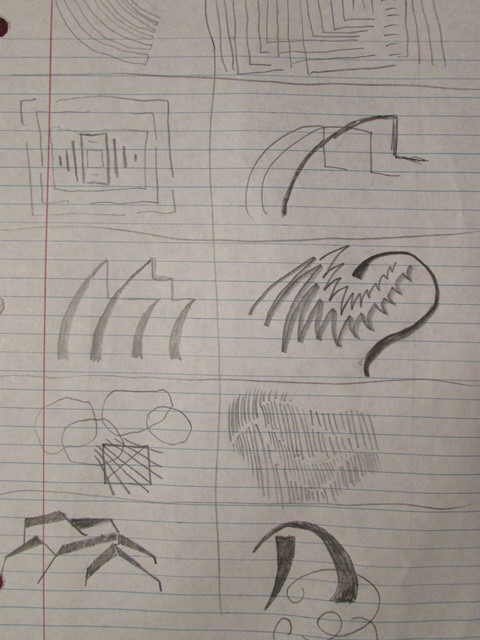
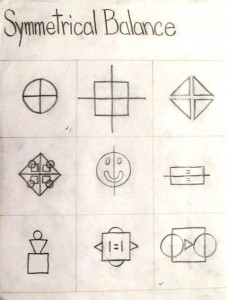
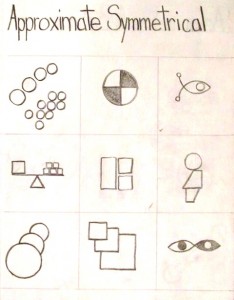
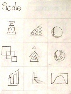
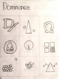
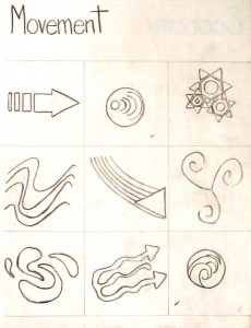
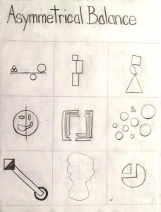
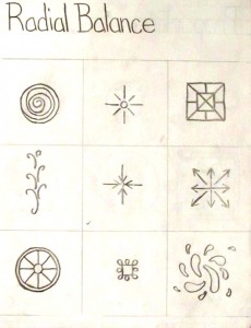
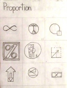
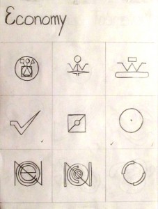
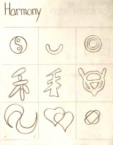
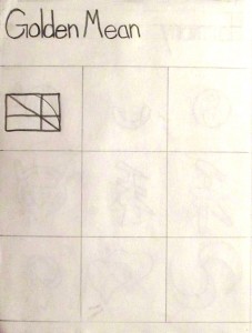
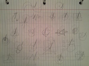
Sketch 9 Thumbnails for each Principle

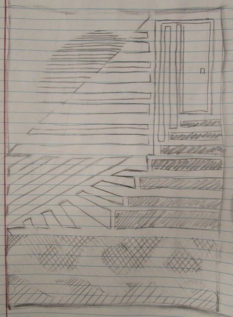
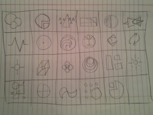
First I quickly sketched each Principle with an ordinary number two pencil on lined notebook paper.

First 11 Principles  Second 11 Principles

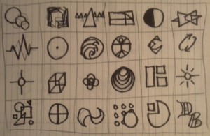
Once I had a general idea of the 9 ideas for each symbol, I drew quality versions in my Sketchbook and made each the approximate size of the finished product. I sketched the first layer with a 4B pencil (I prefer this weight for general sketching and drawing) but went back over each sketch with a 6B pencil (a slightly softer graphite produces a nice dark edge and shades quickly and effectively).

RepetitionRhythmPatternClosureShared EdgesOverlappingTransparencyInterpenetrationVarietyContrastElaborationBalanceSymmetrical BalanceApproximate Symmetrical BalanceScaleDominance MovementAsymmetrical BalanceRadial BalanceProportionEconomyHarmonyGolden MeanBlank Grid
Every other page is covered by a piece of tracing paper to protect both pages from smearing graphite and accidental image transfer.

Transfer Preparation

After sketching and re-sketching 9 versions of each Principle, a favorite was chosen of each. I then quickly sketched each favorite symbol on one sheet of notebook paper – grouped by complexity, similarity and balance – to decide where in the final composition each symbol would reside. Next, I sketched a quick mock grid to place each symbol in an appropriate cell.

 Symbol Grouping Symbol Placement

I based my positioning of each symbol on the approximate weight, position, movement and assumed modifications I might make while transferring the symbols. The twenty-fourth cell was reserved for my signature icon.

Grid Creation

Trimming an inch from the long edge of a 19”x24” sheet of Bristol paper with an X-acto knife provided me with a 6×4 grid of 3” squares with a 3” border. A ruler, T-square and drafting triangle were used to measure and outline the grid.

Image Transfers

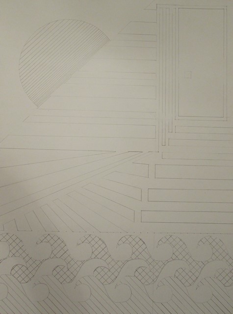
Because of the extra work completed in week one – producing quality and to-scale sketches – the transfer process was simplified for most of the symbols and required no, or very little, modification. A piece of tracing paper and an 8B pencil allowed me to copy each symbol to my 18”x24” Bristol sheet.

Transfer Symbols

Each image was traced from my sketchbook to tracing paper. The tracing paper was flipped over and the negative was traced (to add graphite to the negative image). The tracing paper was then placed in the appropriate position on the Bristol grid, positive side facing up, and traced once more; thus, transferring the exact image desired in the appropriate location within the composition.

Once all the images were transferred from my sketchbook to my Bristol board, I traced over my draft version of the layout with permanent marker to visualize how the final project would look.

Symbol Visualization

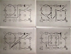
After finalizing each image with permanent marker and adjusting the weight of specific images to balance the overall composition, all the grid pencil marks and visible marks within each individual image were completely erased and the completed image was checked for stray marks and blemishes.

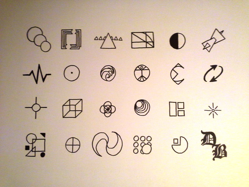
Symbol Grid

Documentation of the entire process was completed at each stage of the composition development.

Learning Process

In preparation for this project, Dr. Giampa expected the class to read two Chapters of Art Fundamentals: Theory and Practice by Ocvirk, Stinson, Wigg, Bone and Cayton and then develop a Case In Point map for each to dissect and scrutinize what we learned.

Case In Point – Form, Design, Composition

The first assignment was to summarize Chapter Two which was based on Form but included the Elements of Art, the Principles of Organization and covered the creation of Space and Visual Unity. I found the exercise very helpful in understanding the specifics of not only the individual elements but the principles, as well. For example, while I originally included the elements in my Case, stating that they included line, shape, value, texture and color, I expanded upon this very general declaration as a bullet in my Point by specifying that not all the elements are always used together but many of them are automatically combined within a design and organized to establish good form. By summarizing the information contained in the textbook and then expanding upon it by engaging in deeper thinking about each main point I found most important, my thoughts were focused and succinct and I then applied this new perspective to my design in progress. I found it extremely helpful while choosing the location of the symbols within my grid based on harmony and variety. Movement and economy were also strongly considered centered on my recent investigation into the Principles of Organization.

Case In Point – Fundamentals of Art

After learning about Space and Visual Unity, the Elements of Art and the Principles of Organization, the same process was applied to Chapter One and the three Components of Art: Subject, Form and Content. Again, I started with a general encapsulation of the chapter, briefly covering the evolving nature of art, Organic Unity and Abstraction. The main points I wanted to discuss, however, were the components themselves and how Subject is essentially the topic or “what” of a design, Form is the “how” or development of a piece and Content is the intention, meaning or “why” of the art. By drilling down into each component I explained how the subject of art may be representational or nonrepresentational and the more abstract the representation becomes, the less identifiable the subject becomes until it reaches a nonobjective state. I described Form as an overall union of the elements of art utilizing the principles of organization and indicated that the message, emotion or mood of a work of art is considered its content.  Each of these investigations into the deeper meanings of what was explained in the textbook helped me comprehend the essence of art and with this foundation I could move on to the creation stages of my projects.

Self-Critique

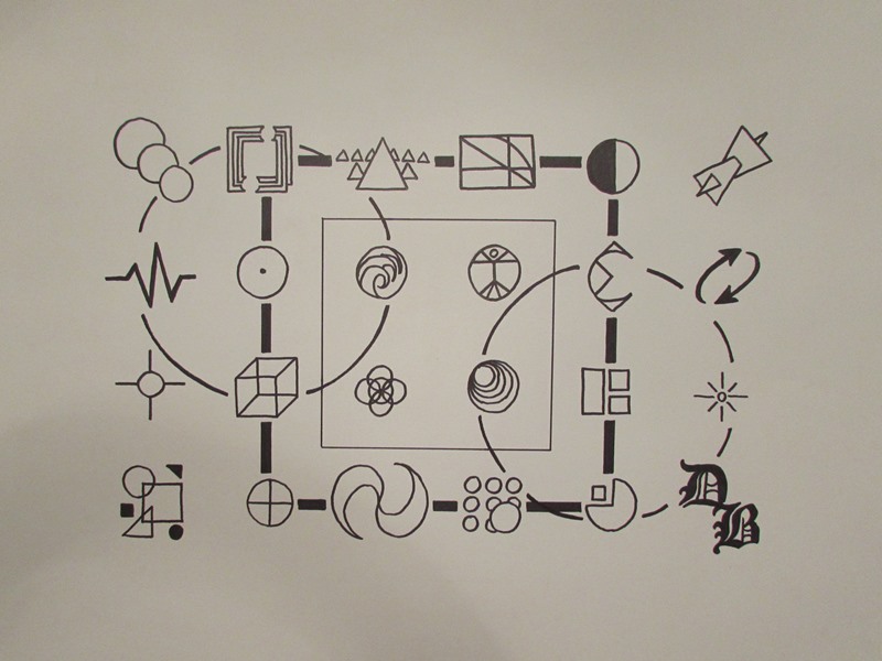
The symbol grid is a visual manifestation of the 23 principles and sub-principles of design. Each icon is representational of a separate and distinct idea or method utilized while planning a composition. The overall subject is a key to design and a guide to development. By approaching the component of “what” as a representational subject, the symbols are physically characterized as individual icons. Even in cases where the principles are more abstract, a physical manifestation is utilized as each symbol is developed. Line, shape and value are obvious while texture and color are not generally employed (other than basic black and white, of course).

While many of the elements of design were employed in each symbol, the principles of organization were needed to combine the icons into a single composition. Balance and proportion were utilized to arrange the symbols into various locations on the grid and some icons needed extra weight, or value, to balance their corresponding images while others needed directional adjustments to ensure fluid movement was achieved within the design. To address the “how”, or organization, component of the piece directly indicates the principles of organization and how they were used to place each icon in its specific location within the grid. Round objects were offset by sharp, jagged icons while darker symbols were placed within the composition based on lighter designs surrounding that area. The direction of some icons was adjusted to indicate internal movement. Balance, economy, proportion and contrast were all apparent in the organization of the piece.

When completed, the overall design felt cold and mechanical. While personally meaningful, the distance between objects resulted in an impersonal and detached product. The thought and effort poured into the project was neither apparent nor represented which left the piece hard and empty. Analyzing the “why” component of the work revealed this disappointment. Energy and soul were a large part of the creation of the composition but the fact that the end result was devoid of feeling made the piece emotionless and isolated. The remoteness of each symbol emitted an automated, rigid, measured sensation. Some movement was apparent within the design but as a whole the image became very static and hollow.

Redesign

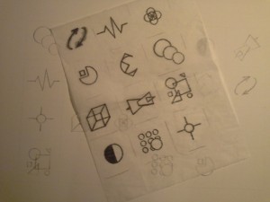
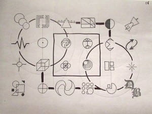
Not happy to leave my Symbol Grid in its current, disconnected state, I experimented with some compositional additions that kept to the spirit of the project. To that extent, I decided to go with some of the basic building block shapes that every symbol within my project contained: the square and the circle. I simply printed photographed copies of my project and drew my ideas on the prints.

Design ExperimentationsDesign Four

After four prints and about 10 design experimentation’s, I chose an idea based on print number four.

Symbol Grid Redesigned

As you can see, even the final version is slightly different from the chosen print experimentation. After adding the initial shapes to tie the piece together, the broken square – previously placed in the background as the farthest element from the viewer – was moved forward to reside within the middle ground of the piece. The circles were also darkened in contrast to the central square but nowhere near the thickness of the aforementioned broken square. The contrast in value between the four additional elements and the opposition to their traditional, assumed behavior regarding perspective – darker shapes advance while lighter shapes recede – leveled the image, once again, to a flat surface; however, with the modifications in place, the overall design became fluid, stimulating and sincere.

View/Download PDF

Case In Point Mapping based on research by
Dr. Joan Giampa http://www.joanmariegiampa.com/teaching/my_research.html

The Tragic Death of the Written Word

Have modern communication methods, such as instant messaging and texting, detrimentally impacted students’ communication skills, and if so, is this influence a dismal foreshadowing of an illiterate future? Some theories lean toward a rapid decline of intelligent readers in our culture, as indicated in an insightful query by Patrick Tucker, the senior editor of The Futurist magazine and Director of Communications for the World Future Society, where he perceptively inquired, “How can it be that less than one-third of 13-year-olds are daily readers, or the percentage of 17-year-olds who read nothing at all for pleasure has doubled over a 20-year period (as measured by the NEA in 2007), or that 40 million Americans read at the lowest literacy level?” (Tucker).
Contrasting opinions have been presented by researchers such as Anupam Kathpalia, who astutely revealed that, “Text messaging may not be all that bad. Some experts add that the use of abbreviations is a novel way of communication that demonstrates dexterity and creativity. This method of communication expands our language capabilities and demonstrates ingenuity.” indicating that text messaging actually exhibits imaginative and resourceful communication alternatives to classic writing styles (Kathpalia). While intriguing arguments exist, both damning and defending Short Message Service technology, the ultimate evidence is irrefutable: modern communication methods, such as instant messaging and texting, have unquestionably influenced students’ social skills; and disastrously, the effect has been mostly negative.

To evaluate objectively the consequences of utilizing such technology, one must first understand the technology in question. Short Message Service, or SMS, is a method of sending short, meaning no more than 160 characters, simple messages between two devices that support the service, such as cellular phones; personal computers and other handheld devices are also capable of exchanging these messages. Jennifer Hord explains how these devices are constantly communicating with towers and their subscribers to update and support mobile users and their ever changing locations. In a nutshell, small packets of information are exchanged allowing the central network to know where each device is currently located and how best to continue providing this vital communication. While unknown to the casual customer, this constant exchange of data allows cellular phone calls, text messaging and other exchanges of information between users within a single network and between multiple networks, as well (Hord). The “store and forward” concept is further elaborated upon by Puneet Gupta, a developer for Lucent Technologies, where he describes a message’s journey from the sender, or originator, to a central SMS center from which it is forwarded to the receiver, or terminator. If the receiver is not available, this method of delivering messages allows the data be stored and delivered when the receiver becomes available (Gupta).

In other words, data is persistently being sent to a central location where it is either passed on or stored based on its purpose. If you send a text message to two friends asking if they’d like to meet for lunch and one of them is out of range of their cellular provider and the other is within range, the later will get the forwarded message immediately while the same message destined for the former will be saved and stored until he or she is available to receive the message, at which time it will be released. This may mean that only one friend will respond in time for lunch but you can rest assured that the other will at least know you made the offer. However, just because you are not placing a phone call, downloading information or sending a message does not mean that your device is inactive. On the contrary, your cell phone is hard at work, relentlessly communicating with towers and access points to ensure you can send and receive the messages and calls you expect from your well paid service provider. So, should your message for lunch be in a finely formed sentence with correct punctuation, spelling and grammar? Is this considered writing?

An interesting concept, loosely based upon the theory that texting is just a quick and easy way of communication and not a form of writing, per se, would state that the damage inflicted upon writing being attributed to instant messages is no more destructive than that of slang used within a telephone call, or indeed, a casual conversation between peers. This concept has been explored by Amanda Lenhart and her team of researchers at the Pew Research Center and she discovered that, “Most teenagers spend a considerable amount of their life composing texts, but they do not think that a lot of the material they create electronically is real writing. The act of exchanging emails, instant messages, texts, and social network posts is communication that carries the same weight to teens as phone calls and between-class hallway greetings” (Lenhart). Another dispute against the notion that texting and social media are destroying literacy in young readers and writers is presented by Professor David Crystal, well renowned linguist and accomplished writer, editor and lecturer, who has referred to common beliefs and statements claiming that these modern forms of communication are contributing to the downfall of the English language as being based on unfounded fears established by language myths and simple ignorance. This claim and other similar opinions have not only been the subject of several of his many books, they were expounded upon in an interview by Joy Lo Dico, writer and diarist for the London Evening Standard, specifically referring to Crystal’s bestsellers, A Little Book of Language and Txtng: the Gr8 Db8, in which she reported that the linguist “found that “txt speak” accounted for barely 10 per cent of the contents of the messages exchanged, and noted that abbreviations have always been part of the English language. . . . The breadth of the internet means that language is morphing not just on grocers’ signs and in school playgrounds, but on a far more fundamental level” (Lo Dico).

However, this does not necessarily mean there are no harmful repercussions from the incorrect spelling, lack of punctuation and rampant sentence fragments produced en masse by constant, ceaseless, careless texting. Several studies have shown that students have admittedly let text lingo slip into their school assignments and have shown a general deterioration in correct punctuation and capitalization due to a lack of practice and repetition of employing correct grammar and writing skills. Kristy Roschke mentions all of these trends in her graduate project, The Text Generation: Is English the Next Dead Language?, and goes on to include the fact that teens have even been known to include emoticons, pictorial representations of facial expressions using punctuation marks and letters, in scholastic assignments (Roschke). Truthfully, the inherent danger to most teens as they mature beyond high school and even into, and after, college is the fateful interview in which they will prove their lacking social abilities, horrendous writing capacity and altogether unacceptable communication skills. It seems to be almost offensively ironic that social media is a leading contributor to deteriorating basic social talents.

For example, many studies have attributed lazy attitudes towards relaying accurate information, a lack of common courtesy and even personal relationship detriment to constant texting but the largest concern has been poor communication skills in corporate America as noted by JoJo Tabares, an experienced expert holding a degree in Speech Communication: According to a 2005 article in the Pittsburgh Post Gazette, employers are complaining about communication skills. Bosses say the biggest failing among college graduates, job applicants, is an inability to speak and write effectively. Communication skills now top the list of qualities employers seek because these are qualities they cannot teach in their two-week new hire training sessions. However, these qualities are consistently at the bottom of the list perspective employees possess at the interview. According to the National Association of Colleges and Employers, good communication skills were what employers said was most lacking in college job candidates. (Tabares)

It is obvious that formal writing is still essential in the business world and that shortcuts and text lingo are not acceptable forms of vernacular when professional communication is required. A client will not be impressed with the ability to insert a smiley face into the end of a proposal, no matter how charming an expression it may signify; nor will an employer. Bradley Ballard also alluded to the differences between formal and informal writing and when each is appropriate when he remarked that, “Texting is here and shows no sign of retreat. However, neither does formal business writing and telephone skills. The real trick is to figure out which mode of conversation is best for the given circumstance.” What he was referring to was the fact that high school and college graduates will eventually need to communicate intelligently and eloquently with employers, colleagues and clients and that their future employers would be “the first to insist on excellent writing skills”. He went on to explain that a lack of communication skills can be traced back to grade school when he ascertained, “texting has had a negative effect on the writing abilities, grammar and spelling of students enrolled in primary and middle school. Evidence suggests that because these young students do not yet have a full grasp of the basic English writing skills, they have difficulty in making the shift between texting language and Standard English. Those students who were introduced to texting after gaining a strong knowledge of basic writing skills had an easier time switching between the informal text-speak and formal English” (Ballard).

Have texting devices and instant messages destroyed the English language? Are we destined to slip quietly into an illiterate future simply because younger generations choose to abbreviate more and punctuate less? There is no evidence to support either of these fantastic theories; however, what has been proven is that there is a great responsibility laid upon those of us who believe the written word is worth saving to march onward with resolute and unwavering sentence structure, fight bravely with unapologetic punctuation and prove victorious the gallant grammar and magnificent language we hold dear.

© Daniel E. Barndt ~2012

Original Post (with pictures!) @ BarndtHouse

Works Cited

Ballard, Bradley. Text Messaging and Its Effects on Writing Skills and Employment. Yahoo! Contributor Network. 2 November, 2011. Web. 11 July, 2012. http://voices.yahoo.com/ text-messaging-its-effects-writing-10325565.html?cat=31.

Gupta, Puneet. Short Message Service: What, How and Where? Wireless Developer Network. n.d. Web. 18 July, 2012. http://www.wirelessdevnet.com/channels/sms/features/sms.html/.

Hord, Jennifer. How SMS Works. How Stuff Works. n.d. Web. 18 July, 2012. http://computer.howstuffworks.com/e-mail-messaging/sms.htm.

Kathpalia, Anupam. The Effects of Text Messaging. Ezine Articles. 7 January, 2010. Web. 1 July, 2012. http://ezinearticles.com/?The-Effects-of-Text-Messaging&id=3540152.

Lenhart, Amanda. Writing, Technology and Teens. PewResearchCenter Publications. April 24, 2008. Web. 11 July, 2012. http://pewresearch.org/pubs/808/writing-technology-and-teens.

Lo Dico, Joy. Watch what you’re saying!: Linguist David Crystal on Twitter, texting and our native tongue. The Independent. 14 March, 2010. Web. 25 July, 2012. http://www.independent.co.uk/arts-entertainment/books/features/watch-what-youre-saying-linguist-david-crystal-on-twitter-texting-and-our-native-tongue-1919271.html.

Roschke, Kristy. The Text Generation: Is English the Next Dead Language? Teaching, projects, portfolios, and archive files. 2 July, 2008. Web. 11 July, 2012. http://mwtc.composing.org/grad/projects/roschke.pdf.

Tucker, Patrick. Could Written Language Be Rendered Obsolete, and What Should We Demand In Return? Encyclopedia Britannica Blog. 29 January, 2010. Web. 11 July, 2012. http://www.britannica.com/blogs/2010/01/how-artificial-intelligence-could-render-written-language-obsolete/.

Taking the Field

She wiped the sweat from her brow with the back of her sleeve, not willing to chance getting her fingers wet with perspiration. Nevertheless, her right hand went to her thigh subconsciously as she dried her fingers on the absorbent fabric of her pants for the third time in as many minutes. The glove on her left hand felt loose so she adjusted her grip and pulled it a little tighter. In another minute the ritual would repeat itself.

The sun was high by now. It beat down like fire on the back of Samantha’s toned, muscular shoulders deepening her already disproportionate tan. The razor-back pattern of her uniform was burned into her skin: a tattoo of pride. While other girls her age were lying out at the pool or on the beach doing everything within their power to avoid such unwanted lines, a small group of dedicated young ladies, known as the Lethal Leopards, wore them with immodest honor.

The umpires and coaches were arguing over a recent play at the plate, so she took this small pause in the action to take inventory of her “faithful few”. The devoted girls that stood with her in this blistering arena were as dedicated and loyal as any team that had ever graced a ballpark. They stood patiently; fearless and undaunted by the harsh elements that scorched them on this hot and humid afternoon. She had known many of them for years and a select few for a lifetime. Through thick and thin, these young ladies counted on each other, anticipated each other’s moves and backed each other up, both on and off the field.

Nicole, standing nonchalantly in left field, pinned her gloved hand under one arm and brought her other hand to her chin as if contemplating the mysteries of life. Far from a passive philosopher, she had once stepped in front of Samantha, shielding her from a slovenly brute itching for a fight over some inconsequential little nothing that seemed to litter the days of every high school student. Where Samantha was fit and toned this behemoth coming after her was a corn-feed mutant: twice as tall and three times as wide. Nicole, who only had a few inches on Samantha, marched between the two and the glistening look in her bright, green eyes promised this monster a slow and painful death were she determined to threaten her teammate. The Leopards were comrades on the field, friends in the classroom but above all, family‐and no one messed with family!

Scanning right field, Samantha caught the eye of her best friend, Jessica, who could make the world smile with a glance. She was always grinning like the Cheshire Cat and today was no exception. She waved and even giggled a little as they shared a quick look. In unison, they both turned to consider the officials quarreling at home plate. Jessica had caused the current disagreement with an expertly thrown play at home where the Leopards notorious catcher, Amanda “The Wall” Turner, had stopped a runner cold as she tried to score after her teammate smoked a ball into deep right field. Jessica had tracked it expertly into her glove and fired it home so fast that, even though the runner on third had tagged-up and waited for the inevitable out before taking off for home, the play was so close the umpire had called her out on the blocked tag. The opposing coach had appealed to the field umpire, thus the current pause in the game. Performances like this were common for Jessica. She was an outstanding softball player and deserved to play for the college of her choice. Her grades were great and her attitude was outstanding. Continuously lifting the spirits of her partners on the ball-field no matter what the situation, everyone depended on Jessica to find the silver lining, no matter how gloomy the game appeared or what ill-fated turn the score may have taken. Today, however, thinking about Jessica started making Samantha angry. Her best friend had just found out she was going to have to work full-time for a couple years before she could afford even a few basic classes at the local community college after graduating in the spring and Samantha had heard the unsettling news just this morning. The boys were getting awarded scholarships left and right, even the unexceptional baseball players were being offered a piece of the pie but the girls softball team was only handed scraps, if anything at all.

Samantha, with an irritated frown twisting her usually pretty face, snuck another quick glance Jessica’s way only to notice, as if silently proving what a positive attitude she had, Jessica beaming almost more than normal as the umpires wound up their discussion at the plate. Samantha smiled. She couldn’t help it, that’s what Jessica did to people. Wiping her fingers across her dusty, grass-stained uniform the patient center-fielder tapped her glove hand on her knee and tightened the wrist strap a little more, ready to get on with the game.

This was fastpitch softball. Scorching, sizzling, sweltering tournaments several times a week; hotter practices in-between with batting practice filling the hours that separated them both. When you were serious about softball there was no such thing as the “off-season”. It was incessant and while the young ladies showed their dedication on the field, their families supported them ceaselessly, both financially and emotionally. The equipment and fees weren’t cheap nor was the cost of hotel rooms and food expenses necessary when running up and down the east-coast to play tournaments. Many families planned vacations around these softball schedules; in fact, some even relinquished their vacation plans altogether.

Amanda proved victorious at the plate. Her spectacular block and tag was determined to have contacted the base runner before those vicious, biting cleats had reached home plate. With two down it was time to get the last out and start batting. Amanda was one of the lucky ones. Her family was struggling like almost everyone else but she had been contacted by a college interested in her as a starting catcher. For an upcoming college freshman, this was almost unheard of; on the other hand, Amanda was an honor roll student and adding her impeccable grades to her nearly flawless softball career, it didn’t surprise anyone that she was getting offers so early. Unfortunately, there just wasn’t very much financial assistance available by way of women’s athletic scholarships to even dent her first year fees. Samantha shook her head in disgust as she thought about Jack, the lumbering football quarterback, who was just offered a full ride to an out-of-state college with an obese football program, even though his grades were less than impressive and his accomplishments on the field were average at best. The indisputable fact that male scholarships outnumbered their female counterparts two to one was blatantly obvious.

Batter up! Taylor, the Leopard’s star pitcher, led off with a fastball down the middle. Strike one! The batter should have at least gotten a piece of it, but no such luck. Not the way Taylor fired the ball! Amanda shot some fingers down and left, calling for a low inside pitch. Taylor obliged. The batter hopped back, expecting a ball. Strike two! The inside corner smoked with the heat Taylor scraped down the strike zone. There weren’t many pitchers like Taylor and with Amanda behind the plate this battery was nearly unbeatable.

Another pitch on the inside came next, but the batter wasn’t going down easy as she fouled it off the left side. Carrie, the third baseman, snagged it and tossed it back to Taylor. Going outside this time, the following pitch caught the end of the bat due to a late swing and the ball veered off to the right, again going foul. Morgan, the Leopards’ tall but sturdy first baseman, scooped it up and returned it nonchalantly to the pitcher. Another outside pitch earned Taylor her first ball; and attempting a drop that went much too low gained the Leopard’s a second ball that, fortunately, Amanda skillfully stopped. With the count at twenty-two, Taylor shot in a tricky rise ball but it went a little too high and the batter didn’t take the bait. Ball three ‐ full count. Firing it down the center, Taylor insouciantly trusted her defense to back her up if the batter happened to connect solidly. Of course, the batter did just that with a line drive to shortstop. Unfortunately for this batter, there camped Sarah with proverbial glue in her glove; for very few hits had ever gotten past her sticky fingers and Taylor was certain that this would be no exception! As the ball skimmed above the surface of the infield, it almost looked like it might catch the ground which would allow the batter a fighting chance if there was a bad hop or an error was committed by the fielder. Imagine! The batter was already sprinting to first base when Sarah dove toward the point of contact and stretched, sacrificing her body for the good of the team. She ignored the pain of crashing to the hard, dry earth to ensure the ball landed solidly in her glove. Out!

As they rushed off the field to grab their bats and helmets, Ashley, jogging in from second, greeted Sarah with a high five and a shout of congratulations. Not the first time but sadly, quite possibly one of the last. After graduation everyone would be headed down their own separate roads, setting off on new adventures that they must journey alone.

They won the game that day; in fact, they won most of their games that season. It wasn’t that it came easy or that there was no competition; on the contrary, the Lethal Leopards practiced hard and played harder! They were dedicated to each other, themselves, their grades and their community. The Leopards were known for volunteering and performing fund raisers for charities and improving the world around them a little bit at a time; as Ashley repeatedly pointed out: what they could do, they would do. Everything that could qualify you for a scholarship packed each of these young ladies resumés. Samantha was painfully aware of that fact when they gathered for the last time to wish each other good luck on their future successes and discuss upcoming plans for their continued education.

It was the end of their senior year, an “End of Season” that actually meant “The End” for this particular team. They laughed, they cried, shared pictures and videos of their past games and seasons. There was good food and great company; it was truly a celebration of what had been and for most, a look forward to what was yet to come. As the girls shared their dreams the revelry was bitter-sweet for Samantha. She watched Jessica, smiling and laughing louder than anyone. The only member of their group without the means to even try to go straight off to college, not even the local community college. She would have to work for each credit hour. Save and scrimp to even start what the rest of them would be halfway through. Jessica deserved a grant more than any of them. She had earned it with her scholastic excellence, her dedication to her sport and her community involvement. If only someone had stood up for women’s sports and demanded they receive the same funding as the men’s sports, maybe Jessica would be able to afford the college education she deserved. Samantha vowed to do something about gender inequality. She didn’t know it at the time but that last day with a handful of friends that she loved like a family changed her vocational pursuits for the rest of her life. She wished she could have helped Jessica, then and there, but she swore she’d change the world for Jessica’s daughters and her daughter’s daughters.


Years later, as an advocate for women’s rights and with a plethora of awards, certificates and accommodations under her belt, bestowed upon her for persistently and vigorously fighting for women’s scholarships, equality in sports and recognition of female athletics, Samantha recognized a familiar voice as she sat quietly in her unpretentious, cozy little office stationed, appropriately, in her home town.

“I love what you’ve done with the place.” The silky voice was unmistakable and Samantha’s head snapped around like the tail-end of a wet towel coiled into a whip, the way the boys used to torture the girls at the neighborhood pool with stinging “rat-tails”, as they named them.

Samantha jumped out of her chair, nearly spilling her coffee and practically tripping over her desk to greet her dearest friend. “Jessica! Oh my god, it’s been forever!” she exclaimed, wrapping her arms around her teammate and embracing her in an affectionate hug.

Jessica returned the embrace with as much, if not more, adoration. “I’ve missed you, girl.” She replied, understatedly and with more than a little effort dedicated to holding back tears of joy at reuniting with her best friend from so long ago. Unfortunately, their paths had separated after high school, not entirely unexpectedly, and although they stayed in touch for a while, sending emails and meeting each other for lunch now and then, life simply got hectic, as sometimes it does. College and families and kids and the mundane routines that pepper our daily existence just overran what was most important—actually living! The trap was far from unique and Jessica had returned to right that wrong, specifically for Samantha and herself, which meant traveling to their home town, where she knew Samantha, her most treasured high school friend, had settled down.

They convened to a nearby café and after some simple catching-up and “how is so-and-so” and “what have you been up to?” and “I’ve been busy, you know, the usual”, Jessica stopped and regarded her long lost friend with a determined look in her piercing, sapphire eyes. Noticing the pause, Samantha glanced up from the newly poured coffee cup she had begun to sip and returned a puzzled look of her own.

“What’s wrong?” Samantha asked, genuinely concerned.

Jessica took a deep breath and began to relate some previously unmentioned details, “You know about Jeff and I and how we were blessed with a sweet, smart, beautiful daughter? Well, Alice decided long ago to follow in her mother’s footsteps, in our footsteps. She started playing softball and was damn good! Natural talent—I’ll take credit, thank you very much.” She giggled her famous giggle at the last statement and Samantha couldn’t help but join her.

“Oh, I have no doubt!” Samantha added, before taking another sip of coffee.

Jessica continued, “Well, she’s a freshman now. Yes, in college and, yes, it’s been that long!” They laughed again until it faded off slowly and a look of nostalgia crossed both their faces simultaneously as they quickly but subconsciously recounted the events of the last couple decades. It was only a flash but it reflected noticeably on both of their faces at once.

Samantha regained her composure first, “That’s great, I’m glad to hear the legacy lives on! How’s she doing?”

“That’s what I wanted to tell you. I really couldn’t believe when I first found out myself. She was awarded a scholarship—and not just a few bucks, a full ride!” The excitement was building in the pitch of Jessica’s voice and she was racing. “She got into her first choice, she’s interested in psychology and they have a great program—one of the best in the country—so she was aiming for them to begin with, and then”, she had to take a breath; “they offered to pay for the whole thing! We couldn’t believe it!”

“I’m so happy for you!” Samantha exclaimed, “You must know that’s one of the things I’ve been working so hard to change all these years: scholarship gender inequality—regarding women’s sports, specifically.”

“That’s the real reason…”, Jessica’s voice cracked a little. Samantha could see tears welling up and clouding her usually bright, sunny eyes. “I needed to come see you, in person. When we were done jumping up and down for joy, I started questioning how it was possible for this wonderful, extraordinary thing to happen to us; so I took a closer look at the program that was offering the grant. I don’t even know if you know…” She looked questioningly at Samantha as tears streamed down her pink, flushed cheeks.

“Know what, Jess?” Samantha took Jessica’s hands in hers. “What’s wrong? Let me help you if I can.” She couldn’t understand why her dear friend had broken down so quickly. She felt herself start to choke up a bit and her eyes moistened, as well.

“It was you! The name at the very bottom, behind all the officials and representatives, a program YOU started is sending MY daughter to a college we could never afford! My god, Samantha, it was you! Thank you so much!” Words were now too difficult. She fell into Samantha’s outstretched arms and sobbed tears of overwhelming joy. Tears she had cried time and time again since realizing that her very best friend from so long ago had reached out, unknowingly and had given her daughter the gift she could not give, a gift no one had offered her all those years ago when she need it most.

Samantha couldn’t hold back any longer; she cried with her best friend freely and as she did they shared special, intimate, universal tears: tears of joy for Jessica’s daughter and for all of the girls around the country that she had a hand in helping over the years. Once again, Jessica shaped Samantha’s life as she realized, concretely, what she had always known: this was the fruition of all that hard work, this moment right here was what made her decision all those years ago worthwhile, and she vowed then and there to never stop fighting for those young ladies. It would never be enough, for the work would never be complete!

© Daniel E. Barndt ~2012

Original Post (with pictures!) @ BarndtHouse

You Are Not Your Effin’ Khakis!

While a cynical computer hacker was learning about the true nature of reality in The Matrix and a depressed psychologist attempted to help a tormented boy who claimed to be able to communicate with spirits in The Sixth Sense, a true masterpiece of cinematic gold was being released. The year was 1999 and the film was Fight Club. Never have I watched a movie and found it absolutely necessary to watch it again, from beginning to end, in its entirety! The direction is marvelous, the acting: superb! But the underlying message‐depicting a revulsion toward our commercialistic culture and a less-than-subtle anti-capitalist theme‐is an artistic commentary on society that cannot, and should not, be ignored!

This is your life and it’s ending one minute at a time.

The Narrator, who is never officially named in the film (a fact that is in no way unrelated to the underlying message criticizing advertising and lifestyle obsession), is an insomniac desperately seeking a cure to his waking nightmare of a sleepless existence. He finds solace in attending support groups of which he has no disease. By allowing himself to let go and weep with the poor souls that are actually suffering from the various afflictions of each meeting he attends, he achieves the essential respite he so urgently needs. Unfortunately, along the way he becomes aware of another “tourist” attending his meetings and this intrusion into his innovative therapy disrupts his emotional release, thus destroying his ability to sleep and returning him to the horror of his previous insomnia. Soon after, the Narrator meets an eccentric soap-salesman with a unique outlook on life and, due to some very unusual events, the odd-couple cohabitate and start a new form of therapy: hand-to-hand combat where everyone wins by learning what is truly important in life.

The things you own end up owning you.

Edward Norton exemplifies a fantastic portrayal of the Narrator (loosely identified as Jack), the epitome of the typical misguided American consumer, in this fantastic film which is about anything but fighting. The director, David Fincher, envisioned the violence in Fight Club as a mere metaphor for the ominous struggle between a young generation and the misplaced values depicted by advertising. Marla Singer, the interloper that disrupts the poor insomniac’s creative therapy, is stunningly represented by Helena Bonham Carter and represents the Narrator’s guilt, regret and fear. Cast as Tyler Durden, Brad Pitt embodies the spectacular antithesis of the Narrator, who quickly becomes our protagonist’s new and improved therapy partner as they form Fight Club: a support group for individuals suffering from modern civilization and commercialism in a detached society.

Her lie reflected my lie…
If I had a tumor I’d name it Marla.

Although expertly adapted for the big screen from an ingeniously brilliant novel and portrayed on film by a cast of immaculate artists, the editing of each scene, shot and sequence predominantly developed Fight Club into a masterwork of cinematography! For example, the scene in which the Narrator ultimately describes Marla as his nemesis is set in a support group meeting with the camera panning behind the main character, projecting the illusion that the audience is in a row behind him attending the same meeting. This illusion connects us, as the viewers, with the Narrator‐we are there with him, in the same room, in the same situation; however, with a flick of a lighter, we are made aware of the intruder. The Narrator turns to see who he already knew was there: Marla, the little scratch on the roof of his mouth that would heal if only he could stop tonguing it, but he can’t. The camera zooms in slowly on the antagonist as she sits smugly in her black garb, black sunglasses, cigarette smoke pouring slowly and seductively from her dark lips in stark contrast to her deathly pale skin. Marla is the Narrator’s infection but she is also his desire‐his cure. At this point in the film, however, she is merely an intrusion into his lie; the lie that was allowing him to sleep. As the Narrator turns we can clearly see the sleepless, drained countenance of a victim immersed in insomnia. After describing Marla as his reason for sleeplessness, a close-up of his face in the foreground with her remaining appropriately blurry but recognizable in the background, casually smoking her cigarette, emphasizes the cancerous leaching Marla inflicts upon the hapless Narrator. The lighter is shot close-up, with only a thumb in the clip, but it’s blatantly obvious who holds the obtrusive paraphernalia, even before the next sequence of shots depicting a black hat covering the face of a woman with a cigarette between her lips. Sound effects play a major role as well. The lighter strike is louder than it should be, indicating the emphasis being placed on its presence in this scene. The Narrator cannot focus on the meeting, the speaker fades away, and even his own thoughts are interrupted and focus on Marla. The final look on the Narrator’s face, a deliberate close-up, epitomizes his helplessness to overcome this intrusion into his endeavor at self-therapy; he is defeated and helpless and, in blunt dissimilarity, Marla is a strong, defiant symbol of unapologetic imposition.

How much can you know about yourself
if you’ve never been in a fight?

Another example of intense use of camera angles, scene selection and sound effects can be clearly appreciated in the fight choreography in the basement of Lou’s Bar. The views alter from first person to a view of both fighters; dolly tracking is used to sweep around as the fighters circle each other. Both fighters, whoever they may be at the time, are shot front-and-center in hard light while the bodies and faces of their spectators are dark and faded into the background, giving the fighters center stage and indicating that they are the stars, they are the heroes. The sound effects are, once again, key elements in illustrating the focus of these scenes. In an adrenalin pumped moment of fight or flight, surrounding noises fade away or even disappear; the crowd that surrounds the fighters lessens while the impact of each blow increases. As the action unfolds and more violent connections are made, the onlookers are all but silent though you can see they are cheering or groaning at what they are seeing but the victor is unaware of their approval or horror; he is intensely engrossed in the beating he is delivering. When he finally breaks out of his trance the sounds return and the fight is over, leaving everyone in a state of surrealism.

When you wake up in a different place at a different time, can you wake up as a different person?

To reduce Fight Club to a simple story of street fighting, bar-room brawling or a shallow exercise in violence would do an incredible injustice to the gifted and talented writer, Chuck Palahniuk, and every shrewd viewer since that has had the insight and vision to see past the superficial surface of the film’s exterior into any of the many underlying layers of social commentary that this exquisitely outrageous film provides into our advertising riddled, commercialistic existence. A beautiful example of how our lives have been saturated in possessions and how true spirituality has been cast aside as an unneeded bi-product of a useless past would be the perfectly appropriate explanation scene in which the Narrator describes his apartment and belongings and essentially describes his pathetic reason for living: price tags appear along with descriptions of his materialistic items as if he was walking through a sales catalogue. He works a job he hates to buy things he doesn’t need; he has no purpose or place in history. Tyler Durdon explains in more detail in his subsequent speech:

We have no Great War. No Great Depression. Our Great War’s a spiritual war… our Great Depression is our lives. We’ve all been raised on television to believe that one day we’d all be millionaires, and movie gods, and rock stars. But we won’t. And we’re slowly learning that fact. And we’re very, very pissed off.

You met me at a very strange time in my life.

The absolute genius of the opening scene sets the tenor for the entire movie and comes full circle by the end of the film: as the opening credits roll, the camera view tracks outward, from the center of the mind; it takes us on a journey from the fear center of the protagonist’s brain through various cerebral scenes and exits a skin pore, elegantly ending between the sights of a Smith and Wesson inserted awkwardly into his petrified mouth. This final shot is repeated near the conclusion of the film, as most of the story is an explanation as to how he ended up in this predicament, but by the time we’ve voyaged with our champion to this point in time our entire perspective has changed and, indeed, so has his. The theme song, Where Is My Mind by Pixies, is undeniably flawless and expresses the sensations of the Narrator as he seemingly losses his grasp on reality. As the final scene illustrates the end result of this unconventional excursion, the audience is not spoon-fed any solutions‐no simple, easy answers are conveniently provided; however, the Narrator has certainly learned something special about himself, society and how he might fit into the big picture. If the viewer is exceptionally lucky, perhaps so have they.

© Daniel E. Barndt ~2012

Original Post (with pictures!) @ BarndtHouse

Equality is a Team Sport

“No person in the United States shall, on the basis of sex, be excluded from participation in, be denied the benefits of, or be subjected to discrimination under any education program or activity receiving federal financial assistance.” [i]

Title IX was signed into law in 1972 and generated major changes to our educational system affording women new and long overdue educational and athletic opportunities. Why then do women athletes continue to get outrageously fewer teams, despicably scarcer scholarships and disgustingly inferior budgets than their male counterparts? It is well past time to change this unacceptable, reprehensible standard.

Our daughters and sisters are as important as our brothers and sons and deserve every opportunity to succeed and excel in sports, education and, indeed, life! Maybe your sister has experienced some sort of sexual discrimination already. Maybe this terrible prejudice has been thrust upon your daughter. What did you say when you had to look into her tear-filled eyes as she wondered why anyone would exude such twisted hate and horrid ignorance toward her based solely on her gender? How could you explain that in this day and age such appalling, bigoted opinions are not only tolerated but actually run rampant in our society? Did it make you angry? Could you feel her pain? Would you, like me, do anything in your power to confront and rebuke the culprits promoting such stupidity and animosity?

As an enlightened nation, we are lucky to live in a time where these chauvinistic, Neanderthal views of our past no longer pertain to women to the degree that they did a few decades ago. However, male athletes still receive 176 million more scholarship dollars than female athletes every year. As recently as 1992, 2.4% of men received athletic scholarships compared to the disproportionate 1.0% of women receiving similar athletic financial support. A slight improvement was seen by the time 2008 rolled around, when 1.6% of male athletes were awarded these grants compared to 1.1% of female athletes. [ii] Regrettably, at this rate of improvement, parity of scholarship distribution will take another 16 years or more before men and women receive equivalent opportunities for scholarships. The sad truth is clear: we have a long way to go before we reach true equality.

While it is true that the majority of money currently generated from spectator sports comes from men’s sporting events; the truth of the matter is, by supporting women’s athletic scholarships the profitability of sports in general could potentially double. Let’s encourage our young women to compete for an affordable education, learn from failure and success and strive for perfection, both in the classroom and on the field! Not only is it appallingly bias to assume men’s sports are the only events that could produce revenue, it’s also prohibited according to Title IX. Regardless of legal implications, consider the benefits of increasing opportunities for young women in sports. The more scholarships that become available for these young ladies, the more competition to qualify for these grants will escalate which, in turn, will improve the skills of all the competitors. By pushing these athletes to new levels of performance, the public’s interest in viewing women based sports will propagate; thus, amplifying the possible spectator sports we currently enjoy and, of course, all the revenue related to such events.

Increased scholarships for young women will result in an overall stronger future workforce, promote more diverse sporting entertainment possibilities and solidify our countries unity by promoting equality. It has been proven that women who are active in sports develop greater confidence, self-esteem and pride in their physical, social and academic endeavors; furthermore, research has suggested that girls that participate in team-based events are less likely to get involved with drugs, less likely to experience teen pregnancy and more likely to graduate from high-school. [iii] By supporting these impressive young ladies today and encouraging their academic growth by awarding them critical scholarships and grants, we will be strengthening and bolstering our homeland’s resilient leaders of tomorrow who will be unequivocally instrumental in shaping and molding our country’s future: promoting even more equality in sports, education and the professional arena, just as their predecessors have done before them.

Studies have established that women’s involvement in sports improves health, grades and leadership skills. Dr. Anne McTiernan, director of the Prevention Center at Fred Hutchinson in Seattle, has attested that participation in rigorous physical activities can reduce a woman’s risk of developing cancer and other diseases. In addition, sports involvement has been confirmed to control anger and anxiety, promote healthy eating and sleeping and benefit the development of grace, balance and poise according to the Women’s Sports Foundation. Athletic female students have historically earned better grades than their inactive counterparts and the graduation rates of young women involved in sports, from both high school and college, outnumber men in sports and, in fact, men in general. Women who have had the benefit of being involved in team activities learn how to take criticism, develop self-improvement skills and become assertive, both on and off the field. Effectively learning how to cope with failure is as important as relishing success; therefore, team sports are imperative to a well-rounded disposition.

While these remarkable, extraordinary young women competing for the limited available scholarships currently offered in today’s imbalanced world are undeniably strong enough to fight for their rights on their own, it is imperative that our entire nation join them in their struggle for equality. This awesome responsibility lies squarely on each and every one of our shoulders and it is our obligation as cultured, progressive, educated Americans to promote vital impartiality, defend basic educational rights and support the fundamental belief that no matter what race, color, creed‐and yes, even sex‐it is up to all of us to ensure that equality is a team sport!

© Daniel E. Barndt ~2012

Original Post (with pictures!) @ BarndtHouse

[i] Title IX, Education Amendments of 1972
[ii] Athletic Scholarships – Who Gets Them and How Many Are There? ~by Leah Westfall, 2011
[iii] Mythbusting: What Every Female Athlete Should Know! ~Women’s Sports Foundation

A Thoughtless Nation

The typical American citizen is willfully ignorant. Content to believe anything and everything the media feeds them they blindly live their daily lives uninterested in challenging the principal majority. Unaware that the accepted “norm” is carefully fabricated and disseminated to the public by a minority with personal hidden agendas. In all fairness, the media is normally merely the vessel of this misinformation, even when the correspondents accept it themselves. In fact, ensuring the purveyors of these untruths believe what they pass along actually endorses the general public’s ability to accept these lies as the unquestionable truth. A perfect example of our nation’s incapacity to recognize propaganda is the ignorant criminalization of marijuana.

Hemp has been used in the creation of woven fabrics for thousands of years and has been traced back to as early as the Chou dynasty (1122-249 B.C.). The first laws passed in America pertaining to marijuana were actually designed to enforce the mandatory growth of hemp in the early 1600’s. George Washington grew hemp at Mount Vernon as his primary harvest. Cannabis was a critical crop and even grown by the government to supply essential rope and related supplies during World War II. The term “canvas” is directly related to “cannabis” due to hemp’s practical use of being woven into this strong and inexpensive material. Literally, cannapaceus means “made from hemp”.

Racism and prejudice were notorious original sources of campaigns to outlaw the recreational use of marijuana. Initially directed toward Mexicans consuming the drug‐farmers were employing them as cheap labor‐the same ignorance fueled misguided attempts to criminalize the plant by blaming black jazz musicians and their “devil music” for the decline of cultural decency.

Political and financial influences to outlaw marijuana seem obvious but many of the indisputable details have been conveniently overlooked. In 1933 Alcohol Prohibition ended, thus reducing funding for the Federal Bureau of Narcotics (later to become the DEA ‐ Drug Enforcement Administration). The director of the FBN, Harry Anslinger, actively campaigned for Marijuana Prohibition vomiting outrageous and unfounded lies about the effects and consequences of smoking marijuana.

Anslinger represented the epitome of propaganda based on racism, prejudice and ignorance propelled by both politics and financial greed. His testimony before Congress in 1937 reflected his strong abhorrence of cannabis users and he has been repeatedly reported as uttering controversial quotes, for example: “Marijuana is the most violence causing drug in the history of mankind. Most marijuana smokers are Negros, Hispanics, Filipinos and entertainers. Their Satanic music, jazz and swing, result from marijuana usage. This marijuana causes white women to seek sexual relations with Negroes.”

William Hearst was extremely helpful in perpetuating Anslinger’s cause. He, however, had ulterior motives of his own. While he shared a hatred for Mexicans and other minorities, his racism was rooted in his personal finances. He had invested heavily in the timber industry to support his newspaper chain and had lost 800,000 acres of timberland to Pancho Villa, a Mexican Revolutionary general. Hemp would also threaten to further his losses based upon his timber investments. Most of all, publishing scandalous stories about the dangers of marijuana sold newspapers.

Anslinger and Hearst were instrumental in the 1937 bill signed by President Roosevelt that damned cannabis illegal at the federal level. As a result, the hemp industry, in its entirety, was doomed to its ultimate destruction.

It’s easy to draw a logical conclusion to a conspiracy among existing leaders of industry of the day that would be threatened by the widespread use of hemp. Namely, the chemical company Dupont, who actively supported the prohibition campaign, was motivated by removing competition to its patented nylon products. In addition, pharmaceutical companies could not control home-grown remedies to common ailments nor were they prepared to standardize or identify cannabis dosages.

What does all this have to do with modern ignorance? Everything. Some of today’s major concerns are the national deficit, the rising unemployment rate and irresponsible government spending. Why not combat unemployment, cut wasteful spending and contribute to paying off the deficit in one fell swoop? Consider the positive implications of legalizing and regulating marijuana. No longer would we spend excessive amounts of taxpayer money to arrest, prosecute, detain and incarcerate non-violent marijuana users. Instead, by regulating and taxing the sale of marijuana cigarettes, dealers, distributors and growers of black-market varieties of the drug (which are of unknown strength and purity‐lacing cannabis with incredibly dangerous drugs is common practice) would be out of business. The jobs created by this new industry would be substantial and the government would finally profit from the production, preparation and sale of recreational marijuana versus their current practice of spending countless millions of wasted funds to fight a losing war on a substance much less dangerous than alcohol. The later has been deemed acceptable by our culture as a legal drug despite the proven dangers on our society and the daily death-toll attributed to alcohol consumption but, in contrast, it is easily regulated, difficult to refine and the government has already lost that war once.

Furthermore, the countless products available which could be produced from the hemp plant would flood the market with alternatives to their present counterparts; thus stimulating the economy and forcing new levels of competition: driving down the price of fabrics, building materials, food products and the many uses of paper and other similarly produced goods. It is even conceivable that this practice would curb our planets existing deforestation issues.

The medicinal value of marijuana has been addressed to a limited extent in recent years. While more willing to accept its use as a medicine, there are still many critics that crusade to ban even this helpful application of the drug. These advocates often have their own specific agendas unrelated to the actual issue in question: religious leaders standing on “moral values”, political figures seeking increased public acceptance or reelection, and industry monopolies protecting their financial interests. Once again, an example of the dominate minority representing the ignorant majority. Most of these factions preach the dangers of “the devils weed” while few understand even the minutest details of Tetrahydrocannabinol (THC‐the active chemical in cannabis). The fact of the matter is, the consumption of red-meat is more likely to cause cancer than smoking marijuana and there has never been a documented case of an overdose attributed to the usage of marijuana. The same cannot be said of cocaine, heroin or even alcohol. A cannabis smoker can fear an increased appetite or escalated fatigue far before the outrageous claim by the 1936 movie Reefer Madness of losing one’s mind and being uncontrollably influenced to become an axe-murderer. Even frequently noted research linking long-term use of marijuana and short-term memory loss are inconclusive as several similarly conducted experiments and studies have resulted in widely varied outcomes. Basically, the medicinal value of cannabis far outweighs its commonly alleged dangers.

Despite all of these facts, the popular opinion of the average American is insistently to keep marijuana banned, that legalization efforts are solely pursued by “pot-heads” and the drug is more dangerous than alcohol. Few of those with these opinions could eloquently or intelligently argue their reasoning without quoting uneducated myths and former perpetuated deceits of anti-marijuana propaganda. Some common lines of thought have been, “Alcohol is legal, thus it is safe if used responsibly” and “Marijuana is illegal, so it must be dangerous no matter what the practice”.

Scarce would be the defender of a substance that has been so demonized in American society; however, the truth remains that marijuana has only been illegal in the United States for approximately eighty years out of our nation’s two-hundred plus (not to mention the thousands of years the plant has been in use preceding our nations birth and it’s widespread acceptance around the world). As for why, it seems blatantly obvious that the prohibition of marijuana is due to the typical American citizen’s complete failure to think for themselves, shrewdly question authority or rebel insightfully against popular opinion. Is it possible to allow ourselves to benefit from this relatively harmless plant? Will we confront our government and demand they cease the needless spending and wasted funds fighting a senseless war on a fictional enemy? Can we agree, instead, to battle unemployment, create jobs and heal our sick? The answer lies in one last, definitive question: do we have the audacity to think for ourselves?

© Daniel E. Barndt ~2012

Original Post (with pictures!) @ BarndtHouse

[i] An archaeological and historical account of cannabis in China by Hui-Lin Li – Economic Botany, 1974
[ii] The History of the Marihuana Tax Act of 1937 by David F. Musto, M.D. – Archives of General Psychiatry, 1972

[iii] The Forbidden Fruit and the Tree of Knowledge: An Inquiry Into the Legal History of American Marijuana Prohibition by Richard J. Bonnie & Charles H. Whitebread, II, 1970

[iv] Unsubstantiated statement of H. J. Anslinger, Commissioner of Narcotics, 1937 Marihuana Tax Act hearings

[v] Biography of  William Randolph Hearst by Jon C. Hopwood
[vi] Snatching The Patient’s Pot by Edward W. Miller, MD – Coastal Post, 2005

Tim Burton ‐ Creativity Incarnate

There are few that will ever probe so deeply, see so clearly, touch so profoundly the souls of a people than the genius that is Tim Burton! Where to begin? The Nightmare Before Christmas? Perhaps, there are many films that could be deemed his tour de force; however, that may be the film that introduced me to “Tim Burton the filmmaker”. I remember it well. Not the plot, specifically, nor the characters (although who could ever forget Jack and Sally?) but the wonderful darkness‐both beautiful and hauntingly sad, that welcomed me into its warm embrace. Suddenly grasping how a simple children’s story could be innocent yet passionate, chilling but harmless, forbidding and comforting: that was the decadent brilliance that drew me in and has never let me go!

Studying at the California Institute of the Arts led to his working on projects for Disney who awarded him a fellowship, circa 1980. This fortuitous apprenticeship allowed Burton to work as an animator on films such as The Fox and the Hound and The Black Cauldron. Interestingly enough, it could be assumed that this very conventional, mainstream, conservative animation style helped push him toward that murky corner of his vibrant mind that allowed us the privilege of such masterpieces as Beetlejuice, Edward Scissorhands and Sweeney Todd. Ironically, Disney then fired him in 1984 after making a short film called Frankenweenie (the story of a boy trying to revive his dog which was hit by a car), deeming it too dark for general audiences and a waste of company funds. Ah, but were it not for that darkness; never would he have shown so bright!

It would be easy to say Tim was always creative. He enjoyed fine art as a boy and making stop motion films. Be it painting, drawing or just enjoying movies, he continually surrounded himself with creative outlets. It’s no surprise that Edgar Allen Poe was a favorite author and that horror and science fiction were at the top of his genres of choice. He greatly respected Vincent Price, an immense influence in his life with whom he had the honor of working with on several occasions.

No one stands out in Burton’s life like his colleague, his friend, the godfather of his children: Johnny Depp. Cast as Edward Scissorhands (1990) the two continued to build a life-long friendship that would span what could be seen as Tim’s greatest works to date including the wonderful and marvelous twists on childhood favorites such as Charlie and the Chocolate Factory and Alice In Wonderland! Obviously, Helena Bonham Carter‐a creative soul in her own right‐also played, and indeed still plays, a crucial part in shaping his films. Helena has a boundless gift of portraying strong characters no matter who she depicts (she may be best recognized as Bellatrix Lestrange from the Harry Potter series but I’ll never forget her as Marla Singer in Fight Club! A movie so gorgeously dark and twisted it could have sprung straight out of a Tim Burton dream). Bonham Carter worked wonders as the sweet, lithe voice of Emily in Corpse Bride, the fascinating Mrs. Lovett in Sweeny Todd and the infamous Red Queen in Alice In Wonderland as well as numerous other great Burton films.

Before I started reading about his childhood I knew little of Tim’s personal history; truly, I believe I have but scratched the surface. Regardless, I feel we share some basic traits that I never knew existed and those similarities endear me to a man I already respected. He was an introvert and focused on his art even at a young age, as did I. Spending many days alone, yet content to be so, I enjoyed drawing, painting, sculpting and writing poetry. I frequently attempted to challenge societies perception of what was considered normal, explore unfamiliar territories and confront uncomfortable topics such as death and anguish; perhaps to push back at communal boundaries I felt surrounded me, possibly due to mere teen angst or conceivably to laugh and find humor in that which frightened me most: mortality itself. I don’t claim to know why Burton focuses on such topics, only that I respect how he creates virtue from agony, pleasure from revulsion and beauty from violence. With the incontrovertible success of his ability to twist such stories as Alice In Wonderland and Charlie and the Chocolate Factory into elegant, sinister works of art, it’s not hard to believe that I am far from alone in my appreciation of that wonderful capacity.

Whichever film may have first broken through the light to reveal the shadow of such glory, whatever magnificent nightmares gave birth to such beautiful gore‐whether it began in a California backyard of the 1970’s or a cynical Disney studio a decade and a half later‐of this I am certain: Tim Burton is the personification of creativity and he has only just begun!

© Daniel E. Barndt ~2012

Original Post (with pictures!) @ BarndtHouse

This Is Real

Ask me if it’s real
Tell me you don’t believe me
Make me scream it to the sky
I’ll beg you to believe me
You can see it in my eyes
Yes, this is real

Roads are hard and tangled webs
Prevent the light from shining through
When I’m bent and broken
When you need more than just the dream
Make me prove it… prove everything to you

Ask me if it’s real
Tell me you don’t believe me
Make me scream it to the sky
I’ll beg you to believe me
You can see it in my eyes
Yes, this is real

Life gets in the way sometimes
The grind makes truth so hard to find
But you know we’ll make it
If you dish, dear, I can take it
Make me prove it… prove everything to you

Ask me if it’s real
Tell me you don’t believe me
Make me scream it to the sky
I’ll beg you to believe me
You can see it in my eyes
Yes, this is real

Tell me that it’s real
Make me believe you see it
Scream until the angels cry
I’m begging you to see it
You can see it in my eyes
Yes, this is real